What Color Is Dover White?
Dover White is a warm, creamy white paint color that was first introduced by Sherwin-Williams in the early 2000s as part of their Signature Colors collection. It is known for being a versatile neutral that works well in all areas of the home. According to Sherwin-Williams, Dover White is their most popular white due to its soft, welcoming look.
The origins of Dover White can be traced back to the coastal town of Dover, England which is known for its iconic White Cliffs. Sherwin-Williams took inspiration from the cliffs’ warm, natural white color when creating Dover White. It has a subtle honey undertone that distinguishes it from more stark whites like Alabaster or Extra White.
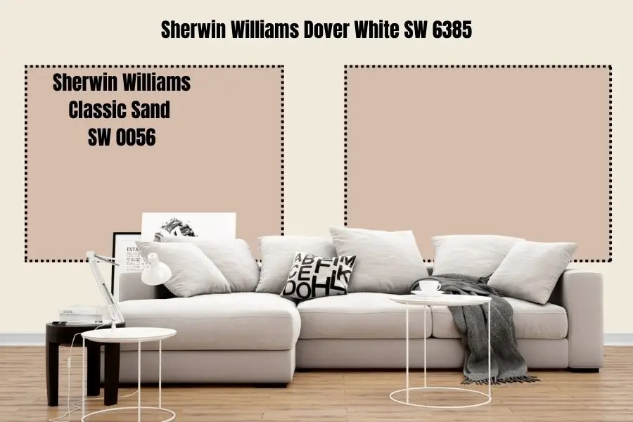
Dover White has become an essential neutral shade for designers and homeowners. It provides a clean, airy backdrop that allows other colors and textures in the space to shine. Many appreciate Dover White for its ability to reflect light and open up smaller spaces. Overall, it offers the versatility and brightness of white with added warmth and character.
Technical Specifications
Dover White is a popular off-white paint color by Sherwin-Williams. Its technical specifications according to Sherwin-Williams are:
- Hex Code: #F0EADB
- RGB Values: R: 240 G: 234 B: 219
- CMYK Breakdown: C: 2% M: 3% Y: 9% K: 0%
The hex code is a 6 digit code that represents the specific color in web and print design. The RGB values indicate the amount of red, green and blue light that makes up the color. In the CMYK breakdown, C stands for cyan, M stands for magenta, Y stands for yellow, and K stands for black. The percentages indicate how much of each color is mixed to create Dover White.
These specifications allow Dover White to be accurately reproduced digitally and in print materials. The RGB values in particular are useful for matching Dover White on screens and monitors.
Use in Design and Decor
Dover White is a popular neutral paint color used widely in interior design and decor. Its versatility and subtle warmth make it an ideal choice for many design schemes and styles.
In interior design, Dover White works well in both classic and contemporary spaces. It’s commonly used on walls, trim, cabinets, and doors to create a clean, bright backdrop. The hint of warmth prevents Dover White from reading as stark white, giving it more character. It pairs nicely with other neutrals like grays, creams, and tans. Dover White also complements accent colors like navy blue, emerald green, and warm metallics. Popular interior design styles incorporating Dover White include modern farmhouse, coastal, traditional, and Scandinavian (source).
For architecture, Dover White is an exterior color seen on many residential homes. Its soft tone stands out against landscaping and adds an inviting, easygoing feel. Dover White works well for craftsman, cottage, and farmhouse style homes (source).
In fashion, Dover White offers a clean, polished look for apparel and accessories. It reads as a true white, allowing colors paired with it to really pop. Dover White provides a lightweight feel perfect for spring and summer collections.
Use in Branding
Dover White is a popular off-white shade that has been utilized by many major brands for its clean, bright, and minimalist look. Some of the most notable companies that have used Dover White or similar off-white shades in their branding include:
- Apple – Many of Apple’s products like the iPhone, iPad, and MacBooks prominently feature a bright, clean white. This white branding helps convey Apple’s minimalism and modern aesthetic.[1]
- Ikea – Ikea uses an off-white that is very similar to Dover White across much of its branding and products. This helps reinforce Ikea’s Scandinavian design roots.[2]
- Zara – Zara stores are painted in an off-white shade comparable to Dover White, allowing the colorful clothing and displays to stand out.
- Nintendo – Many of Nintendo’s consoles like the Wii and Switch use a bright white color for the base unit, mimicking the clean minimalism of Apple products.
- Sonos – The wireless speaker company Sonos utilizes an off-white color similar to Dover White for its speaker products, which blends easily into modern home decor.
The clean, modern, minimalist aesthetic conveyed by shades like Dover White has proven extremely effective for technology and lifestyle brands looking to appeal to modern sensibilities. The color manages to be both bright and subtle, fading into the background while still conveying an image of purity and innovation.
Psychological Effects
The color white is often associated with purity, innocence, and cleanliness. It can evoke feelings of freshness and openness. In business, white is seen as representing equality, fairness, and impartiality (source). It gives off an air of neutrality.
White is considered a color of new beginnings and provides a blank canvas. It can help clear the mind and allow for focus. The simplicity of white can also evoke minimalism and space (source). Too much white, however, can feel isolating or stark if not balanced properly.
Overall, white aims to promote qualities of clarity, tranquility, and order. It represents faith and hope for the future. In decor, white provides the impression of cleanliness, efficiency, and modernity.
Cultural Associations
White has many symbolic associations across different cultures and periods of history. In Western cultures today, white is often associated with purity, innocence, and goodness. It is considered a color of perfection. In weddings, white symbolizes the bride’s virginity and purity. In literature and art, a woman in white represents innocence and light. White is also associated with cleanliness and hygiene.
However, white has not always symbolized positive traits. In ancient Greece and Rome, white was associated with cowards and was not a desirable color. In some Eastern cultures, white represents death and is worn at funerals. In Japan, white represents death, mourning, and misfortune. In China, white clothing is worn at funerals and represents mourning, loss, and the transitory nature of life. However, Chinese culture also associates white with purity, sacredness, and naturalness.
In Western art history, white was rare and expensive as a pigment. It represented holiness, innocence, and purity, especially in religious works featuring Christ, the Virgin Mary, and angels. During the Renaissance and Baroque periods, white became fashionable in portraits to showcase the wealth of the subjects. Later, white became connected with minimalist art and architecture.
Literature contains many symbolic meanings of the color white. It often represents innocence and purity in women, from Desdemona in Shakespeare’s Othello to the white dress of Jane Austen’s virginal heroines. In Herman Melville’s Moby Dick, the white whale represents an inscrutable and unknowable force. The “great white light” has spiritual overtones in both Western and Eastern cultures, representing transcendence and divine illumination.
Overall, white has a long history of symbolic and spiritual meaning across cultures that continues to evolve today. While it generally evokes positive qualities in the West, white retains more ominous undertones in some Eastern cultures.
Pairings and Contrasts
To maximize the freshness and elegance of Dover white, consider pairing it with complementary accent colors that enhance its crisp, clean look. According to color theory principles, hues opposite Dover white on the color wheel make attractive companions. These include:
- Navy blue – A rich, deep blue that adds a touch of sophistication. Navy accent walls or navy kitchen cabinets pair beautifully with Dover white trim, cabinetry or furniture (https://www.hunker.com/13773013/kitchen-color-schemes-that-go-with-white-cabinets).
- Light sage green – With its soft, nature-inspired green, this color scheme evokes tranquility. Use light sage on walls or textiles to accent Dover white cabinetry and decor.
- Warm terra cotta – For Mediterranean flair, terra cotta orange walls or accents bring energy. The earthy tone contrasts nicely against bright white.
- Rich chocolate brown – A neutral that adds coziness and sophistication. Use chocolate brown wood accents, tile backsplashes or furniture against a Dover white backdrop.
Monochromatic schemes utilizing tones of grey also complement Dover white. Soft greys work well for walls and textiles paired with crisp white cabinetry, trim and decor. Avoid pairing extremely cool tones like stark grey or black for a balanced, welcoming look.
Paint Formulations
Dover White is a popular neutral white paint color that can be achieved by mixing other paint colors together. According to HGTV, Dover White can be created by mixing equal parts of SW 7008 Alabaster and SW 7006 Extra White from Sherwin-Williams. This results in a soft, warm white with subtle gray undertones. Other options include mixing Benjamin Moore’s White Dove OC-17 with Gray Owl OC-52, or Behr’s Snowfall White with Classic Gray.
When mixing paint to achieve Dover White, it’s important to thoroughly combine the two colors in equal ratios to reach the desired pale white shade. Test batches on swatch cards are recommended to match the exact hue. While premixed Dover White paint is formulated consistently, hand-mixing allows customization based on personal color preferences. With some trial and error, the warm, inviting tone of Dover White can be recreated through blending other complementing paint colors.
Maintenance and Care
Keeping white fabrics and surfaces clean requires special care and attention. Left untreated, whites can become dingy, yellowed, and stained over time. Follow these tips for maintaining bright, fresh-looking whites:
Wash whites separately from colored items using the hottest water safe for the fabric. Hot water helps loosen stains and prevent yellowing. Check clothing tags for temperature recommendations. For most cottons and linens, hot water is ideal (https://simplegreen.com/cleaning-tips/laundry/white-clothes/).
Use chlorine bleach in the wash cycle to brighten whites and remove stains, but avoid overuse as this can damage fibers. Follow garment care instructions and never mix bleach with ammonia (https://www.lowes.com/n/how-to/care-for-white-clothing).
Check for stains before drying and spot treat with stain remover if needed. Heat can set some stains. Air dry delicate whites when possible.
Store whites properly, folded or hung, to prevent yellowing from light exposure. Use cedar blocks or white tissue paper to prevent yellow discoloration.
Clean white surfaces like grout lines, bathtubs, sinks and appliances regularly with bleach cleaners. Let bleach sit several minutes before rinsing.
Alternatives and Variations
Dover white is a classic bright white shade, but there are many other white and off-white colors to consider for your space. Here’s an overview of some popular alternatives and how they compare to Dover white:
Other white shades like antique white, swiss coffee, and pearl white have slightly warm undertones that can soften a space. Antique white has just a hint of yellow, while swiss coffee and pearl white lean more beige. These shades don’t provide as crisp and clean a look as Dover white, but do provide a cozier feel.
Off-whites like chalk, ivory, and buttermilk have distinct cream or gray undertones that read as softer whites. Chalk and ivory have a yellow cream cast, while buttermilk has a muted gray cast. These shades aren’t as bright as Dover white, but can glow beautifully in the right light.
Some pros of alternatives like antique white or ivory are that they hide scuffs and stains better over time. However, shades with yellow undertones tend to discolor more over time. Dover white has a pure clean look that brightens up a space and reflects light well. But it can also show imperfections on walls or in paint finishes more than off-whites.
Overall, the choice between Dover white and alternatives depends on the mood and ambiance you want. Dover white is ideal for a fresh, airy look in contemporary spaces. While shades like antique white or buttermilk work for a more relaxed, vintage aesthetic.
[1] https://renaissancepainting.ca/white-colors-how-to-pick-the-perfect-shade/

