15 Best Paint Colors That Go Well With Peach
In the realm of interior design, color coordination is a vital element that can make or break a room’s aesthetic. The right color palette can transform an ordinary space into a stunning masterpiece, while the wrong one can result in a room feeling disjointed and uninviting. Among the plethora of colors available, peach has emerged as a popular choice among designers and homeowners alike. Its soft, warm undertones offer a unique versatility that makes it a delightful option for any room.
This article will delve into the world of color harmony, exploring the colors that beautifully complement peach, providing you with inspiration for your next interior design project. From soothing whites to vibrant corals, we’ll uncover the perfect paint colors that work in tandem with peach’s warm, inviting tone.
What is Peach Color?
Peach is a captivating color that embodies warmth, comfort, and sweetness, drawing inspiration from the fruit’s distinctive hue. Its versatility allows it to range from soft pastel shades to deeper, more vibrant tones, depending on the specific nuances involved. The peach color profile is often characterized by its nurturing quality, evoking feelings of serenity and invitation, making it an excellent choice for creating a cozy atmosphere.
The emotional impact of peach color is equally impressive, promoting relaxation and calmness in spaces where tranquility is paramount, such as bedrooms or living rooms. On a psychological level, peach is said to foster open communication, stimulate creative thinking, and inspire optimism, making it an ideal hue for fostering collaboration and innovation.
Furthermore, the warmth of peach color can create the illusion of abundant natural light, even in spaces with limited sunlight, which makes it an excellent option for rooms that struggle to capture sufficient daylight. Ultimately, the peach color offers a unique harmonization of calming serenity and invigorating energy, providing a perfect balance that can elevate any space.
Why Choose Peach?
Peach is an excellent color choice for interior spaces, offering a multitude of benefits due to its unique characteristics and adaptability. Here are some compelling reasons why peach can be the perfect hue for various rooms in your home.
One of the most striking features of peach is its versatility. The warm, soft tones can seamlessly blend with different styles, from vintage and rustic to modern and minimalist.
This means that whether you’re aiming to create a cozy bedroom or a lively living room, peach can adapt to suit your needs.
Furthermore, peach exudes warmth, which can make a room feel more inviting and comfortable. As such, it’s an ideal choice for communal areas like the living room or dining room, where people gather and socialize. The warm atmosphere created by peach can foster feelings of relaxation and conviviality.
The color peach is also known to promote comfort, calmness, and optimism. Using peach in bedrooms or home offices can help create a soothing and positive environment that can enhance mood and productivity. This makes it an excellent choice for areas where you spend most of your time.
In addition, peach has light-reflecting properties that can brighten up spaces with limited natural light, making them appear more open and spacious.
This is particularly beneficial for smaller rooms or those with few windows.
Lastly, peach pairs well with a wide range of colors, from neutrals like white and gray to more vibrant hues like blues and greens. This makes it relatively easy to find complementary colors for furniture, accessories, and other decor elements.
15 Paint Colors That Go With Peach
Soft White

When it comes to creating a light and airy feel in any room, pairing peach with soft white is a match made in heaven. Soft white brings a sense of freshness and openness to a space, providing a neutral backdrop that allows the warmth and brightness of peach to truly shine. This combination creates a pleasing contrast that’s both visually appealing and emotionally soothing. The soft white acts as a canvas, allowing the peach color to take center stage without being overpowering.
It also enhances the light-reflecting properties of peach, making the room appear brighter and more spacious. Moreover, this color combination is incredibly versatile, able to adapt to various styles and moods. For a relaxed and tranquil ambiance, use soft white as the dominant color with subtle hints of peach in accessories or artwork. For a warmer and more stimulating atmosphere, increase the presence of peach while keeping soft white as the base color.
Ultimately, this pairing offers endless possibilities for creating a space that’s both inviting and uplifting.
Mint Green
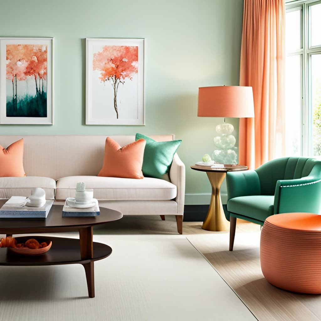
The synergy between peach and mint green creates a visually striking and refreshing atmosphere in any setting. While both colors possess soft, pastel-like qualities, their contrasting warm and cool undertones allow for a harmonious yet dynamic visual effect. Peach’s warm, comforting tone is perfectly balanced by mint green’s cool, refreshing vibe, resulting in a space that feels both lively and cozy at the same time.
The interaction between these two colors can also enhance each other, with peach adding warmth to mint green and vice versa, making it an excellent choice for creating a welcoming environment. This color combination lends itself well to various design styles, from vintage to modern. For instance, muted, dusty versions of peach and mint green can evoke a vintage look, while brighter, more saturated hues can create a modern aesthetic.
In terms of application, you could use peach as the primary color for walls and mint green as an accent color for furniture or accessories, or vice versa. Alternatively, you could employ both colors equally throughout the space to achieve a balanced look. Ultimately, the key to successfully incorporating this color combination is to strike the right balance between warm and cool tones.
Sky Blue

Combining peach and sky blue creates a unique atmosphere that is both calming and uplifting. The tranquil nature of sky blue can offset the warmth and vibrancy of peach, preventing it from becoming overwhelming. At the same time, the peach tone adds a touch of coziness and warmth to the coolness of sky blue, resulting in a harmonious balance. This color combination evokes the feeling of a beautiful summer day, with the sky blue giving the illusion of extra space and the peach adding comfort.
In terms of application, you can use sky blue as the dominant color on walls, with peach used for furniture, accessories or a feature wall to create an open and airy feel. Alternatively, you could apply these colors equally throughout the space to achieve a specific mood. The versatility of this color combination makes it suitable for various design styles and applications.
Charcoal Grey
Charcoal grey, a colour often described as sophisticated and striking, can create a harmonious balance when paired with the warmth of peach. This versatile shade can add depth and drama to a space without being overpowering like black, making it an excellent choice for creating a nuanced atmosphere. When combined with peach’s soft, warm tones, charcoal grey forms a contrasting yet harmonious duo that grounds the lightness of peach, preventing it from feeling too sweet or overly bright.
Meanwhile, peach’s warmth offsets the coolness of charcoal grey, introducing a touch of vibrancy to the overall palette. This colour combination exudes elegance and sophistication, with charcoal grey lending a sense of formality and seriousness, while peach adds playfulness and cheer. This balance makes it suitable for spaces where you want to strike a balance between professionalism and approachability.
In terms of application, charcoal grey can be used on larger surfaces like walls or furniture, with peach serving as an accent colour. Alternatively, peach could be the dominant colour, with charcoal grey used for accents and details. This flexibility makes the combination adaptable to various styles and settings.
Interestingly, according to Zillow paint colour analysis, rooms painted in dark gray hues such as charcoal can potentially increase a home’s selling price, indicating that this colour is not only aesthetically pleasing but may also add value to a property.
Coral

When combined, the bold and vibrant hue of coral and the soft, gentle tone of peach create a unique tropical color scheme that is both invigorating and soothing. Coral’s warmth and joy are tempered by peach’s subtlety, resulting in a harmonious palette that can evoke feelings of comfort and tranquility. This dynamic duo can transport a space to a lush paradise, reminiscent of a breathtaking sunset on the beach.
Whether used in interior design or applied to a tropical garden setting, the combination of coral and peach is sure to bring a touch of exotic beauty and joyfulness to any environment.
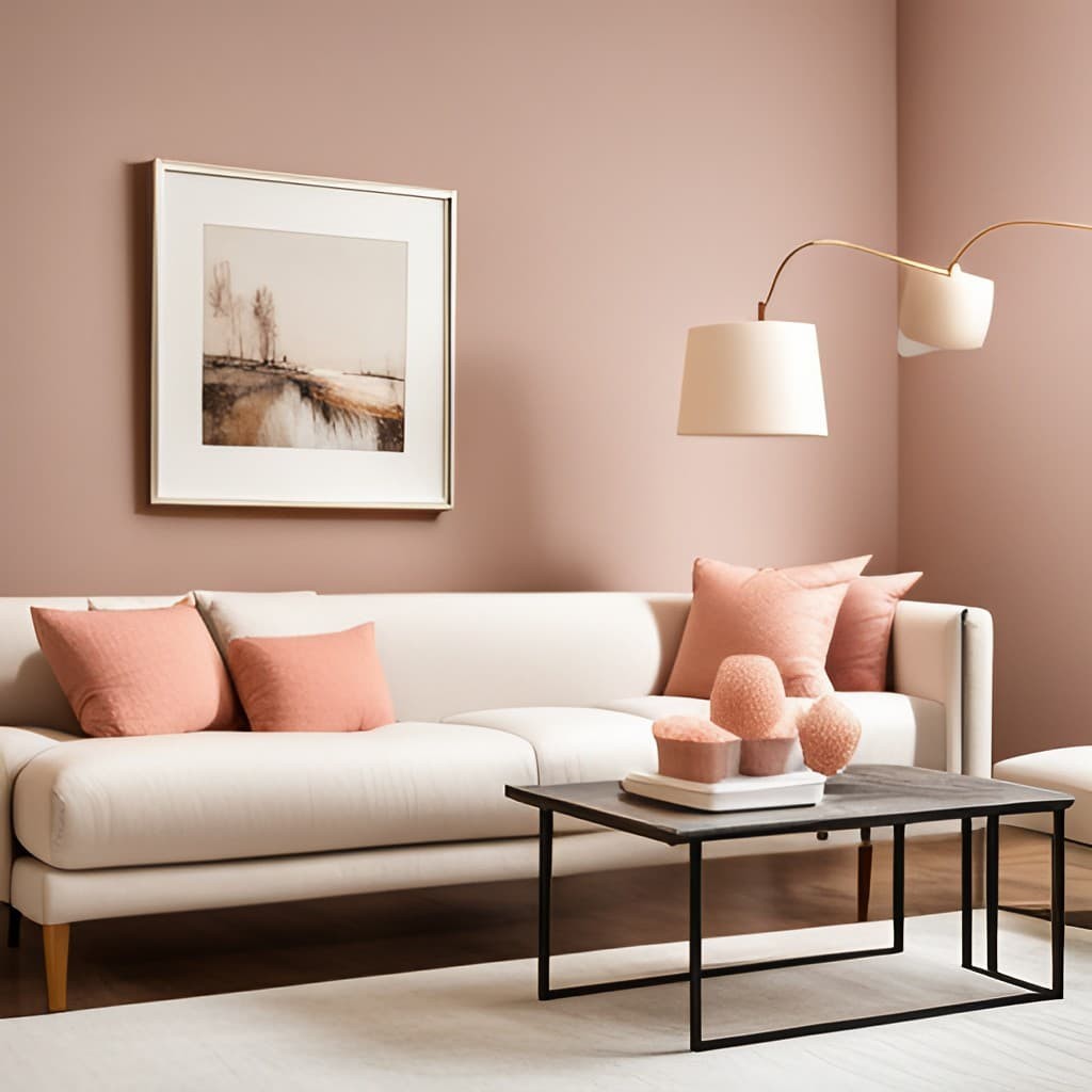
Cream
The pairing of cream and peach yields a nuanced and calming color scheme that exudes warmth, comfort, and refinement. Cream, with its soft yellowish-white hue, is often linked to serenity, relaxation, and sophistication. Its versatility allows it to introduce a touch of brightness and lightness to a space without being overpowering or harsh. Peach, on the other hand, is a warm and inviting color that can inject a sense of cheerfulness and vibrancy into a room.
While its brightness might suggest it’s overwhelming, peach is actually surprisingly soft and understated compared to other warm colors, making it an excellent companion for cream’s understated elegance. When combined, the subtlety of cream balances out the warmth and brightness of peach, producing a harmonious and well-balanced color palette.
The cream provides a neutral background that allows the peach to take center stage, while the peach adds a pop of color and life to the soothing cream backdrop. This color combination can evoke a sense of warmth, invitation, and comfort, reminiscent of a cozy cottage or a sunny beach house. It’s ideal for spaces where you want to create a relaxed and welcoming atmosphere, such as living rooms, bedrooms, or kitchens.
In terms of implementation, you could use cream as the primary color on walls, with peach serving as an accent color for furniture, accessories, or even a feature wall. Alternatively, you could apply these colors equally throughout the space, depending on the mood you want to cultivate.
Terracotta
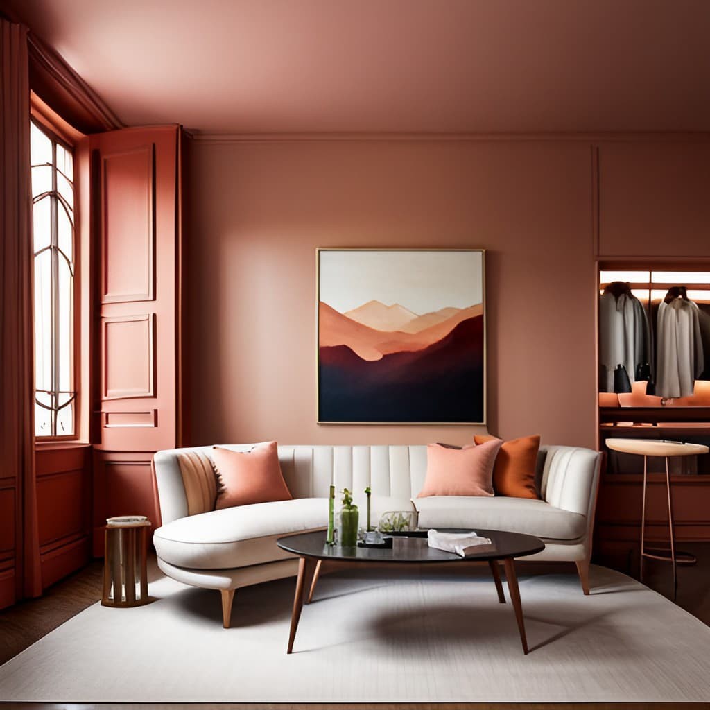
When it comes to creating a harmonious and inviting color scheme, the rich earthy tones of terracotta can beautifully complement the softer, lighter hues of peach. Terracotta’s robust warmth and natural feel evoke a sense of comfort, stability, and connection to nature, while peach’s brightness and charm bring a touch of cheerfulness and vitality to the space.
The combination of these two colors creates a warm and welcoming palette that is both soothing and vibrant, with the deeper terracotta tones adding depth and balance to the softer peach hues. This earthy pairing also has the ability to ground the lightness of peach, preventing it from feeling too sweet or overpowering, while simultaneously lightening the heaviness of terracotta with its softness and vibrancy.
In terms of application, this color combination can be applied in various ways – terracotta as a dominant color on larger surfaces, with peach serving as an accent, or vice versa. This flexibility makes the terracotta and peach pairing adaptable to diverse styles, from rustic to modern, traditional to bohemian.
Lavender

Imagine the enchanting fusion of lavender and peach, where soft purple hues mingle with warm orange tones. This captivating color combination embodies elegance, tranquility, and creativity, transporting you to a world of whimsy and romance. Lavender, with its subtle blue undertones, brings sophistication and serenity to any space, while peach injects a dose of cheerfulness and charm.
When paired together, the result is a harmonious balance of vibrant and soothing tones that evoke the magic of a sunset or a blooming flower garden. This captivating color palette can be applied in various ways to create an unforgettable atmosphere. For instance, it could be used in wedding design, with lavender blooms and peach table runners conjuring a sense of romance and wonder.
Similarly, in interior design, lavender walls and peach accents can transform a room into a dreamlike setting, perfect for relaxing or socializing.
Teal
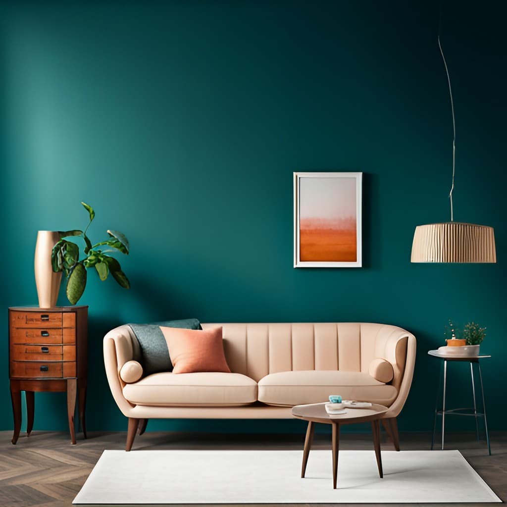
The fusion of teal and peach produces a vibrant and harmonious color scheme that is both striking and emotionally resonant. Teal, with its medium to dark greenish-blue hue, conveys depth, sophistication, and communication. It brings balance and stability to a space, making it feel grounded and calm. Peach, on the other hand, radiates warmth and cheerfulness, inviting a sense of brightness and life into a room without overpowering it.
When combined, these colors create a dynamic contrast that is both visually captivating and emotionally stimulating. This bold combination can energize a space while maintaining harmony and balance. The synergy between teal’s intensity and peach’s softness adds depth and sophistication to the color scheme, while also tempering the boldness with warmth and vibrancy.
This harmonious blend of colors lends itself well to various applications, such as interior design where teal walls and peach accents create a striking look or graphic design where teal and peach make a bold visual statement. Whether in fashion, art, or architecture, this color combination can add a touch of excitement and energy to any space.
Chocolate Brown

The harmonious union of chocolate brown and peach yields a warm, earthy ambiance that seamlessly blends coziness with sophistication. Chocolate brown, with its deep, rich undertones, is deeply rooted in nature, evoking feelings of comfort, security, and warmth. Its natural tone can anchor a room’s color scheme, providing a solid foundation for creative expression.
In contrast, peach radiates cheerfulness, freshness, and vitality, its soft, warm hues injecting brightness and energy into any space without overwhelming the senses. The complementary relationship between chocolate brown and peach results in a balanced palette that seamlessly blends their contrasting strengths. When combined, this color combination creates an inviting atmosphere that skillfully balances the robustness of chocolate brown with the lightheartedness of peach.
The pairing grounds the heaviness of the brown while elevating the freshness of peach, yielding a space that feels both grounded and vibrant. This earthy color scheme can be effectively applied across various settings to create a warm atmosphere. For instance, in interior design, chocolate brown can dominate larger surfaces like walls or furniture, with peach serving as an accent color for decorative elements or accessories.
This harmonious balance results in a space that exudes warmth, coziness, and inviting charm.
Sunflower Yellow

The synergy between sunflower yellow and peach yields a radiant, uplifting, and welcoming atmosphere that is hard to resist. Sunflower yellow, named after the iconic blooms of the sunflower, embodies boldness, energy, and creativity, capable of instantly boosting one’s mood and stimulating mental activity.
Peach, with its warm and soft undertones, exudes charm, warmth, and cheerfulness, making it an inviting hue that can add a dash of brightness and vitality to any space without being overpowering. When these two colors are combined, they create a visually stunning and emotionally uplifting color palette. The dynamic energy of sunflower yellow is expertly balanced by the softer tones of peach, producing a vibrant contrast that is both aesthetically pleasing and mood-enhancing.
This harmonious union can transform a space into a sunny, summer day-like atmosphere, replete with warmth, joy, and positivity. In terms of application, this color combination can be leveraged in various ways to create a radiant and uplifting ambiance. For instance, they could be used in interior design, with sunflower yellow walls and peach accents creating a lively and vibrant room.
Alternatively, they could be incorporated into event themes, such as a summer party or wedding, with sunflower yellow and peach decorations crafting a cheerful and festive atmosphere.
Rose Gold

The allure of rose gold is undeniable, particularly when paired with peach. This harmonious blend creates a palette that embodies sophistication, warmth, and luxury. The unique combination of red and gold hues in rose gold conveys opulence and warmth, making it a sought-after choice for high-end products and jewelry. In contrast, peach is a soft, warm color often associated with cheerfulness and charm.
Its gentle lightness adds a touch of freshness and vitality to any design or space, without being overwhelming. When brought together, rose gold and peach create a sumptuous and refined color palette. The elegance of rose gold complements the softness of peach, introducing an air of luxury and sophistication. Conversely, the brightness and vibrancy of peach can temper the heaviness of rose gold, injecting a sense of freshness and vitality.
This coveted combination is frequently seen in high-end fashion, design, and luxury branding, as well as in luxurious accessories and party decorations, such as balloon arch kits and exquisite jewelry pieces like 18K Rose Gold Peach Bandini Sunglasses and the Peach Sapphire Engagement Ring in Rose Gold.
Sage Green
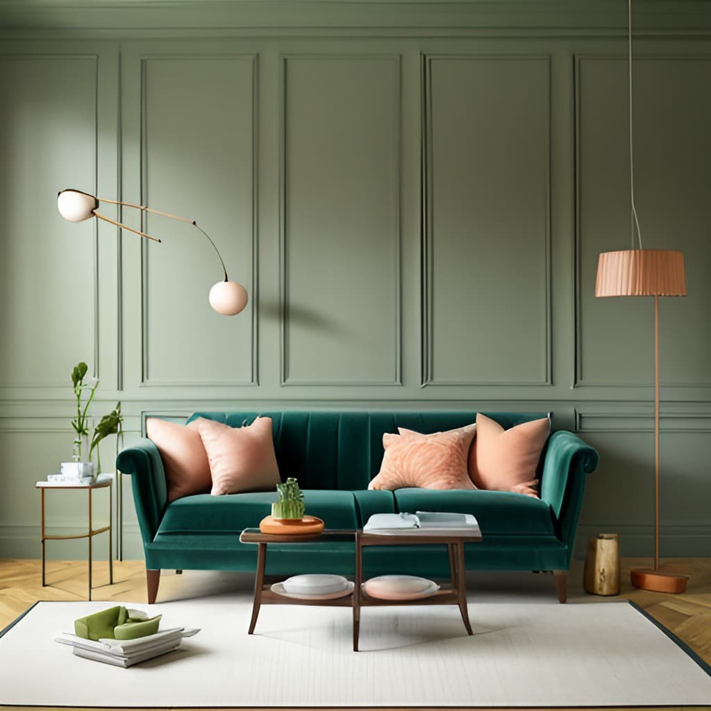
The harmonious union of sage green and peach yields a soothing atmosphere that calms the senses and lifts the spirit. Sage green, inspired by the healing herb, presents a muted, grey-toned green hue that embodies tranquility, balance, and nature. Its subtle earthiness fosters serenity and peace, making it an ideal choice for spaces where relaxation is paramount.
In contrast, peach radiates warmth, charm, and freshness, its gentle brightness adding a touch of vitality to any room without overpowering the senses. When these two colors converge, they craft a calming palette that balances the softness of sage green with the warmth of peach. This synergy can evoke feelings of comfort, tranquility, and rejuvenation, transforming any space into a serene oasis from the outside world.
This color combination is versatile, allowing it to be effectively applied in various settings. In interior design, for instance, sage green could adorn walls or furniture, while peach serves as an accent hue for decorative items or accessories. This harmonious blend creates a space that feels calm, inviting, and peaceful, perfect for unwinding and rejuvenating.
Navy Blue

The harmonious union of navy blue and peach creates an extraordinary visual experience. The depth and richness of navy blue, reminiscent of the midnight sky or deep sea, are expertly balanced by the warmth and softness of peach. This color combination effortlessly blends contrasting elements – coolness with warmth, boldness with subtlety, and vibrancy with depth – yielding a visually stunning palette that is both sophisticated and elegant.
Navy blue’s power, authority, and elegance can be harnessed to add luxury and refinement to any design or space, while peach’s charm, cheerfulness, and vitality inject freshness and brightness without overpowering. When paired together, the boldness of navy blue is tempered by the softness of peach, creating a harmonious blend that is pleasing to the eye. This color combination can be applied across various settings to establish an atmosphere of sophistication and elegance.
For instance, in fashion, a navy blue dress paired with peach accessories would yield a chic and stylish look, while in interior design, navy blue walls complemented by peach furniture or decor items would create a room that is both luxurious and inviting.
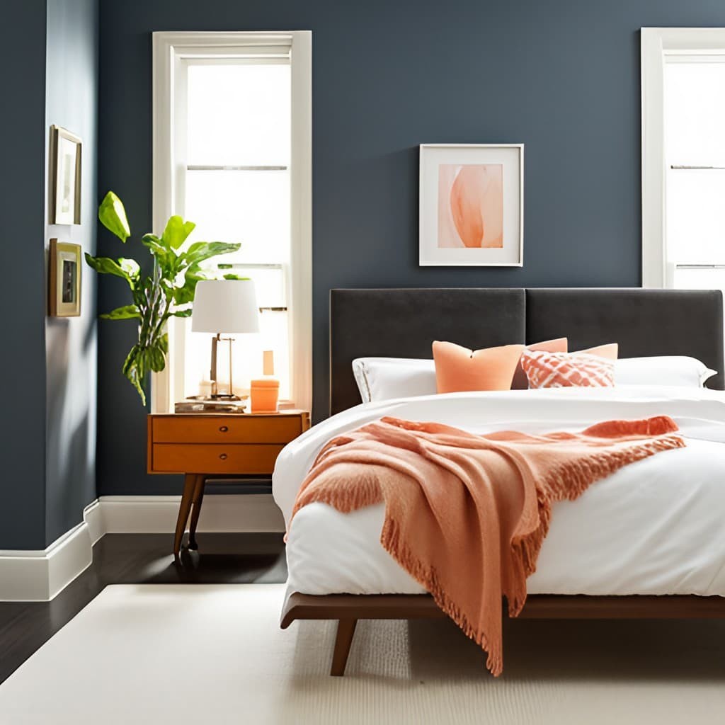
Blush Pink
The harmonious union of blush pink and peach yields a color palette that embodies softness, femininity, and warmth. This alluring combination radiates elegance, charm, and sophistication, making it an ideal choice for settings where tenderness and refinement are paramount. Blush pink, with its delicate hue, is often linked to femininity, romance, and nurturing qualities.
Its soothing essence can add a touch of poise and refinement to any design or space, while its warm undertones evoke feelings of comfort and serenity. In contrast, peach boasts a vibrant and cheerful personality, imbuing spaces with vitality and joy. When paired with blush pink, the warmth and brightness of peach temper the softness of the pink, creating a balanced and harmonious blend that exudes warmth, comfort, and romance.
This color combination can evoke emotions ranging from tenderness to passion, making it a popular choice for romantic occasions like weddings. In various settings, this palette can be applied to create a soft and feminine ambiance. For instance, in fashion, blush pink dresses could be paired with peach accessories for a stylish and alluring look.
Similarly, in interior design, blush pink walls could be complemented by peach furniture or decor items, resulting in a room that is both refined and inviting.
Conclusion
When it comes to color combinations in interior design, peach is a versatile hue that can be paired with a wide range of colors to create distinct atmospheres and styles. From elegant contrasts to playful duos, the right combination can evoke different feelings and set different moods. Here’s a rundown of 15 colors that pair well with peach: Navy blue creates an elegant contrast, balancing cool tones with warm ones. Blush pink pairs beautifully for a feminine, romantic vibe.
Sage green forms a natural and calming palette, evoking tranquility and comfort. White adds freshness and cleanliness, while gray brings sophistication and modernity. Mint green produces a refreshing and invigorating combination, perfect for lively spaces. Turquoise creates a bold and dynamic contrast, suitable for energetic and creative areas. Coral and peach form a warm, vibrant duo that exudes a tropical feel. Lavender complements peach perfectly for a delicate, dreamy atmosphere.
Teal’s jewel tone paired with peach creates a rich and sophisticated palette. Gold brings out the warmth and elegance of peach, forming a luxurious look. Chocolate brown creates a cozy, earthy combination perfect for comfortable spaces. Black adds depth and drama to peach, forming a striking contrast. Cream forms a soft, warm duo that exudes coziness. Emerald green and peach create a vibrant and luxurious palette, suitable for bold and dramatic spaces.
When experimenting with color combinations, remember that each one can evoke different feelings and set different moods. The key is finding the right balance and harmony between colors to enhance the beauty and comfort of your space. So don’t be afraid to mix and match, and let your creativity shine.
FAQs
What colors go well with peach in interior design?
When it comes to pairing colors with peach in interior design, you’re spoiled for choice.
From classic combinations to bold contrasts, the following hues can create stunning visual effects: navy blue’s dramatic flair, blush pink’s soft romance, sage green’s natural calm, white’s crisp cleanliness, gray’s sophisticated neutrality, mint green’s fresh vitality, turquoise’s playful whimsy, coral’s vibrant energy, lavender’s dreamy elegance, teal’s subtle sophistication, gold’s luxurious glamour, chocolate brown’s warm coziness, black’s dramatic intensity, cream’s soft subtlety, and emerald green’s lush opulence.
Can I use peach as a neutral color in my home?
Peach’s versatility and capacity to harmonize with numerous hues render it an excellent neutral option. This warm shade can effortlessly provide a calming foundation for a wide range of design components, fostering a sense of warmth and welcoming atmosphere.
How does lighting affect the appearance of peach paint?
The impact of lighting on peach paint colors cannot be overstated. In fact, the way a room is lit can completely transform the appearance of this warm and inviting hue. When it comes to peach-colored walls, natural light can amplify its inherent warmth, while artificial light may reveal subtleties that might not be immediately apparent in other settings.
To ensure you’re making the best possible choice, always test paint samples in various lighting conditions before committing to a specific shade.
Is peach a good color for a bedroom?
Peach’s soft, golden hue can effortlessly evoke a sense of serenity in a bedroom setting. As the colors blend together to create a cozy ambiance, it’s no wonder why peach is an increasingly popular choice for bedrooms. Its calming essence has a profound effect on our minds and bodies, making it an ideal shade for a space where we spend a significant amount of time unwinding and recharging.
Which metallic accents work best with peach?
The harmonious combination of gold, copper, and peach creates a sophisticated atmosphere in any room. The warm undertones of these elements – gold and copper’s rich hues and peach’s soft glow – blend seamlessly, introducing an air of refinement and opulence that can elevate the entire space.
Can peach be paired with cool colors?
While peaches are often associated with warm tones, they can also be stunningly paired with cooler hues such as blues and greens. This harmonious combination allows for a perfect balance between the warmth of peach and the calmness of blue or green, resulting in a visually appealing contrast.
What feelings does a peach color scheme evoke?
A peach-colored aesthetic radiates warmth, comfort, and jubilation, while also conveying a refined and cultured vibe. This inviting palette effortlessly captures the essence of coziness, making it an ideal choice for spaces that demand a sense of serenity.
How can I incorporate peach into my home decor?
While going all out with peach-painted walls may not be for everyone, there are still plenty of ways to bring this warm and inviting hue into your home. Incorporating peach-colored furniture, textiles, artwork, and accessories is a great way to add depth and character to a room. Even small pops of peach can make a big impact, creating a cozy and charming atmosphere that’s perfect for relaxing or entertaining.
Is peach a good color for small spaces?
Peach’s warm and inviting tone has a clever trick up its sleeve – it can successfully brighten up even the most compact areas, creating an optical illusion that makes them appear larger than they actually are. By reflecting light, this soft color plays a significant role in opening up small spaces, making them feel more airy and spacious.
What color wood furniture goes best with peach?
When it comes to pairing wood tones with a peach-inspired color scheme, subtle yet harmonious options can be found. Pine and oak woods, with their lighter hues, can create a soft and calming atmosphere that complements the warm tones of peach. On the other hand, darker woods like walnut or mahogany can add a dramatic flair, providing a striking contrast to the delicate peach shades.