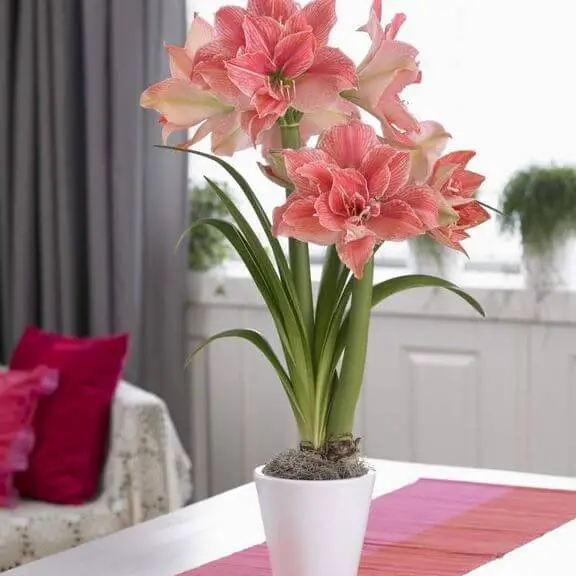
54 Colors That Go Perfectly With Green In Your Home Decor
Green is a versatile color that can be paired with a wide range of hues to create stunning visual effects in home decor. While it’s often associated with nature, its calming properties make it an excellent choice for any room. But what about the colors that complement green perfectly? In this article, we’ll delve into 54 unique color combinations that will help you achieve the perfect harmony in your home. From subtle neutrals to bold and bright shades, there’s something for everyone.
Whether you’re looking to revamp a single room or give your entire house a fresh new look, these color pairings are sure to inspire. So, let’s get started! Ash blue and green create a soothing atmosphere, while aubergine and green add a pop of elegance. Beige and green blend seamlessly together, while black and green provide a striking contrast. The possibilities are endless, and we’ll explore each combination in detail.
From bronze to yellow-orange, there’s no shortage of colors that look great with green. So, if you’re ready to give your home a makeover, let’s begin our journey through the world of color combinations.
Green Color Psychology.
The soothing presence of green evokes feelings of serenity, connecting us to the natural world, our well-being, and the promise of growth. This calming hue has the remarkable ability to alleviate stress, fostering a sense of tranquility and optimism. Beyond its peaceful properties, green is also an invigorating color that can revitalize energy levels and stimulate creativity.
In the realm of color psychology, green is often hailed as a beacon of hope, embodying the spirit of new beginnings, fresh starts, and continuous growth. As a harmonious and balanced color, it has the power to bring people together, fostering a sense of peace and unity.
Colors That Go Well With Green
Ash Blue and Green.

Ash Blue, a captivating shade with a distinctive purple undertone, brings an unparalleled level of vibrancy to any outfit. Its unique quality makes it an ideal hue for spring and summer ensembles, yet its versatility allows it to be worn throughout the year. If you’re seeking a way to inject some personality into your wardrobe, Ash Blue is an excellent choice. This bold color will undoubtedly help you stand out from the crowd, making it perfect for those who crave making a statement.
Aubergine and Green.
In harmony with nature, the combination of aubergine and green creates a visually stunning pairing. The former boasts a rich, deep purple hue, while the latter exudes a vibrant, fresh quality. This natural synergy translates seamlessly to the kitchen, where these two colors can be beautifully integrated into your culinary space.
Beige and Green.

Beige, a soft brown hue, owes its name to the French city of Beiges, once renowned for its tanneries. The first documented use of beige as a color term in English dates back to 1887.
As a neutral or light-colored background, beige can evoke a cozy and welcoming atmosphere. Its versatility also allows it to describe a light brown shade, making it an ideal choice for creating a natural and earthy ambiance.
When paired with green, beige proves to be a popular combination that brings forth a sense of serenity. By highlighting the green color, beige can add depth and visual interest to the overall design. However, it is crucial to consider the tones of both colors when used together. For instance, a light beige might not be as effective when paired with a dark green.
Black and Green.

In a world where colors are often used to evoke emotions and convey meaning, one hue stands out for its profound impact: black. This absence of visible light is the darkest color imaginable, an achromatic shade that defies the typical associations between hues and brightness. As the symbolic opposite of white, black represents darkness, death, mourning, power, fear, mystery, and evil in many cultures.
Yet, it’s precisely this stark contrast that makes black such a potent symbol, capable of commanding attention when paired with brighter colors like yellow or red. In its own right, black also harmonizes beautifully with darker tones like blue or purple, creating a sense of balance and equilibrium. Ultimately, the versatility of black as a color lies in its ability to represent both the unknown terrors that lurk in the shadows and the mysterious allure of the cosmos.
Black-Brown and Green.

When contemplating the intersection of black and brown, it’s common to perceive a complex blend of meanings. While black is often linked to darkness, evil, or negativity, brown typically evokes feelings of positivity, nature, and earthy tones. The fusion of these two colors can yield a nuanced interpretation, oscillating between dark yet positive, negative yet uplifting, or even mysterious and intriguing.
This dichotomy can also be seen as a representation of strength, power, sophistication, and class.
In design, the combination of black and brown can produce an elegant aesthetic or serve as a bold statement. Its versatility allows it to be employed in various ways, from subtle accents to striking focal points.
When seeking to infuse an outfit with refinement, consider pairing black-brown with green.
This harmonious union can evoke an earthy, natural ambiance perfect for everyday wear or outdoor activities.
Blue and Green.
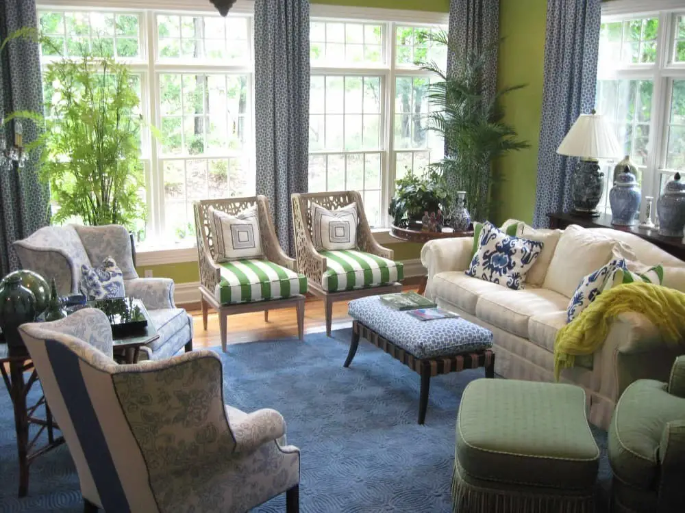
Blue, the colour of the sky and ocean, evokes feelings of serenity and tranquility. Associated with trust, loyalty, wisdom, confidence, and intelligence, blue is a powerful hue that can evoke strong emotions. In nature, blue and green are often found together, creating a harmonious balance that is both soothing and stimulating. As complementary colours, they can be used to create a bold visual statement or to induce a sense of calm.
The combination of blue and green can result in a range of effects, from the soft pastel tones of teal to the dramatic contrasts of a gradient effect. This colour combination has been used effectively in interior design, particularly in bedrooms and bathrooms, where its calming properties can create a peaceful atmosphere. By varying the proportions of blue and green or adding other colours to the mix, designers can create a wide range of unique and captivating looks.
Blush Pink and Green.
Blush pink, a captivating hue that evokes feelings of romance and femininity, is an excellent choice for various occasions. Its versatility makes it suitable for adding a touch of elegance to your wardrobe, home decor, or special events like baby showers, bridal showers, or outdoor springtime weddings.
When paired with green, blush pink creates a stunning color palette that’s perfect for feeling like royalty.
The light pink hue is incredibly flattering, and the green adds a beautiful contrast that can’t be wrong. This classic combination works equally well in a nursery, little girl’s room, or outdoor event.
For a more sophisticated look, combine blush pink with mint green for a girly yet elegant feel. Adding white creates a fresh and clean atmosphere, making it ideal for a nursery or child’s bedroom.
If you prefer something bolder, try pairing blush pink with kelly green.
This bright and cheerful combination is perfect for a playroom or sunroom.
For a calming and serene space, combine blush pink with sage green. Adding neutrals like beige or cream creates a warm and inviting atmosphere, making it suitable for a bedroom or bathroom.
Bronze and Green

Bronze brings an air of sophistication to home decor, effortlessly elevating any room’s aesthetic. Its versatility allows it to be used as a striking accent or the primary color, depending on the desired ambiance. When paired with green, a harmonious balance is struck, fostering a warm and inviting atmosphere that’s ideal for both lively gatherings and cozy retreats.
To achieve this perfect blend, it’s crucial to consider the mood you wish to evoke in your space – too much bronze can result in a somber atmosphere, while an overabundance of green might create a revitalized ambiance. By thoughtfully integrating these colors, you can craft a stunning and welcoming space that effortlessly becomes the heart of your home.
Brown and Green

Brown, a timeless color for home decor, exudes warmth and invites coziness into any room. Its versatility allows it to be used in various ways, from statement pieces to larger furniture items. However, it’s crucial to balance brown with other colors in the space, as excessive use can create a heavy, dreary atmosphere. When combining brown with green, two of the most popular home decor colors, the possibilities are endless.
A nature-inspired aesthetic can be achieved by incorporating earthy tones and natural materials. For instance, pairing a brown leather sofa with green throw pillows or using wood furniture alongside lush green plants can create a harmonious space. Alternatively, a more traditional look can be achieved by pairing dark green walls with brown furniture, resulting in a classic feel that’s still warm and inviting.
Burnt Orange and Green

Burnt orange is a versatile color that can bring warmth and coziness to any room when used thoughtfully. While it’s easy to get carried away with this vibrant hue, it’s essential to strike the right balance to avoid overwhelming the senses. A little goes a long way, as too much burnt orange can quickly make a space feel cluttered. That being said, burnt orange and green are an intriguing combination for creating a harmonious and stylish atmosphere.
By striking the perfect blend of these colors, you can craft a unique look that’s either bold and statement-making or subtle and understated. The key is to experiment with different ratios of burnt orange to green in various elements such as furniture, walls, accessories, and more. If you’re unsure where to begin, consider incorporating green as an accent color against burnt orange furniture or walls. You can also bring in green through smaller decorative items like vases, lamps, and rugs.
Alternatively, why not push the boundaries by combining different shades of orange and green, or even introduce other colors like yellow or red to create a truly one-of-a-kind space?
Burnt Red and Green

Burnt Red, a versatile color in home decor, offers endless possibilities to create various looks. It can serve as an accent or the main attraction, depending on your design vision. Moreover, it’s an excellent choice for crafting a warm and inviting atmosphere in your home. Complementary colors like Green and Burnt Red can be skillfully combined to add depth and visual interest. As primary and secondary colors, respectively, they provide a harmonious contrast that can elevate any room.
Consider pairing burnt red with lime green, perfect for kitchens or dining rooms, for a unique and captivating design.
Champagne and green
When it comes to home decor, color plays a significant role in creating a space that truly stands out. Champagne and green are two hues that, when combined, can evoke a sense of luxury and sophistication. To incorporate these colors into your own home, consider the following strategies:Start by adding an accent wall featuring champagne-colored paint or wallpaper. This will instantly introduce an air of elegance to any room.
Next, bring in some natural elements by incorporating plants or flowers with green tones. This will not only add a fresh and lively feel but also create a sense of serenity. To take things to the next level, consider combining both colors in your furniture and accessories. A champagne-colored sofa paired with green pillows would be nothing short of stunning in a living room. Alternatively, you could opt for a green vase filled with champagne-colored candles on your dining room table.
Finally, don’t forget to incorporate art that features both colors prominently. This will help tie the entire look together, creating a cohesive and visually appealing space that exudes refinement.
Chestnut Brown and green
Combining the warmth of chestnut brown with the freshness of green creates a harmonious and inviting atmosphere in home decor. These two popular colors can work together to craft a cozy space or stand alone to inject a burst of color into any room. Chestnut brown, with its rich, earthy undertones, adds depth and dimension to a space, complementing both light and dark hues. It’s a versatile color that can be used in various design styles.
Meanwhile, green brings a sense of nature indoors, promoting a feeling of calmness and serenity. When paired with chestnut brown, it creates a warm and inviting room that feels like an extension of the outdoors. Alternatively, green can shine on its own, adding a pop of color to any space.
Clay Red and green
When it comes to home decor, two colours stand out for their ability to evoke warmth and serenity: clay red and green. The former is a staple in Southwestern and rustic design schemes, imbuing spaces with a cozy and welcoming atmosphere. In contrast, green is often used in calming environments like bedrooms and bathrooms, symbolizing growth and renewal.
Interestingly, combining both colours can lead to the creation of a harmonious and inviting space that effortlessly balances warmth and relaxation.
Coffee Brown and green

In the realm of home decor, green and brown are two versatile colors that can be leveraged to evoke a sense of nature and organic charm. Brown, with its warm undertones, provides a cozy and inviting ambiance, while green’s cool tone brings a refreshing and calming essence. When harmoniously paired, these earthy hues can strike a perfect balance, resulting in a visually appealing space that exudes warmth and serenity.
Cool Beige and green
When it comes to creating a harmonious atmosphere in your home, the combination of beige and green is an excellent choice. Beige has a calming effect, whereas green brings a refreshing and natural touch. This dynamic duo can be used to create a cozy and inviting space that’s perfect for relaxing or entertaining. To incorporate beige and green into your decor, try the following: Use beige as the primary color and introduce green accents to add visual interest.
Experiment with different shades of beige and green to create depth and dimension. Add texture to the room by incorporating items like rugs, throws, or curtains that feature either color. By combining these elements, you can achieve a warm and welcoming ambiance that’s sure to become your new favorite spot.
Coral and green

When it comes to creating a statement in your home decor, the combination of coral and green is a winning formula. This refreshing and inviting duo can transform any room into a space that’s both lively and serene. Coral, with its vibrant tone, adds a pop of color that’s sure to grab attention, while green, with its calming essence, brings a sense of balance and harmony. As an accent color for green, coral is particularly effective in creating a natural and inviting atmosphere.
Similarly, green can be used as the primary color, with coral serving as a bold and eye-catching contrast. Whether you’re looking to create a lively or soothing ambiance, the union of coral and green is sure to deliver.
Crimson and green
Crimson and green can elevate the visual appeal of your home decor. For a striking and dramatic effect, opt for crimson, while green creates a sophisticated and understated ambiance. These two colors offer versatility in their applications, allowing you to use them as accent hues or as the primary color scheme for a room. Here are some creative ways to incorporate crimson and green into your home design: Paint one wall in each color to create a bold and striking visual display.
Combine green curtains or drapes with crimson walls for a harmonious and dramatic look. Pair green rugs or carpets with crimson furniture for a unique and eye-catching combination. Use green and crimson pillows, throws, or paintings as decorative accents to add depth and personality to your space. Incorporate these colors into your holiday decorating scheme – crimson and green are perfect for Christmas or Valentine’s Day.
Daffodil Yellow and green
Transforming your home decor with the vibrant duo of daffodil yellow and green is an excellent idea. This sunny combination offers numerous opportunities to infuse your living space with energy and warmth. To get started, consider using daffodil yellow as a statement accent color or incorporating it throughout your home for a cheerful ambiance. Green, its perfect complement, brings visual interest and depth when paired with the bright yellow.
Whether you’re looking to add a splash of color or create a cohesive look, here are some creative ways to incorporate daffodil yellow and green into your decor. Paint: Use daffodil yellow as a bold accent wall or go all out with a fully painted room for an instant mood booster. Wallpaper: Add visual appeal by applying patterned wallpaper featuring the harmonious duo. The possibilities range from subtle texture to bold patterns, ensuring there’s something to suit every taste.
Fabric: Inject warmth and style into your home with daffodil yellow and green fabrics. Apply them to window treatments, upholstery, or create one-of-a-kind pillows and curtains. Flooring: Brighten up your floors with the uplifting combination of daffodil yellow and green flooring options. Whether you opt for tile, wood, or another material, this duo is sure to bring a smile to your face.
Dark Khaki and green
The current trend in home decor features a stunning combination of dark khaki and green hues. This palette can be achieved by pairing the earthy tones with green accents or vice versa, resulting in a harmonious blend. The versatility of dark khaki as a wall color lies in its ability to complement any style of furniture or decor while still exuding warmth and coziness. As a perfect complement, green brings a refreshing and natural ambiance to the space.
To add depth and visual appeal, it’s essential to incorporate various shades of green in your design, creating a sense of layering and texture.
Dusty pink and green
Combining dusty pink and green can add a touch of sophistication or playfulness to any space, depending on how you use them. This classic color combination can be incorporated into various elements, such as wallpaper, upholstery, or accessories. The key is to decide what tone you want to convey: a refined atmosphere can be achieved by pairing dusty pink with deeper greens like hunter or olive, while a softer, more feminine feel results from combining it with minty green hues.
For a truly unique look, experiment with different shades of pink and green for a bold and quirky vibe. Regardless of how you choose to use them, dusty pink and green is sure to make a striking impression in any room.
Gold and green
When blending the luxurious connotations of gold with the natural charm of green, you can create a sophisticated yet inviting space. This harmonious combination allows for a versatile design approach, enabling you to add a touch of elegance through accent pieces like lamps or vases, or make a bold statement by incorporating gilded walls or furniture.
Alternatively, you can introduce green accents against a gold backdrop or use gold as an accent color against a predominantly green setting, achieving a subtle yet effective visual balance.
Gray and green
Gray and green, the ultimate dynamic duo in home decor. Their widespread popularity is no coincidence – these colors possess a unique ability to evoke feelings of calmness and serenity. In fact, combining them can create an atmosphere that’s both soothing and stylish. One of the key reasons gray and green are favored is their capacity to promote relaxation. Imagine walking into a room that exudes tranquility – it’s no wonder these hues are sought after for their calming effects.
Moreover, their harmonious combination can lead to the creation of a peaceful sanctuary in your home. So, how do you incorporate this winning duo into your space? You have several options at your disposal. For starters, introduce small touches like throw pillows or area rugs that feature gray and green. Alternatively, make a statement with a bold paint color or a piece of furniture that incorporates these colors.
Whichever approach you choose, the result is bound to be a harmonious haven that reflects your personal style.
Lavender and green
The calming effects of lavender make it a popular choice for home decor. This soothing hue is said to promote relaxation and peace, creating a serene atmosphere in any room. Whether you’re looking to add a touch of tranquility or create a sense of calm, lavender is an excellent option. You can incorporate this calming color through paint, wallpaper, scented candles, diffusers, or potpourri. For the ultimate experience, why not take it to the next level by growing your own lavender plants?
Lemon Yellow and green
When it comes to creating a warm and inviting atmosphere in your home, combining the colors green and yellow can be a winning combination. Green is often associated with nature, while yellow is known for its cheerful and happy vibes. When brought together, these two colors can evoke feelings of warmth and coziness. There are many ways to incorporate green and yellow into your decor, from bold statements to subtle touches.
Start by thinking outside the box and using wallpaper or fabric with a green and yellow design to create an accent wall. Alternatively, you could paint one wall in each room lemon yellow and use a light green for the others. Add some personality to any room with green and yellow accessories like throw pillows, rugs, or vases. Hang curtains in the living room or bedroom featuring these colors for a pop of color.
You can also incorporate fresh flowers into your decor by displaying them in a green vase with yellow accents. For a more functional touch, use green and yellow dishes in the kitchen or dining room. And why not bring this look to life outside of your home too? Add a touch of lemon yellow to any outfit with accessories like a scarf or belt.
Maroon and green
Green and maroon form a stunning combination in home decor, where the deep, rich tone of maroon adds sophistication and elegance, while the fresh, vibrant hue of green injects energy and vitality. The synergy between these two colors creates a warm, inviting atmosphere that is both stylish and welcoming.
To achieve this harmonious blend, consider the following strategies: Painting one wall in a bold green and the remaining surfaces in a rich maroon can produce an exceptional space for entertaining or unwinding. Introduce green accents throughout a room to add bursts of color and vibrancy – a green vase, throw pillow, or piece of art can significantly brighten up a space.
Alternatively, hang maroon curtains or place a rug with this deep red hue in a room featuring green walls, which will help ground the area and make it feel cozier. Finally, balance the two colors equally throughout a room to achieve a harmonious, visually appealing effect.
Mauve and green
When combining mauve and green in home decor, it’s essential to strike the right balance between these two colours. Mauve brings a sense of depth and richness, while green injects freshness and vibrancy. By following some simple tips, you can create a space that is both stylish and inviting.
Begin by establishing a neutral foundation. White walls or cream-coloured furniture provide a clean canvas for the mauve to take centre stage.
Next, introduce green as an accent colour, placing it thoughtfully throughout the room to add pops of freshness.
For a more sophisticated look, opt for a monochromatic scheme that combines different shades of mauve and green. This will create a harmonious space that exudes elegance.
Finally, don’t forget to incorporate texture into your design.
Mixing velvety softness with the roughness of linen or the smoothness of silk adds visual interest and depth to the room, making it feel more inviting.
Muted Orange and green
Incorporating muted orange and green into your home decor requires striking a balance between the two hues. Overusing either color can lead to a space that feels chaotic or visually overwhelming. To achieve harmony, use each color judiciously and in distinct areas of the room. Muted orange, with its warm undertones, is well-suited for walls, as it can create a cozy atmosphere. Meanwhile, green’s calming essence makes it an excellent choice for accent pieces like throw pillows or rugs.
The neutrality of both colors allows them to be easily paired with other hues if you desire to introduce a pop of color into your space.
Nantucket Red and green in home decor.
As the holiday season approaches, many people turn to the vibrant color of Nantucket Red to bring warmth and cheer to their homes. This rich, deep red hue is infused with subtle green undertones, making it an ideal choice for injecting a festive touch into any room. The classic combination of Nantucket Red and green also nods to the traditional colors associated with Christmas, making it a popular pick for holiday decorations.
Whether you’re looking to add a bold splash of color or simply want to give your space a seasonal refresh, incorporating Nantucket Red into your decorating scheme is sure to spread some joy.
Navy Blue and green
The combination of navy blue and green in home decor is a timeless classic, evoking a sense of nautical adventure or traditional elegance. This versatile color palette can be tailored to suit various styles, from coastal chic to formal sophistication. The rich, dark tone of navy blue provides a striking backdrop for the fresh, natural hue of green, resulting in a harmonious balance that enhances any room’s aesthetic.
Orange and green.
The vibrant hue of orange is derived from its composition of yellow and red pigments. Its name originates from the fruit, which shares the same radiant tone. Orange is an extremely well-liked colour, particularly during the autumn and winter seasons when it’s often linked to feelings of joy and optimism. When paired with green, orange produces a lively and energetic effect that can elevate any space.
This harmonious combination is ideal for decking out your home for special occasions or adding a burst of colour to an area of your dwelling.
Pale Lilac and green
For spring and summer events, this color scheme is a timeless favorite. Its versatility makes it suitable for various celebrations, including weddings, birthday parties, and baby showers. The soft, airy tones evoke the feeling of a warm day, making them ideal for outdoor gatherings. The pale lilac hue mirrors the sky’s gentle blue, while the green represents the lush grass. This refreshing combination radiates cheerfulness and joy, making it a perfect choice for any spring or summer event.
Pale Yellow and green
For those seeking a warm and inviting hue with a subtle green undertone, this versatile option delivers. Whether you’re decorating a living space, bedroom, or office, this pale yellow shade is sure to bring a sense of calm and serenity. The best part? You can mix and match different textures and colors to create the ideal tone for your specific project – ensuring a harmonious and cohesive look that reflects your personal style.
Peach and green.
When it comes to adding a pop of color to your home decor, the harmonious pairing of peach and green is an excellent choice. This visually appealing combination has the ability to evoke a sense of warmth and welcome, making it perfect for creating a cozy and inviting atmosphere in any room.
Pewter and green
Pewter, a timeless metal alloy, has been cherished for centuries to craft exquisite objects. Its enduring popularity stems from its distinctive appearance and remarkable durability. When incorporating pewter into your decor, it’s essential to consider the metal’s versatile color palette, which spans from light silver to dark gray. This range of hues necessitates selecting a harmonious color scheme that complements pewter’s unique tones.
Green is an excellent choice for a pewter-inspired color palette, as it offers a soothing and stylish combination. Olive green, mint, and other shades can be seamlessly integrated into the design. To create visual cohesion, choose two or three green hues and apply them consistently throughout the room in various ways. For instance, paint the walls mint green and incorporate olive green accents through furniture and decor.
For an added splash of color, consider incorporating brighter greens like lime or Kelly green. These vibrant shades will dramatically accentuate pewter’s presence and infuse the space with a lively, fresh atmosphere. To balance the boldness of these colors, incorporate more subdued shades like forest green or sage.
Pink and green
To build upon the existing harmony of pink and green hues, consider incorporating lighter or pastel shades to create a softer, more calming atmosphere. A fusion of pale pink and minty green would produce a charming and rejuvenating palette. Alternatively, opt for dusty rose pink paired with olive green for a timeless, vintage-inspired aesthetic. For a bolder approach, why not combine hot pink with neon green for a vibrant and eye-catching visual?
Purple and green
When crafting a colour palette for your home, the options seem limitless. However, if you’re seeking a one-of-a-kind and captivating combination, purple and green is an unbeatable duo. This harmonious pair can be used in various ways to create a stylish and inviting atmosphere. For those unsure where to begin, here are some creative ideas for incorporating a purple and green palette into your space:Start by combining bold shades of purple and green to make a striking statement.
Alternatively, balance the duo with neutral tones like white or gray to achieve a more subtle look. Create a gradient effect by layering different hues of purple and green. Use both colours to add visual interest to accessories and decorative items. Finally, incorporate purple and green accents to enhance other colours in your space.
Raspberry and green
Bringing the outdoors in by incorporating fresh or artificial raspberries into your home decor is a fantastic way to add a burst of color and whimsy. Here’s how you can incorporate raspberries into your design:
Incorporate them into a floral arrangement. Combine raspberries with some simple greens for a stunning and effortless centerpiece that will be the focal point of any room.
Create a show-stopping garland by threading fresh or faux raspberries onto green twine or ribbon, perfect for adding a pop of color to your mantel, staircase, or dining table.
Use them as a sweet and creative way to decorate cakes, cupcakes, or other treats. Top off a special dessert with some fresh raspberries for a visually appealing and scrumptious garnish that’s sure to impress.
Red and green
As the iconic colors of Christmas, red and green pair perfectly in home decor. This classic combination can be effortlessly incorporated into any room, instantly imbuing it with a festive ambiance. The living room is an ideal space to bring this palette to life, where warm and inviting tones can be created by combining greenery and vibrant red accents. A statement piece like a green sofa paired with bold red throw pillows is a simple yet effective way to introduce these colors into your decor.
Royal blue and green
Elevate the ambiance of your home with the majestic charm of royal blue and green. These opulent hues can effortlessly transform any space into a luxurious oasis. Begin by setting the tone with a bold wall color or striking wallpaper featuring a harmonious blend of blue and green. From there, infuse the room with an abundance of regal accents through carefully curated window treatments, plush furniture upholstery, and sumptuous bedding.
To further enhance the atmosphere, incorporate statement accessories such as vases, lamps, and pillows in these majestic colors, allowing their richness to permeate every corner of the room.
Sky blue and green
To create a calming and serene atmosphere in your home decor, consider incorporating a sky blue and green color palette. This harmonious combination can be seamlessly integrated into any room of the house, from the cozy living room to the peaceful bedroom. One way to achieve this is by painting the walls a soothing sky blue hue, while adding pops of green through furniture, accessories, or accents.
Additionally, you can incorporate these colors into your fabrics, such as curtains, rugs, and bedding, to create a cohesive look that promotes relaxation and tranquility.
Slate blue and green
When it comes to home decor, the slate blue and green color palette is a timeless favorite. Its versatility allows for a range of styles, from classic to contemporary. To achieve different looks, consider these tips:
To create a traditional ambiance, make slate blue the primary hue and use green as an accent. This can be achieved by painting the walls a soothing slate blue and incorporating green accents through throw pillows or area rugs.
For a modern twist, flip the script and make green the dominant color, using slate blue as a striking accent. To bring this look to life, paint the walls a vibrant green and add pops of slate blue via lamps, art pieces, or other decorative elements.
Soft Blue-Gray and green
Infusing your home with soft blue-gray or muted green hues can effortlessly evoke a sense of calmness and tranquility. These soothing colors are ideally suited for bedrooms, living rooms, and other areas where you seek relaxation and unwinding. Furthermore, incorporating natural elements like greenery, such as potted plants, can significantly enhance the serenity of the space, creating a harmonious balance between your environment and well-being.
Tangerine and green
Combining tangerine and green in home decor creates a visually appealing combination that can add depth and interest to any space. Tangerine’s warm undertones bring energy and vibrancy, while green’s cool tones introduce a sense of calmness. This harmonious pairing can be used to create a unique aesthetic that draws the eye. To incorporate tangerine into your home decor, consider using it as an accent color in small doses, such as throw pillows or artwork, to add a pop of color.
Alternatively, you can use tangerine more extensively, like in wallpaper or upholstery, for a bolder and more impactful look. Green, on the other hand, is a versatile color that can be used in various ways to create different moods and atmospheres. It can serve as an accent color, adding a touch of serenity, or it can be used more extensively to establish a calming and relaxing ambiance.
Taupe and green
Taupe and green, two harmonious colors in home decor, can be used together to create a cozy atmosphere. The earthy tone of taupe provides a neutral base, while the cool tone of green adds a pop of freshness. This combination works particularly well as it creates a sense of balance between warm and cool temperatures. This color palette is versatile and can be applied to any room in the house, but it’s especially popular in living rooms and bedrooms.
Taupe walls with green accents can create a peaceful ambiance, while green walls with taupe accents can bring nature indoors. To incorporate taupe and green into your home decor, you can paint your walls taupe and add green accents through throw pillows, curtains, or rugs. Alternatively, you could opt for a bold look by painting your walls green and using taupe as an accent color. Ultimately, the possibilities are endless, allowing you to create a unique space that reflects your personal style.
Teal and green

In the world of home decor, few color combinations are as popular or versatile as teal and green. These two hues can be blended together to craft a wide range of styles, from timeless traditional to cutting-edge modern. The key to successfully pairing teal and green lies in selecting the perfect shades that work harmoniously together. Teal, for instance, can transition seamlessly from a soft blue-green to a rich navy, while green can morph from a delicate pastel to a deep forest tone.
By thoughtfully combining these different shades, you can create a look that is at once stylish and inviting.
Terra Cotta and green
Combining green and terra cotta hues in a single space can yield a harmonious and captivating environment. The earthy warmth of terra cotta brings a sense of sophistication and refinement, while the fresh vitality of green injects a sense of energy and vibrancy. When blended together, these two colors create a unique equilibrium that is both aesthetically pleasing and emotionally inviting.
Turquoise and green
Struggling to find the perfect color palette for your home? Look no further! A harmonious blend of turquoise and green can bring warmth, energy, and serenity to any room. Turquoise, with its vibrant blue-green hue, adds a delightful pop of color that’s sure to grab attention. Pair it with soothing shades of green, ranging from soft sage to rich emerald, to create a space that exudes calmness and welcome.
This striking combination is perfect for those seeking a unique and inviting atmosphere in their home.
Warm Beigh and green
When it comes to home decor, warm beige and green are two of the most popular color combinations. The warm, inviting tone of beige can create a cozy atmosphere in any room, while the calming effect of green can bring a sense of serenity. Together, these colors can craft a beautiful and relaxing space that’s perfect for unwinding. One way to incorporate these colors into your decor is to use them as a backdrop and accent combination.
For instance, you could paint your walls a warm beige hue and then add pops of green through throw pillows, rugs, or curtains. Alternatively, you could choose beige furniture with green accents through cushions, lamps, or vases. The possibilities are endless! You could also create a statement wall in beige and then add some greenery, such as plants or artwork, to bring the look together. Another way to combine these colors is through your bedding.
Choose a beige comforter with green accents, or vice versa, to add a touch of warmth and calmness to your bedroom.
Warm Gray and green
Warm gray’s versatility makes it an excellent choice to serve as either an accent color or the foundation upon which other hues are built. Its neutral tone allows it to harmonize effortlessly with a wide range of colors, yet its subtle nuance creates a unique synergy when paired with green, resulting in a visually pleasing combination.
White and green
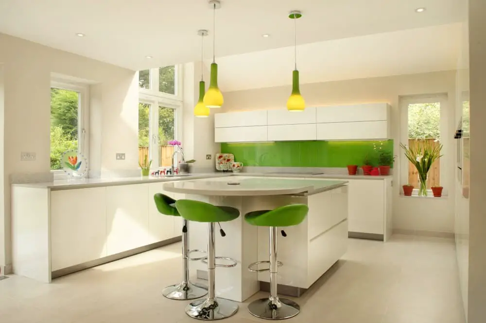
The white and green color palette offers a timeless appeal in home decor, exuding freshness and versatility. Its adaptability allows it to be used in diverse ways, resulting in distinct aesthetic approaches.
To evoke a traditional ambiance, combine white with green accents. This can be achieved through the incorporation of greenery like plants or floral arrangements, green-hued paint or wallpaper, or even fabrics featuring this calming color.
In contrast, for a modern look, utilize white as the primary hue and intersperse it with pops of green throughout the space. This can be accomplished by adding green accessories, furniture pieces, or artwork.
Regardless of your personal style, the white and green color palette is an excellent choice for any home, providing a versatile foundation to build upon.
Wood and green
Wood and green are the ultimate home decor power couple. When combined, they have the ability to transform a space into a cozy retreat or a modern masterpiece, depending on the style you’re going for. Wood, with its natural warmth, can be used as an accent color in a room dominated by green, bringing a touch of organic charm.
Green, on the other hand, is incredibly versatile – it can range from bold and energizing to soft and soothing, making it easy to find the perfect shade to suit your mood or decor.
Yellow and green
Yellow and green are a dynamic duo when it comes to home decor, offering a versatile palette for creating distinct looks. By combining these vibrant hues, you can craft spaces that range from modern and bold to classic and soothing. When used in harmony, yellow and green can produce a cheerful atmosphere that’s perfect for lively gatherings or quiet moments of repose.
The calming essence of green, often tied to nature’s serenity, pairs beautifully with the warm, sunny disposition of yellow, yielding a space that is at once inviting and peaceful.
Yellow-Orange and green
The realm of home decor is often characterized by two distinct yet harmonious color palettes: yellow-orange and green. These versatile hues can effortlessly evoke a range of atmospheres, from vibrant and lively to soothing and calming, making them a popular choice for many interior design enthusiasts.
What colors don’t go with green?
While some may assume that colors like pink and purple clash with green, the truth is that it ultimately depends on the specific shade of green in question. For instance, when working with a light green, pairing it with a soft pastel pink can create a charming combination. Conversely, darker greens can be beautifully complemented by deep purples, resulting in a sophisticated and refined aesthetic.
Conclusion
When analyzing the compatibility of colors with green, it becomes clear that many hues pair harmoniously with this versatile and calming color. Green’s adaptability allows it to be successfully matched with a range of other colors, creating visually appealing combinations. Moreover, its soothing nature makes it an excellent choice for color schemes designed to promote relaxation and serenity. Ultimately, pairing colors with green yields a winning combination that is hard to beat.