What Color Is Pewter? (25 Colors Go With Pewter In Home Decor)
Pewter, a unique and versatile color, can add a touch of sophistication to any home’s interior or exterior. While some may opt for neutral tones or bold statements, those who dare to be different will appreciate the subtle charm of pewter. In this article, we’ll delve into the world of pewter, exploring its nuances and pairing it with 25 colors that complement its distinctive tone. Whether you’re a fan of creamy whites or rich jewel-tones, we’ve got you covered.
From classic combinations to bold statements, discover how to make pewter shine in your home.
What color is Pewter?
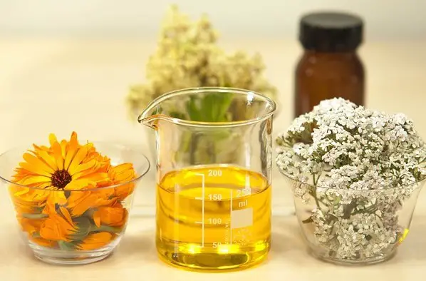
Pewter’s unique charm lies in its harmonious blend of warmth and coolness, much like the color gray. Defined in dictionaries as a gray alloy infused with tin, antimony, and copper, pewter’s definition transcends just its visual appeal. When used as a metal, it often masquerades as silver, boasting a distinct blue undertone. One notable difference between the two is that pewter develops an attractive patina over time, while silver remains relatively unchanged.
This unique aging process has earned pewter pieces a timeless beauty. Today, the term ‘pewter’ extends beyond its metallic connotations, encompassing gray-blue hues in fabrics, wallpapers, and paints.
What color is pewter fabric?
Pewter fabric is characterized by its versatility in terms of color palette. While it can appear as various shades of gray, it often has a silver undertone that may be accompanied by subtle greenish and blue hues. Overall, the defining characteristic of pewter fabric is its silvery gray tone, which serves as the foundation for its many variations.
What color is pewter brown?
The pewter brown variant, also known as creamy brown, boasts a soft and inviting hue reminiscent of vanilla and subtle hints of copper. This versatile shade excels when paired with earthy tones such as beige and cream, making it an excellent option for harmonizing these colors in a design or decorative scheme.
What is an antique pewter color?
Pewter’s versatility shines through its diverse range, featuring both warm and cool tones. One notable variant is antique pewter, which presents a weathered silver appearance infused with subtle nuances of black and light gray. This unique hue is particularly well-suited for rustic and farmhouse designs, effortlessly complementing antique hardware to create a cohesive aesthetic.
Pewter color meaning
Pewter’s rich history and diverse palette are just the beginning of its significance. The metal’s unique blend of tin and subtle blue-gray tones imbues it with a profound symbolism. When paired with warm or cool shades, pewter appears balanced and neutral, conveying seriousness and depth. This unconventional yet practical color is also linked to feelings of responsibility and maturity.
In the realm of color psychology, pewter is closely tied to the symbolism of gray, suggesting commitment, intellect, sophistication, introversion, and a hint of bitterness. These complex associations underscore pewter’s unique ability to convey subtle nuances in its meaning, making it a compelling choice for artists, designers, and anyone seeking to add depth and complexity to their work.
25 Colors That Go With Pewter in Home Décor
When selecting colors to pair with pewter home decor, it’s essential to find harmonious combinations that enhance the metallic tone. Without further delay, here are some standout colors that beautifully complement pewter:
Creamy white
Pewter, an unconventional color, finds a harmonious match in this versatile hue due to shared brownish undertones and coppery hints. Their coexistence is characterized by a balanced blend of warm overtones and cooler undertones, resulting in a visually appealing combination that effortlessly pairs the two colors.
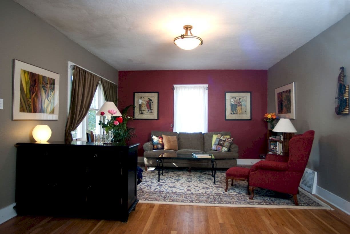
Burgundy
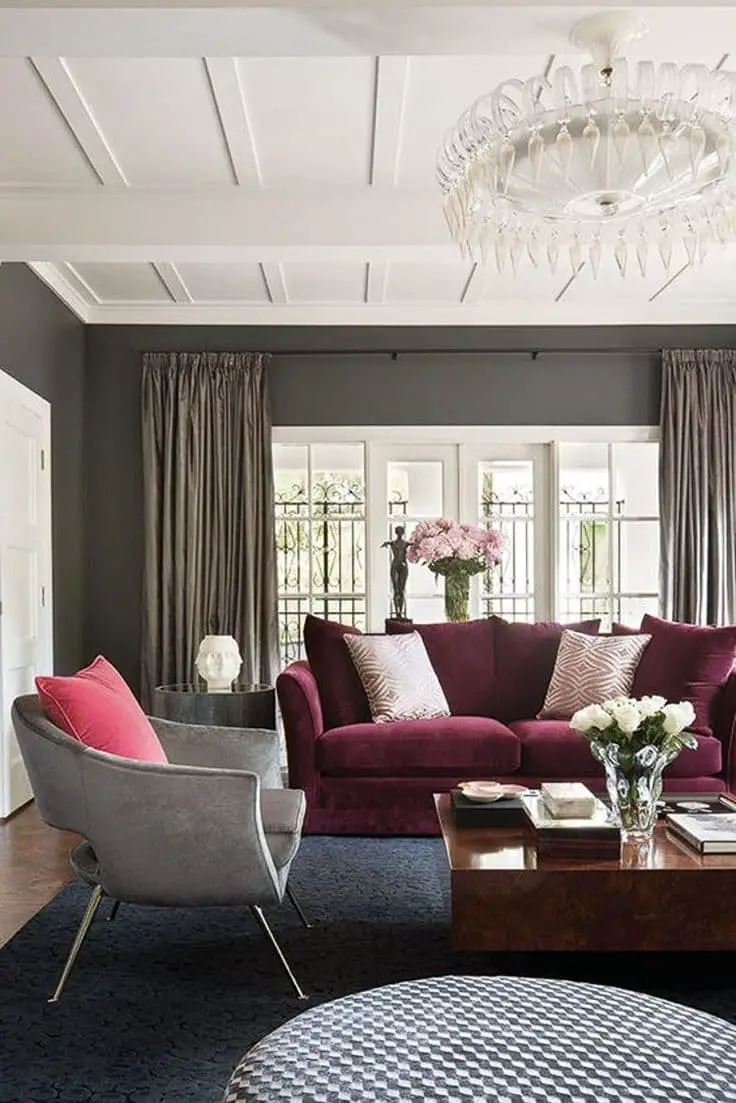
For those seeking a versatile red shade, burgundy stands out as an excellent option. Its warm undertones create a harmonious pairing with the creamy hints found in pewter, allowing it to accentuate this characteristic effectively. Additionally, both colors sharing warm temperature properties results in a rich depth that can elevate any space.
Turquoise
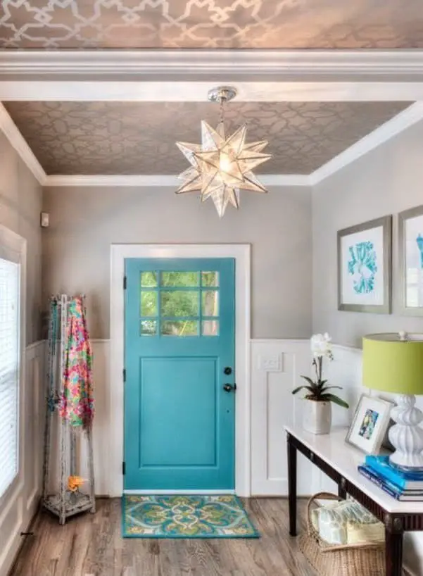
When considering pairing options with pewter, this calming shade stands out as an excellent choice for home decor. Its serene quality makes it a natural complement to the more understated pewter. For those seeking alternatives, bold options like aquamarine or deeper hues of teal might also provide a striking contrast.
Gold
The harmonious union of gold and pewter in home decor is nothing short of breathtaking. Initial concerns that this pairing may be too bold are quickly dispelled by the subtle nuances of certain pewter variants, which cleverly incorporate shrapnel and alloy undertones to create an opulent and visually striking combination.
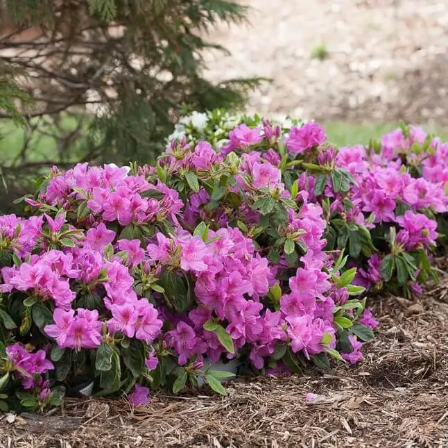
Coral
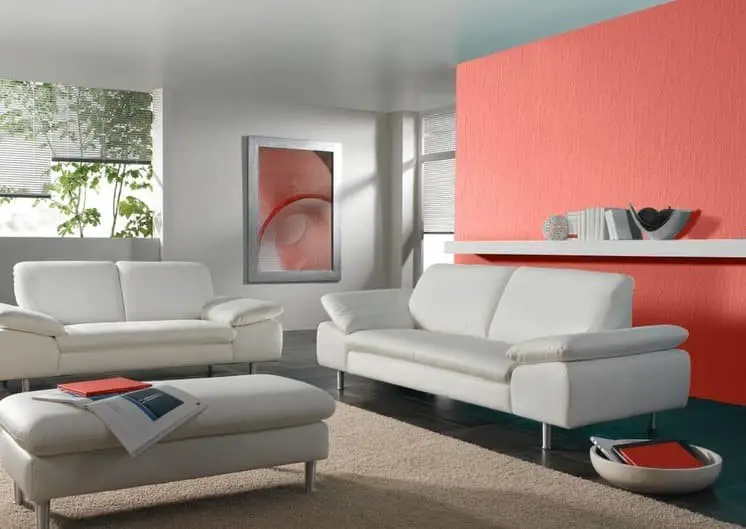
When it comes to pairing colors with pewter, one of the most challenging yet rewarding options is coral. The vibrant, bold quality of coral provides a stunning contrast to the subtler hue of creamy pewter, creating a unique and harmonious combination. This pairing also offers an alternative to cooler colors like turquoise, which would result in a truly phenomenal aesthetic.
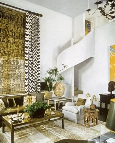
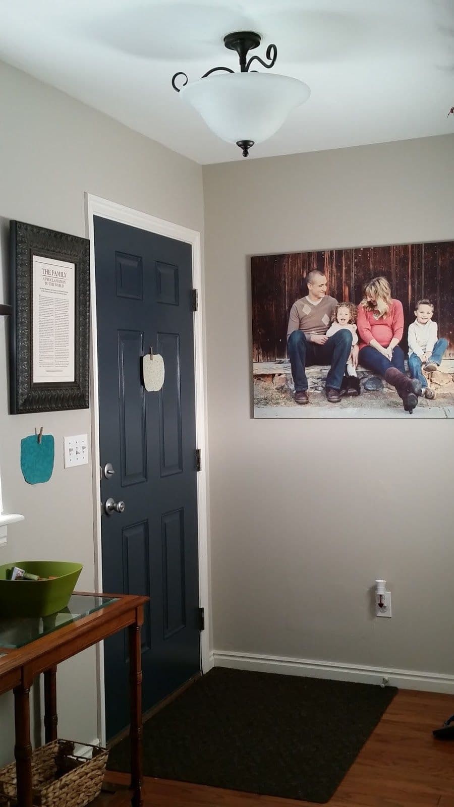
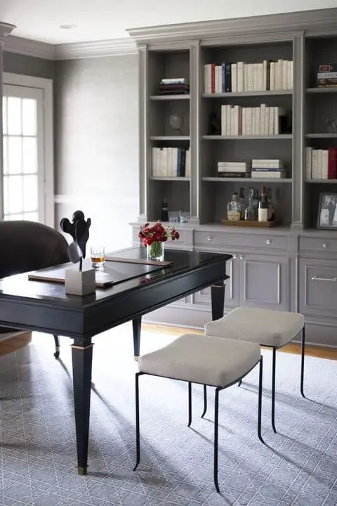
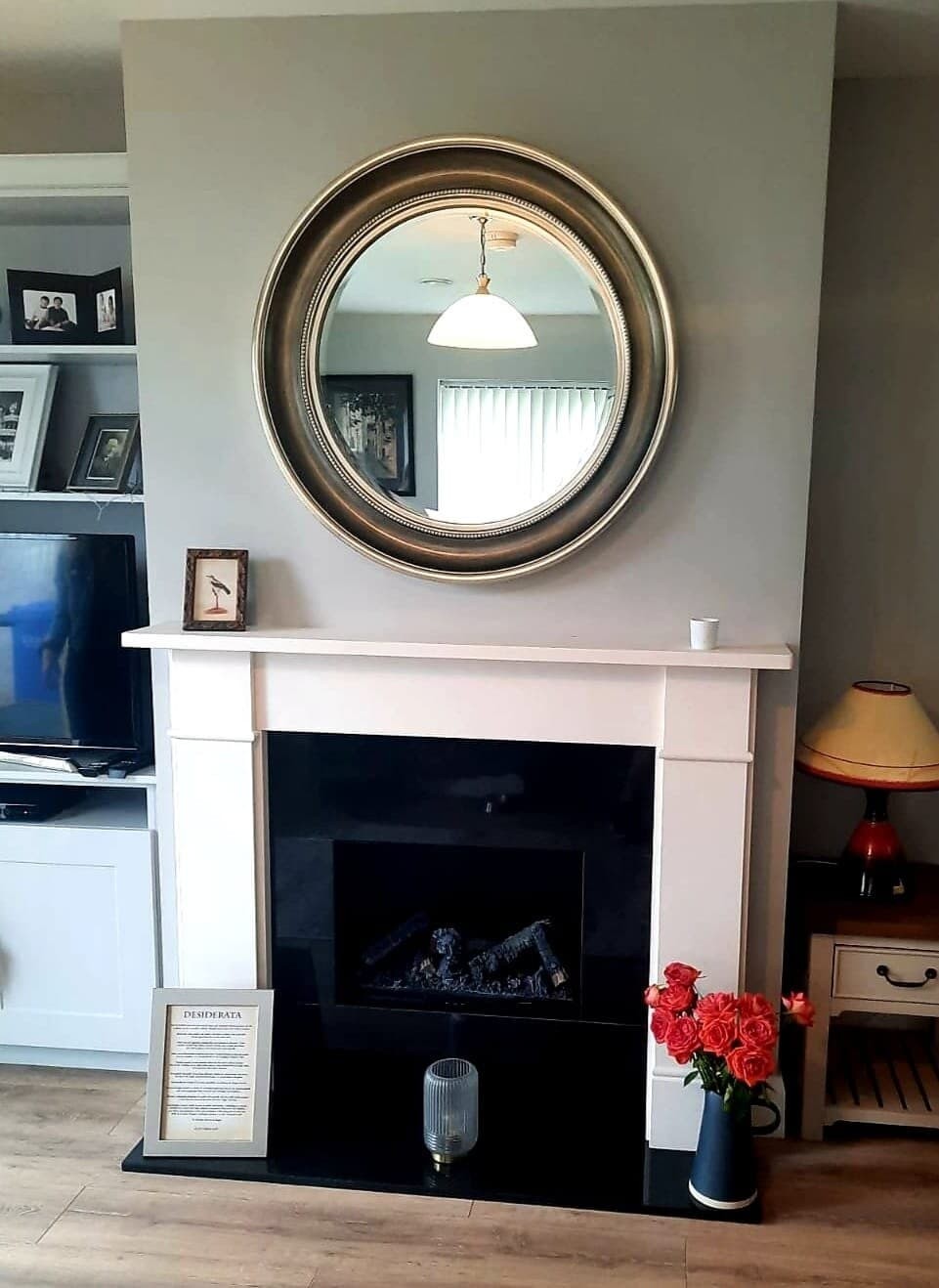
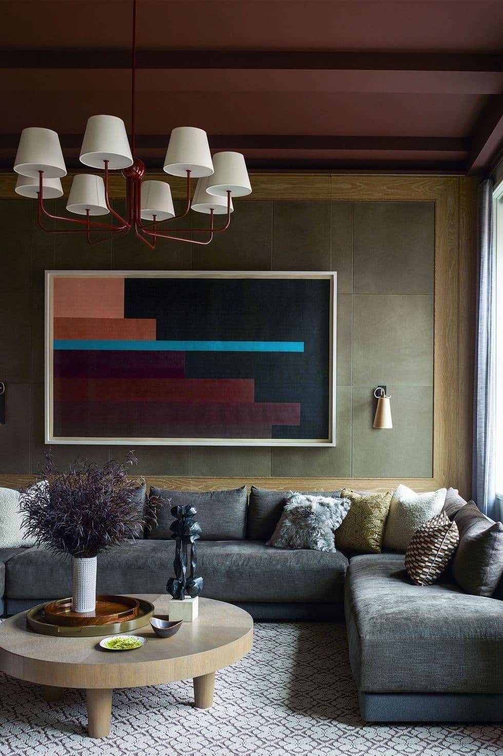
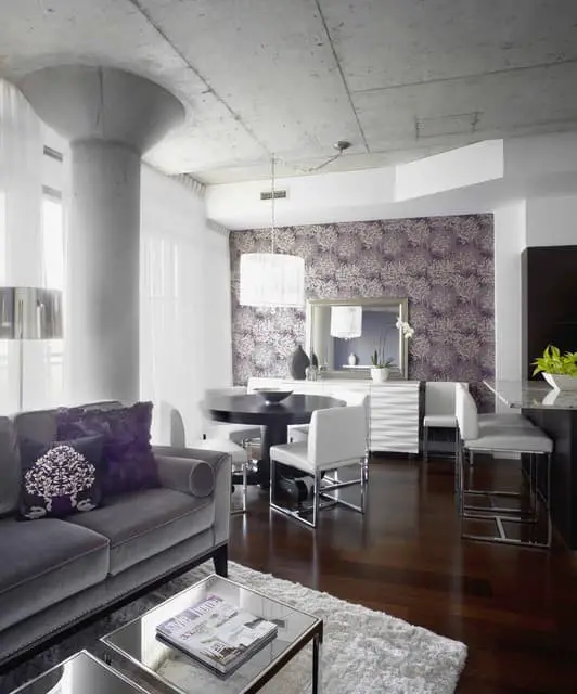
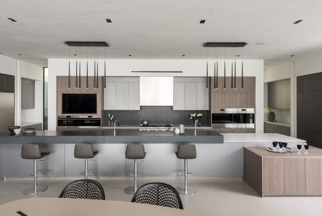
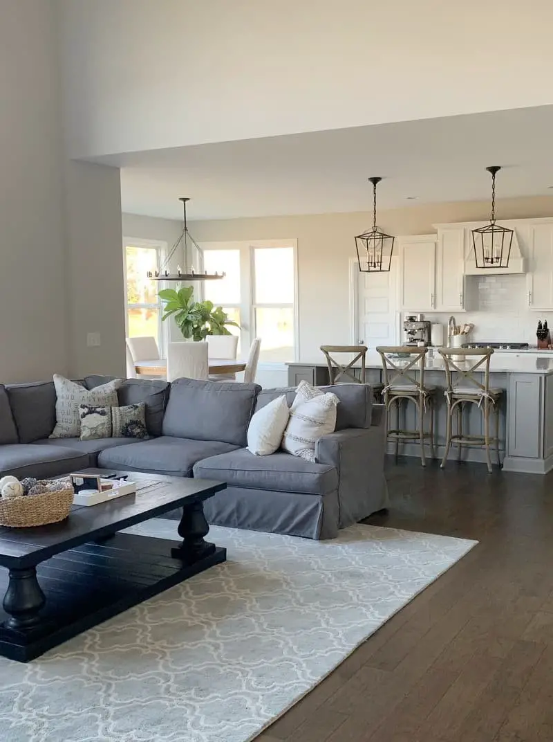
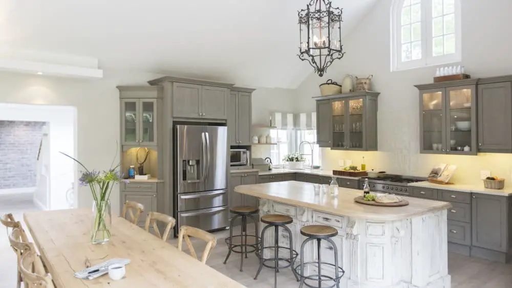
Charcoal or muted gray
When it comes to complementing gray pewter, consider incorporating nuances of the color spectrum that balance its tone. Dark charcoal gray and muted gray hues can serve as effective accents, creating a harmonious palette in your home decor. The versatility of gray, whether in its lighter or darker forms, makes it an excellent choice for neutral-colored decors that exude serenity and sophistication.
Mauve
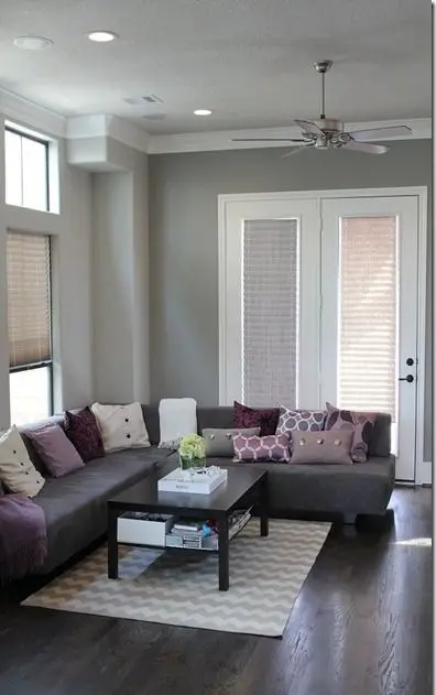
Pewter-like in its intrigue, this rich purple hue is an unexpected yet captivating color choice. Often used in combination with paint palettes and interior paints, it’s particularly well-suited when paired with pewter, especially gray-toned pewter, due to the subtle vintage undertones that bring out the best in each other. The harmonious union of mauve and pewter creates a truly show-stopping visual effect.
Navy blue
Navy blue’s neutral tone makes it an ideal canvas for pairing with any color, including pewter. The combination of these two hues creates a stunning contrast, particularly when paired with creamy pewter accents. This harmonious blend not only adds depth to plain or muted elements but also elevates their overall aesthetic appeal, solidifying its place in this list.
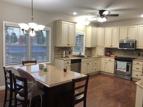
Peach
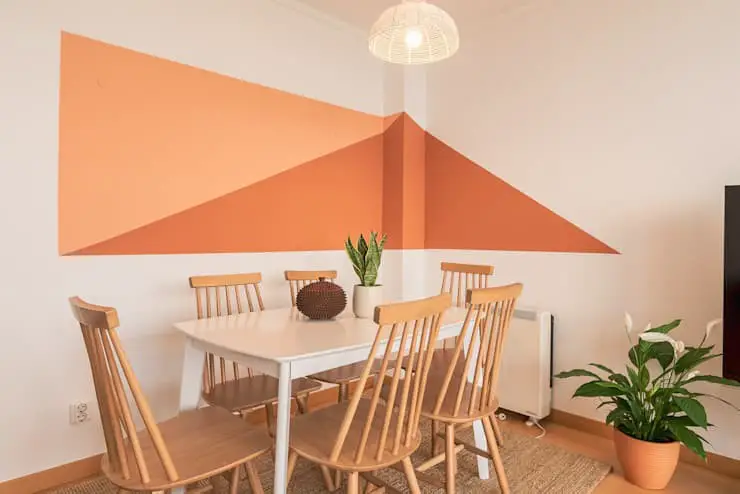
While coral is notoriously challenging to pair with other colors, peach presents a similar conundrum. However, one color that harmonizes particularly well with peach is gray – specifically, pewter gray. The juxtaposition of these two hues yields a visually stunning combination that can be leveraged effectively in home decor and interior painting projects, particularly in the kitchen and bedroom.
Greige
The harmonious blend of gray and beige, often referred to as greige, offers a unique balance between cool and warm tones. This colour combination is particularly well-suited for home decor, where it can add a sense of subtlety and sophistication. For an added layer of depth and visual interest, consider pairing greige with pewter, which shares similar undertones. This pairing creates a calming yet refined atmosphere perfect for bringing harmony to your living space.
Blue green pewter
As you’ve likely noticed by now, pewter encompasses its own distinct color spectrum. If you’re seeking a subtle, cool-toned hue for your home’s interior, pairing blue-green pewter with other shades from this palette can create a harmonious blend. On the opposite end of the spectrum, blue-green pewter is often considered the most vibrant pewter tone, making it an excellent choice for adding a pop of color to neutral monochromatic schemes.
Silver
In our previous discussions on pewter, we touched upon its definition as a byproduct of various metals, including silver. When designing a space that features blue-green or green pewter accents, pairing them with silver can create a harmonious metallic ambiance without dominating the room with overly cool tones.
Bright white
When considering a bold and striking aesthetic, pairing a green or blue-green pewter with bright white can produce a truly stunning effect. While we already appreciate the versatility of white in various design contexts, selecting the wrong hue can result in an overall look that feels dull and uninspired. Conversely, choosing bright white specifically to complement the metallic tone of pewter can create a timeless and classic appearance.
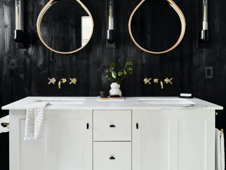
Black
When it comes to pairing colors, few combinations are as striking as the union of black and pewter. The rich darkness of black provides a stunning backdrop for the metallic sheen of pewter, making them a natural match for interior painting projects or accent pieces like home decor items. By combining these two colors, you can add depth and visual interest to your space, with black serving as an effective foil to highlight the Pewter’s silvery tones.
Yellow
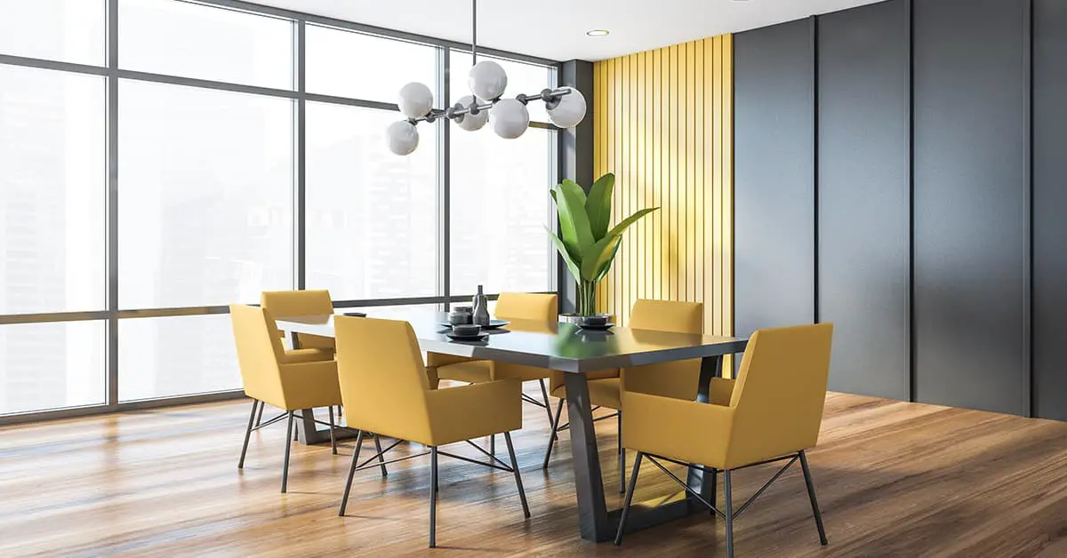
The harmonious pairing between yellow and pewter is often overlooked, but it’s actually a match made in heaven. The key to this successful combination lies in the contrasting undertones of the two colors. While yellow is typically warm, pewter boasts grayish and silvery undertones that create a cool and calming visual balance.
This contrast not only adds depth to the design but also creates a sense of warmth, making it an intriguing choice for those looking to add some personality to their space.
Olive green
To enhance the warmth of pewter, consider blending it with olive green. This fusion not only adds a sense of coziness but also injects a natural, earthy ambiance into the space. For those seeking to create a snug and inviting atmosphere in their living room, this combination is an excellent option.
Dark brown
Pairing pewter with a warm and earthy shade like dark brown can create a unique and inviting aesthetic in your home decor. Unlike traditional combinations that often feature tans or whites, the rich tones of dark brown bring a sense of ruggedness and coziness to the metallic look of pewter. This unexpected pairing can add a touch of rustic charm to your room’s design.
Aged oak
Building upon the concept of dark brown, the warm, earthy tone of aged oak brings a cozy, organic essence to your design scheme. This versatile hue can be effectively paired with pewter in various applications, extending beyond traditional home decor accents to incorporate furniture and flooring elements as well.
Maroon
When seeking to introduce warmth and masculinity into a space, pairing maroon with pewter is an excellent choice. The combination not only creates a cozy atmosphere but also adds depth and visual appeal. To further enhance the room’s cohesion and visual interest, consider incorporating maroon and pewter accents through curtains, chairs, area rugs, or furniture cushions. These subtle yet effective additions can make a significant impact on the overall aesthetic of the space.
Violet
To achieve a harmonious blend of deep tones in your pewter-themed room, consider incorporating violet hues into your decor. This bold and cool color will effectively counterbalance the richness of the pewter pieces. Consider using it for curtains and rugs to create a cohesive look that ties together the various elements in your space.
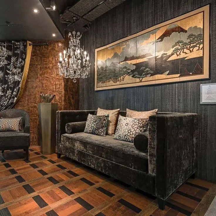
Copper
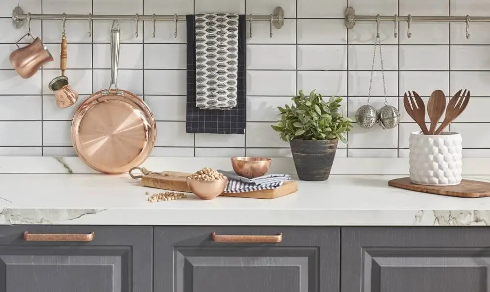
Pewter’s subtle nuances can be further enhanced by pairing it with copper accents. In fact, this harmonious blend is highly recommended when seeking to add a touch of sophistication to your home decor. The warm tones of copper beautifully complement pewter’s neutral base, creating a striking visual balance that adds depth and interest to any room.
This combination also lends itself well to incorporating metallic elements into your interior design, offering a unique opportunity to experiment with different textures and shades.
Platinum
Platinum is another striking option in the realm of metallic hues, boasting a distinctive white and pale gray palette that gradually deepens into a captivating celeste blue. When paired with vibrant pewter tones, platinum creates a visually stunning combination that truly holds its own among fellow metallic colors.
Stone grey
When exploring the realm of gray tones, another option that harmonizes particularly well with pewter is a darker, richer hue. This shade is characterized by its silver undertones and subtle brown notes, blending metallic and earthy elements in perfect balance. For those seeking a unique combination that exudes both modernity and organic charm, stone grey paired with pewter is an instant winner.
Chrome
While chrome’s sleek sheen is undeniable, it’s not for everyone. Its flush of gold undertones, mixed with subtle brushed nickel tones, create an opulent ambiance that elevates home decor to new heights. For those seeking the glamour of metallic colors, pairing pewter and chrome offers a sophisticated union that’s sure to impress.
Forest green
Infusing a touch of warmth into your home decor scheme, the juxtaposition of forest green against the earthy tones of pewter creates an inviting atmosphere. For those who crave a bohemian, oriental, or organic aesthetic, this harmonious blend of forest green and pewter is a thoughtful choice.
FAQs
When exploring the world of home decor, it’s natural to have questions and uncertainties. To further support your decision-making process, we’ve compiled a selection of frequently asked questions regarding pewter accents. This valuable information will help you make informed choices when incorporating this timeless material into your home’s aesthetic.
What color is close to pewter?
While pewter may not have a definitive signature color, its closest cousin is undoubtedly gray. However, to simply reduce pewter’s essence to gray would be an oversimplification. In reality, this unique color combines the dominant undertone of gray with subtle hints of silver, copper, blue, and brown, making it a complex and intriguing shade.
Is pewter and silver the same color?
While silver and pewter are often confused with one another, they exhibit distinct differences in terms of their visual characteristics. Silver is renowned for its radiant shine and exceptional luster, whereas pewter appears duller and more muted by comparison. In fact, pewter has a deeper, bolder tone that sets it apart from the bright sheen of silver. Interestingly, pewter’s appearance is often likened to lead, suggesting a closer affinity than with silver.
These subtle yet distinct differences highlight the unique nature of each metal, despite their shared tendency to be mistaken for one another.
Is pewter a warm or cool color?
Pewter’s unique characteristic lies in its diverse color spectrum, which can be broadly categorized into two distinct ranges: warm and cool. The cooler range is characterized by a blend of colors such as blue, green, and darker gray, giving rise to a palette that is distinctly vibrant and nuanced. In contrast, the warmer range is defined by hues based on brown and muted gray, resulting in a more subdued and earthy tone.
Are there alternative colors to pewter?
When considering pewter as an option, it’s understandable that you might find yourself seeking alternatives. Fortunately, there are several colors that can provide a similar aesthetic while offering unique characteristics. If you’re looking for a more practical choice, gray is an excellent substitute, as it shares similarities with pewter but offers greater visual flexibility. For a darker, matte look, charcoal is another viable option.
Additionally, nickel, copper, oak, and silver are all worthy runners-up that can provide a distinctive alternative to pewter.
What are the colors that do not go well with pewter?
While pewter may be an unconventional yet flexible color option, it’s not without its aesthetic limitations. Certain hues simply don’t mesh well with this metal shade. Lime green, for instance, is already a dull color, and pairing it with pewter would only mute its impact further. Orange, too, struggles to work alongside pewter, as the complex metallic undertones of pewter overwhelm the more vibrant orange tones.
Similarly, bright red is too bold and overpowering for pewter’s antique charm, rendering their combination visually jarring. In contrast, maroon and burgundy – the only red tinges on our list – manage to harmonize with pewter’s understated elegance.
How do you decorate around pewter?
To successfully incorporate pewter into your interior design, it’s essential to have a solid understanding of the pieces and arrangements that work well together. One effective way to complement pewter is by pairing it with sparkly decorative accents, such as antique or vintage designed decors and accent pieces. This combination not only enhances the pewter but also adds depth and visual interest to the space.
When working with pewter, it’s often helpful to pair it with natural materials like wood and neutral shades of gray, which can help to balance out its softness. Additionally, incorporating a statement wallpaper or shiny, glossy tiles can add a pop of color and create a cohesive look. Pewter is particularly well-suited for industrial design schemes, as its rugged texture and matte finish can add a touch of grittiness to the space.
Ultimately, the key to successfully incorporating pewter into your interior design is to strike a balance between its softness and the right cabinet arrangement, which can help to temper its more delicate qualities.
How do I know if the pewter has more lead mix?
The nuances in pewter’s hue are largely determined by the proportion of metallic colors blended into it. When pewter has a darker, more intense appearance and leaves noticeable marks on surfaces, it suggests a high concentration of lead. Conversely, if it appears lighter, tin is likely the primary metallic base used. The ideal pewter color is often considered to be its silvery tone, which strikes a balance between depth and subtlety.
Would pewter as a metal have value?
Pewter, a modern alloy of tin, lead, copper, and bismuth, boasts an intriguing property: its scrap value. When considering selling pewter for recycling, the going rate typically falls between $3-5, roughly half the market price for this metal. Notably, pewter’s cost efficiency outshines that of gold, platinum, and even silver. Its popularity stems from being more malleable and offering greater craftsmanship potential, making it a sought-after material in various industries.
Does pewter metal corrode?
Pewter’s resistance to rust and corrosion is another factor that sets it apart from other metals in the eyes of metalsmiths. This unique property makes it an ideal material for creating antique-inspired pieces such as pitchers, basin sinks, and decorative accents for the home. Its affordability and malleability also make it a practical choice for crafting intricate designs. As a result, pewter is a popular selection for adding distinctive touches to various interior design elements.
Is pewter historical?
For thousands of years, pewter has been a staple material in human history. Its origins date back to Roman times, where it was used to create everyday household items. But its significance didn’t end there. In Great Britain, particularly in rural areas, pewter’s popularity endured for centuries, with applications extending beyond household goods to other uses as well.
Conclusion
Pewter’s unique characteristics lie in its ability to seamlessly blend warm and cool tones, resulting in a versatile color that can appear differently depending on the context. When used on fabric, pewter takes on a warmer tone, whereas in interior design it becomes more adaptable. The story changes entirely when combined with other home decor elements, which we’ve explored earlier.
Taking all these factors into account, pewter emerges as an excellent choice for those seeking a visually striking and unique interior. Furthermore, its versatility makes it surprisingly easy to match with other design elements.
Related Posts
When it comes to curating the perfect exterior aesthetic, one crucial consideration is the harmonious pairing of your garage door with your home’s dominant hue. For instance, if you have a yellow house, selecting the right shade of garage door can elevate its curb appeal. Similarly, if you’re working with an emerald green abode, finding the ideal match for your garage door will create a stunning visual symmetry.
And it’s not just about the exterior – even interior design elements like curtains and bedding require thoughtful consideration to ensure a cohesive look. In this context, understanding which colors complement alabaster walls or gray furniture can be the key to creating a stylish sanctuary. Ultimately, crafting a harmonious color scheme for your home requires a deep understanding of how different hues interact with one another.
This guide provides expert insights and practical advice on how to make informed decisions when selecting a color palette that brings out the best in your space.