22 Best Colors To Pair With Turquoise: How To Make Your Room Pop
When it comes to adding a pop of color to your room, turquoise is an excellent choice. Its vibrant blue-green hue can instantly brighten up any space. However, finding the right colors to pair with it can be a challenge. In this article, we’ll explore some of the most striking combinations that will make your room truly stand out.
From classic neutrals like beige and cream to bold statements like coral and chartreuse, we’ll cover 22 different options that you can use to create a stunning visual effect. Whether you’re looking for a subtle hint of color or a bold statement piece, we’ve got you covered.
What color is turquoise?
In the realm of colors, turquoise stands out as a unique blend of blue and green hues that evoke feelings of serenity and tranquility. Its calming essence makes it an ideal choice for bedroom design, as it can significantly enhance relaxation and induce a deeper sleep. Moreover, this vibrant color can also be used to add a pop of brightness to any room, generating a lively and cheerful ambiance.
Turquoise color meaning.
Turquoise, with its captivating essence, embodies a rich tapestry of symbolism. Its calming presence has a profound effect on our emotional well-being, rendering it an ideal hue for bedrooms and other serene environments. Furthermore, turquoise is often linked to the fluidity of water and the vastness of the sky, evoking a sense of tranquility.
Moreover, this captivating color is believed to foster open communication and honesty, making it an excellent choice for offices or spaces where creativity and productivity thrive.
The meaning of turquoise color in Feng Shui.
The element water and the eastern direction are intimately tied to the calming hue of turquoise. This soothing color is believed to foster relaxation and serenity, making it an ideal choice for creating peaceful environments. In Feng Shui practices, turquoise is often employed to draw in positive energies and blessings, with its benefits particularly evident when used in the East sector of a space.
This direction is associated with new beginnings, growth, and prosperity, making turquoise a powerful tool for attracting these qualities into one’s life. Additionally, this color can be used in any setting to instill a sense of calmness and tranquility, making it an excellent choice for promoting overall well-being.
What color is the opposite of turquoise?
The debate about what constitutes the opposite of turquoise often centers around black or white. However, when examining the color wheel, it becomes clear that red takes its rightful place as the true antipode. This opposition creates a harmonious balance when the two colors are used together. When designing with these hues, it’s crucial to remember that red should be employed as an accent rather than the dominant color, lest it overpower the composition.
Moreover, red and turquoise should not coexist in the same space, as their confluence would result in a jarring visual experience.
What colors go with turquoise for a room?
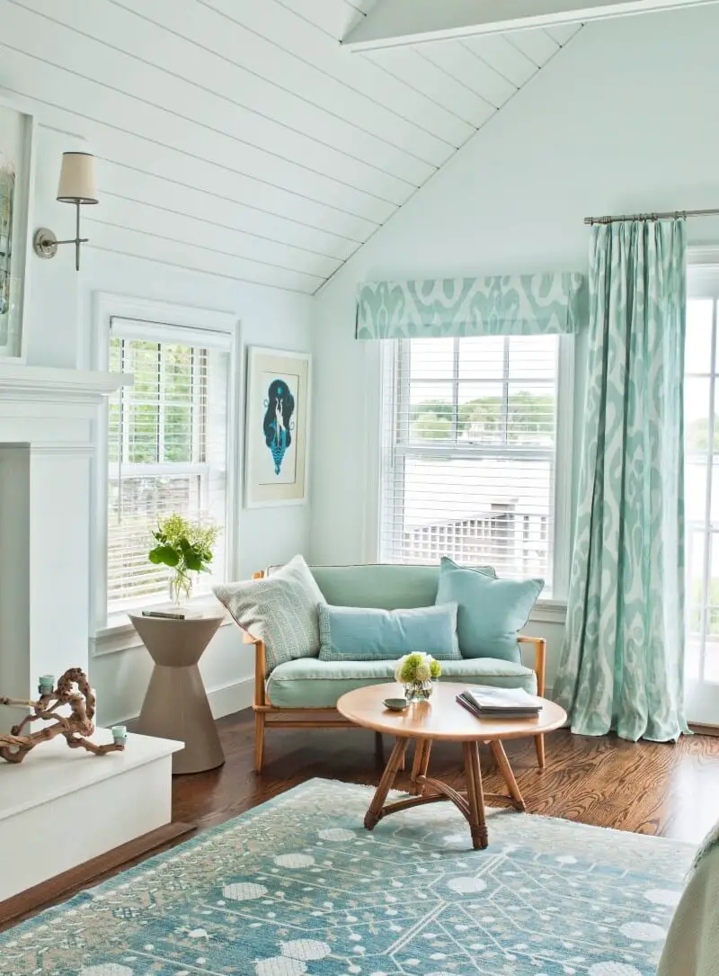
Beige and turquoise.
When it comes to combining colors, few duos are as striking as the pairing of beige and turquoise. This unlikely pair can add depth and visual interest to a room when used thoughtfully. Beige’s warm, calming tone makes it an excellent choice for accenting a space, particularly one featuring turquoise walls. The brighter, more vibrant hue of turquoise on walls can create the illusion of a larger space, making it an ideal option for smaller rooms.
One of the greatest benefits of combining these colors is the flexibility they offer. You can use beige as an accent color to brighten up a room, or incorporate turquoise into furniture or accessories to add contrast and visual appeal. For instance, you might paint a piece of furniture turquoise and then balance it with beige accessories.
Alternatively, create a focal point in your room by using a turquoise rug and balancing it out with beige curtains.
The key is to strike the right balance between these two colors. When used effectively, they can work together to create a harmonious, spa-like atmosphere, even in a bathroom.
Whether you’re looking for a way to add some visual interest to your home or simply want to experiment with new color combinations, the pairing of beige and turquoise is definitely worth exploring.
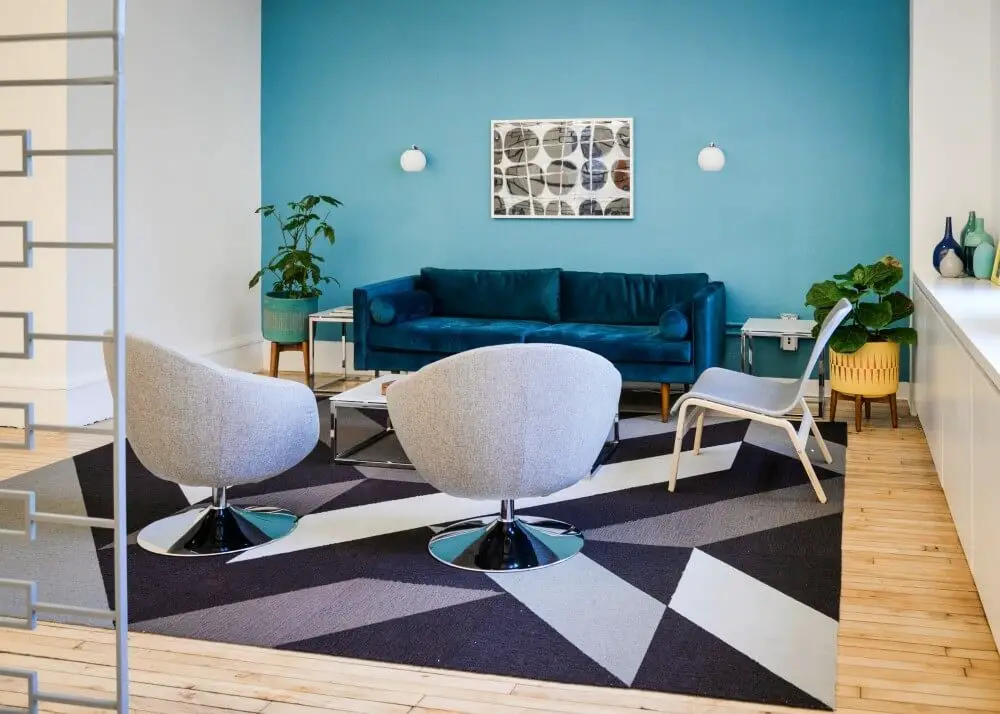
Black and turquoise.
When considering a pairing of black and turquoise for a room, it’s hard to go wrong with this striking combination. The versatility of black allows it to be used as an accent color to enhance the vibrant hue of the turquoise, or vice versa, making them a well-matched duo regardless of which one takes center stage. However, for a harmonious outcome, there are a few key factors to keep in mind.
First and foremost, it’s essential to ensure the room receives sufficient natural light, as the brightness of the turquoise can become overwhelming in darker spaces. Additionally, care must be taken to strike the right balance between the two colors, as their bold nature means they can easily clash if not thoughtfully combined.
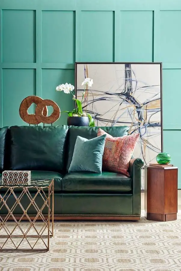
Brown and turquoise.
When combining brown and turquoise, it’s essential to consider the balance you want to achieve in your space. The earthy and calming nature of brown can help ground a room that might otherwise feel too bright and bold due to the presence of turquoise. This combination works well because both colors have distinct personalities that can be leveraged to create a unique aesthetic.
Turquoise, with its vibrant and playful vibe, can be used as an accent color or serve as the primary hue in your room’s palette. If you’re looking for inspiration on how to bring these colors together, here are some ideas to get you started. One approach is to use brown as an accent color in a space dominated by turquoise. This adds depth and visual interest to the room.
Another option is to create a striking focal point by painting one wall brown while keeping the other walls a shade of turquoise. This can be a fun way to infuse your space with personality. You could also experiment with different shades of both colors to craft a harmonious color scheme that suits your taste.
Copper and turquoise.
The harmonious union of turquoise and copper is undeniable. When selecting a room color scheme and turquoise is one of your colors, consider pairing it with copper for a stunning combination. You can incorporate copper through accessories like lamps or vases, or take it to the next level by painting the walls this warm, inviting hue. Either approach will add depth and warmth to the space, allowing the turquoise to truly shine.
Coral and turquoise.
Coral and turquoise form a harmonious duo, as the warm tones of coral perfectly complement the cool undertones of turquoise. This color combination can be used as an accent or dominant theme in a room, making it suitable for various design styles. The connection to water and freshness makes coral particularly well-suited for bathroom designs, where its calming influence can help create a spa-like atmosphere.
Turquoise, too, is an excellent choice for bathrooms, as its invigorating quality can revitalize the senses. When paired together, these colors create a stunning visual effect that evokes feelings of serenity and renewal, making them an ideal combination for any room or season.
Cream and turquoise.
The harmonious pairing of cream and turquoise is nothing short of remarkable. The former brings a sense of warmth and brightness to the space, while the latter injects a vibrant splash of color. What’s more, both hues are incredibly versatile, effortlessly complementing a wide range of other design elements. If you’re seeking a room makeover that will impress, look no further than this dynamic duo – they’re sure to deliver!
Chartreuse and turquoise.
When paired together, the vibrant Chartreuse and rich Turquoise create a striking contrast that adds depth and brightness to any space. Chartreuse, with its almost lime green hue, brings an energetic feel, making it perfect for adding a pop of color through accessories like pillows or curtains, or even painting one accent wall. On the other hand, Turquoise’s deep blue-green tone lends a sense of calmness and sophistication, allowing you to add depth without overwhelming the space.
Both colors can be used as accent pieces or taken up a notch by painting an entire wall in each shade, offering endless possibilities for creating a unique and captivating atmosphere.
Dark Blue and turquoise.
Dark blue and turquoise are a harmonious pair when it comes to interior design. The former adds depth and sophistication, while the latter injects vibrancy and energy. When used together, these colors create a visually appealing combination that’s sure to draw attention.
To incorporate them into your room’s décor, consider the following ideas: Start by painting one wall dark blue and the remaining walls turquoise – this subtle yet effective approach adds visual interest without overwhelming the senses. Alternatively, use dark blue as an accent color in a predominantly turquoise space. This clever combination will bring out the blue undertones in the turquoise, fostering a sense of cohesion.
For a bold contrast, flip the script and employ turquoise as an accent against a dark blue backdrop. This thoughtful blend will brighten up the space and create a dynamic ambiance.
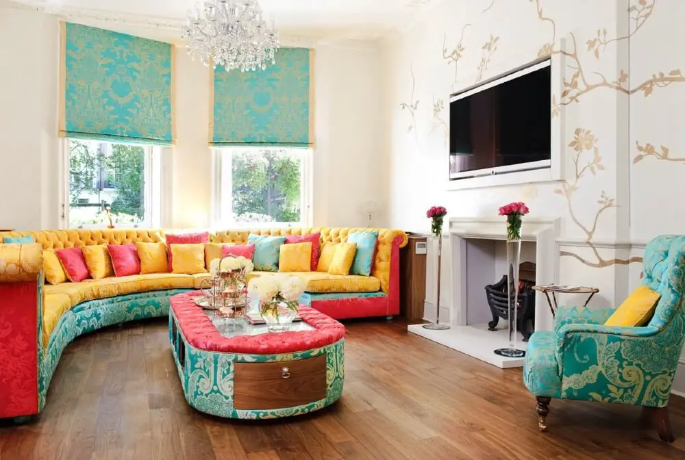
Gold and turquoise.
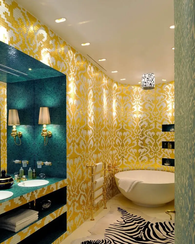
When it comes to combining gold and turquoise, the result can be truly stunning. As complementary colors, they offer a unique opportunity to add depth and visual interest to a room. The warm, bright tone of gold pairs perfectly with the cool, calming quality of turquoise, creating a sense of balance and harmony. The key is to find ways to blend these two colors together in a way that feels cohesive and intentional.
This can be achieved by using them on furniture, accessories, or even paint colors. For example, consider pairing a pale gold wallpaper with a bold turquoise accent wall, or use a gold-colored rug to create a striking contrast against a turquoise-painted room. The possibilities are endless, but the end result is always sure to be a beautiful and stylish space that reflects your personal taste and style.
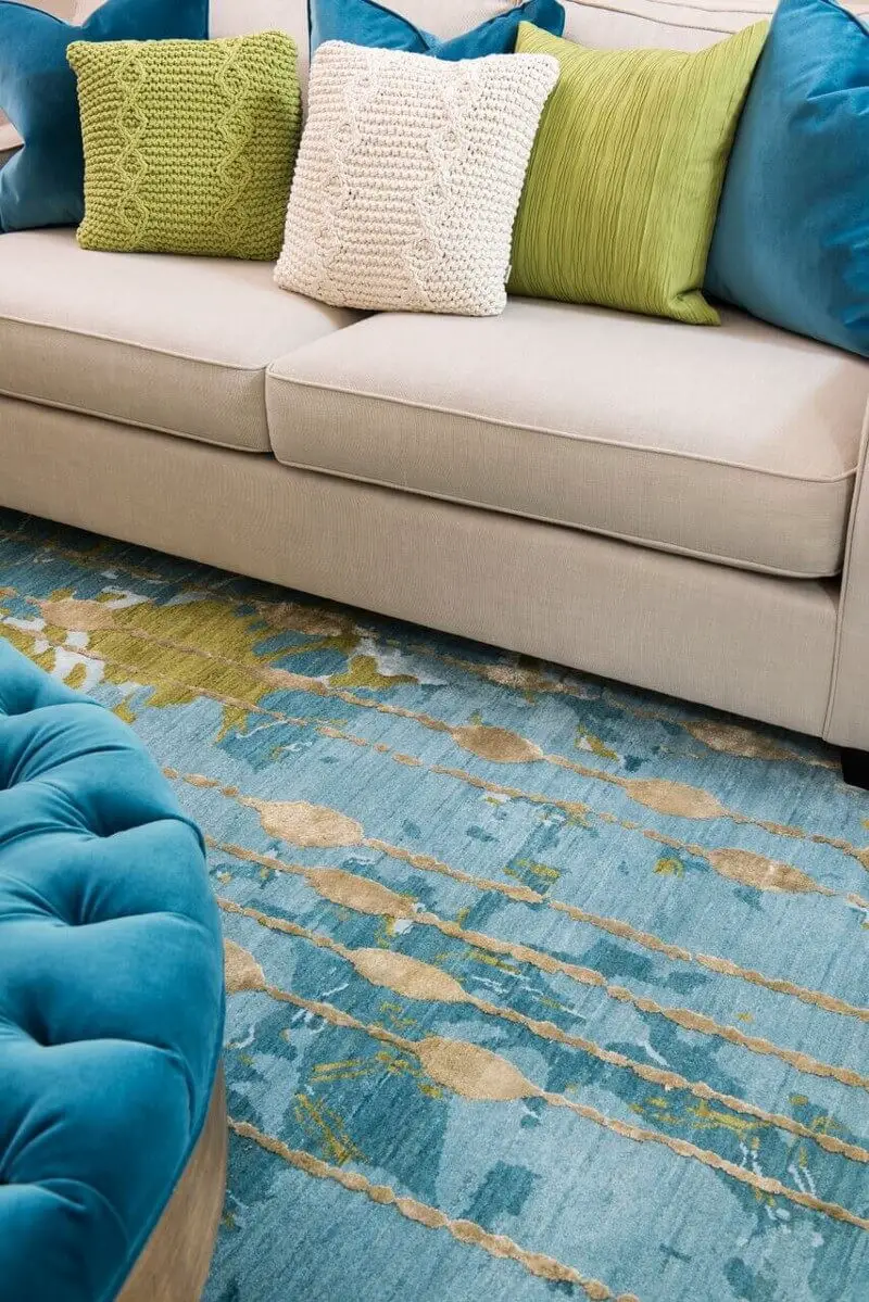
Green and turquoise.
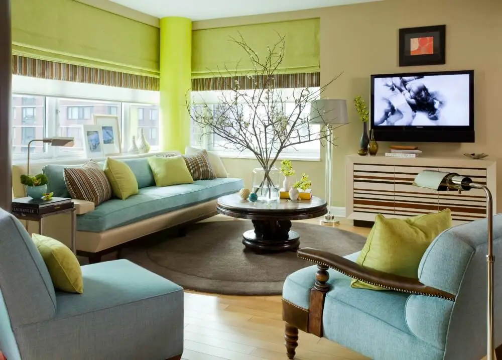
When it comes to accentuating a room with vibrant turquoise walls, green is an excellent choice. This combination creates a visually appealing space that exudes freshness and energy. To further enhance the ambiance, consider incorporating other complementary colors such as white, beige, or brown. These harmonious hues will help counterbalance the boldness of the turquoise, resulting in a design that feels both cohesive and inviting.
Gray and turquoise.
When it comes to accent colors, gray is an excellent choice due to its versatility in pairing well with many other hues, including the vibrant and cheerful turquoise. This combination can instantly add a touch of brightness to a room. If you’re looking for inspiration on how to incorporate these colors into your decor, here are a few ideas to get you started. One approach is to paint the walls a soothing gray and use turquoise as an accent color.
Simply adding curtains, throw pillows, or a rug in this shade can greatly enhance the ambiance of the room. Alternatively, you could play with different shades of gray and turquoise to create a visually appealing contrast. Consider painting your walls a light gray and using a deeper turquoise for accents, or opt for a brighter turquoise paired with a softer gray. Either way, the result is sure to be an interesting and eye-catching space.
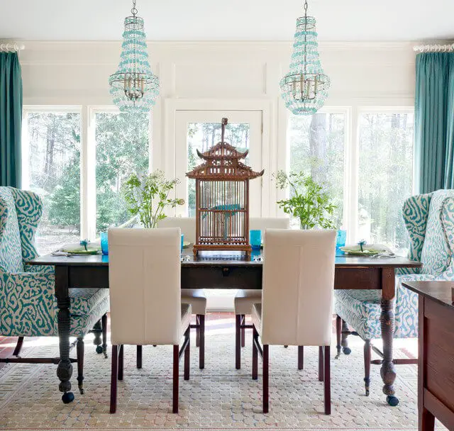
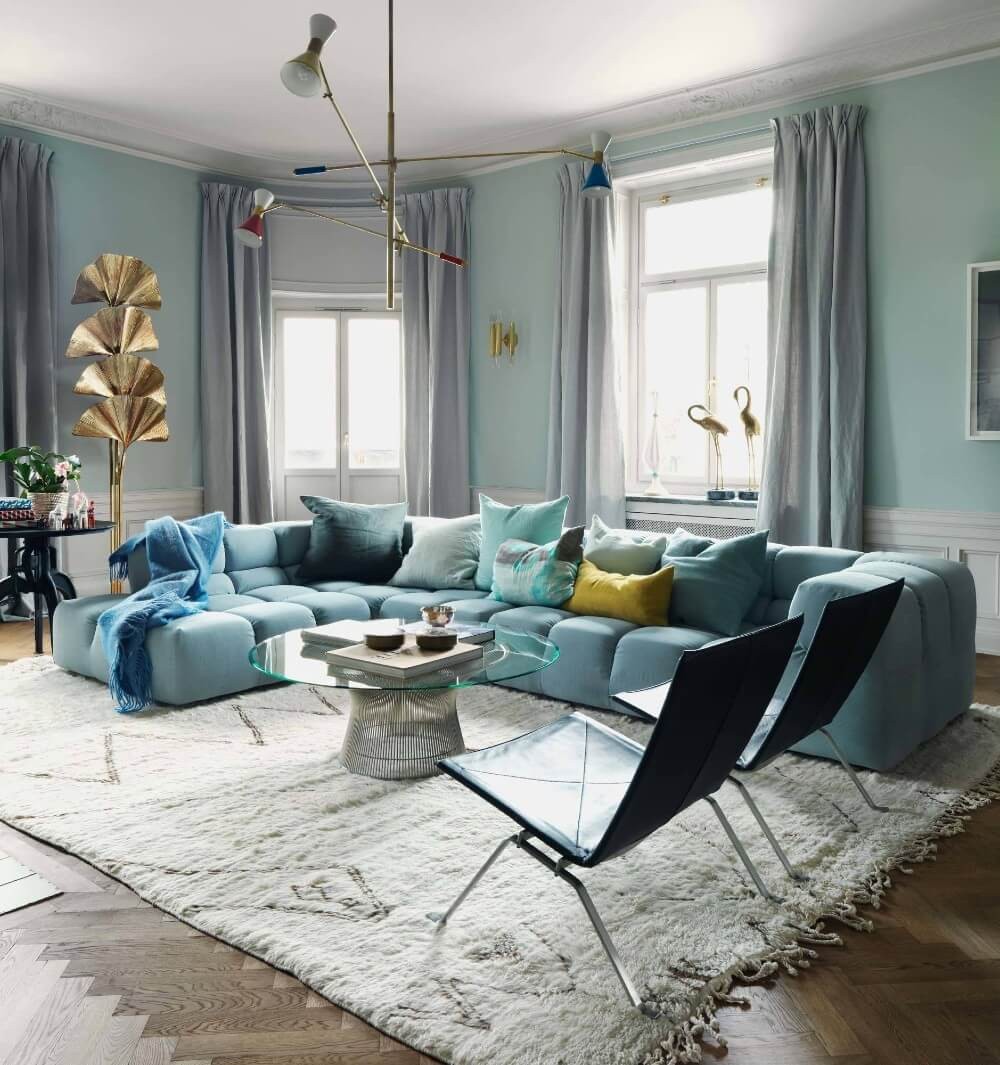
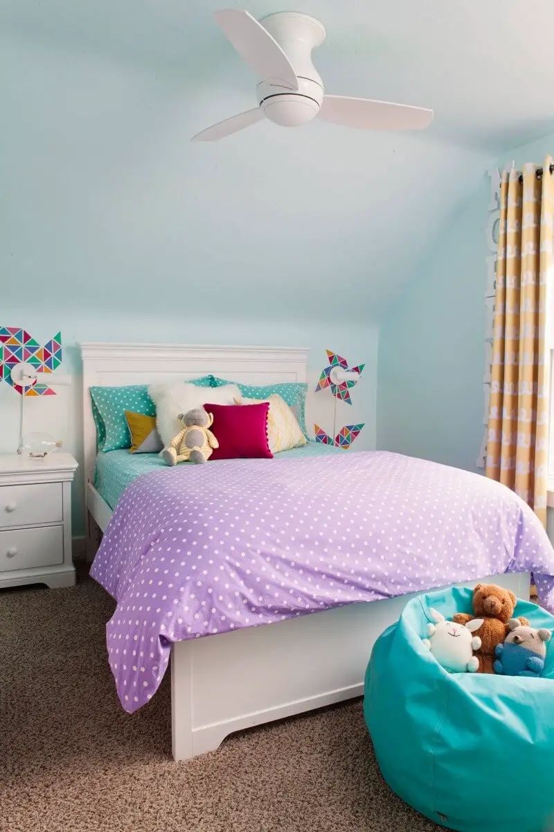
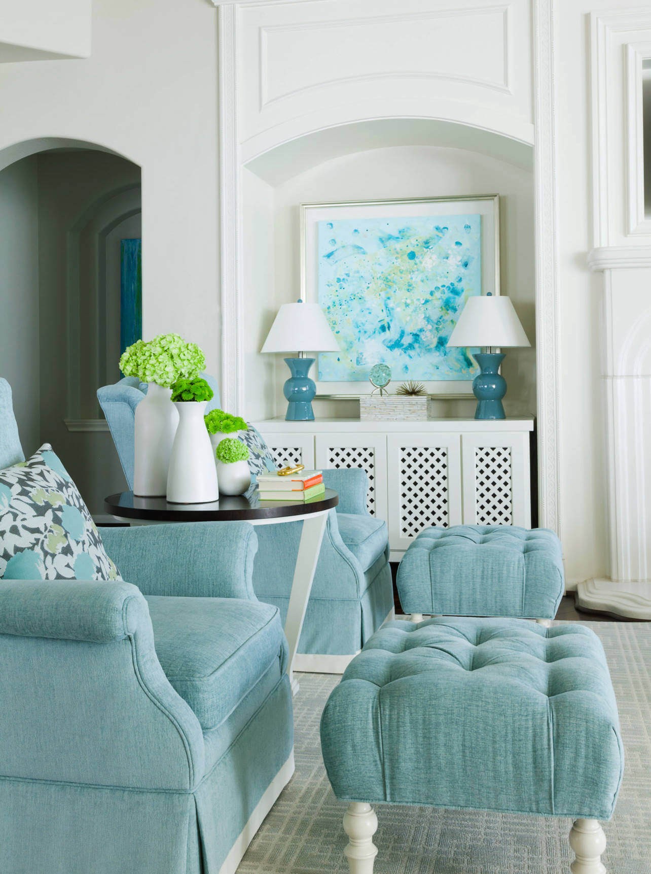
Light Blue and turquoise.
Turquoise and light blue are a match made in heaven, harmonizing beautifully together. When considering a color scheme that complements turquoise walls, light blue is an excellent choice. This pairing has the effect of brightening up the space and creating a sense of openness. You can also utilize light blue as an accent color elsewhere in the room, such as on bedding or pillows. Turquoise is an ideal color for a bedroom, and when paired with light blue, it’s sure to be a stunning combination.
Lilac and turquoise.
The harmonious combination of these two colours has the power to instantly uplift any space. When seeking to inject a burst of vibrancy into your décor, this colour duo is an excellent choice. Its versatility makes it suitable for various design styles, ensuring that you can’t go wrong with this beautiful pairing.
Mustard Yellow and turquoise.
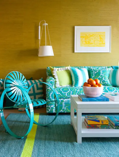
When it comes to pairing complementary colors, blue and orange are an unbeatable combination. This harmonious duo can be used to add depth and visual interest to any space. Whether you’re looking to make a bold statement or prefer a more understated approach, this color scheme has got you covered. A vibrant yellow provides the perfect opportunity to inject some energy into your design, while a softer mustard tone offers a more subtle alternative.
Meanwhile, turquoise adds a touch of playfulness and whimsy, effortlessly pairing with both bright and muted hues. By incorporating these colors into your room’s aesthetic, you can create a space that’s not only visually stunning but also inviting and enjoyable to spend time in.
Neutrals and turquoise.
To incorporate this vibrant color into your home’s aesthetic, consider starting with a neutral base that will provide a timeless foundation for the space. This backdrop will allow the turquoise pops to truly shine, adding a burst of energy and playfulness. Consider incorporating the bold hue through accessories or a statement feature wall – allowing you to have fun with the design process and create a look that’s uniquely yours.
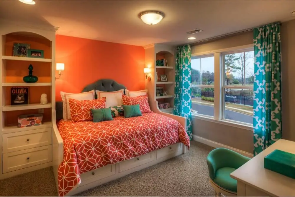
Orange and turquoise.
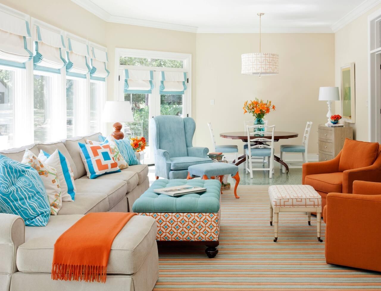
When pairing turquoise with its complementary color orange, the key is to strike the right balance. To add some vibrancy to your turquoise space, incorporate subtle orange accents throughout. This could involve incorporating orange hues into accessories, furniture, or even painting a statement wall. Be mindful of the shade you choose – a lighter orange will help maintain harmony and avoid overpowering the turquoise.
Pink and turquoise.
When the colors pink and turquoise are paired together, they form a harmonious complementary color scheme that is not only visually striking but also adds depth and energy to any space. To incorporate this scheme into your home decor, consider painting one wall in a bold pink hue and another in a vibrant turquoise tone. Alternatively, you can introduce these colors through accent pieces such as pillows or curtains, allowing you to add pops of color without overwhelming the senses.
Red and turquoise.
When it comes to pairing colors, complementary hues like red and turquoise can create a visually stunning combination. To add some excitement to your space, consider incorporating these colors through paint, accessories, or furniture choices. Just remember to strike the right balance by using them thoughtfully to avoid overwhelming the senses. This harmonious union of red and turquoise is sure to bring a touch of personality to any room.
Royal blue and turquoise.

The harmonious relationship between blue and turquoise is undeniable. When used together, these colors create a visually appealing combination that can be applied in various ways to a room’s design. You can incorporate one color as an accent or opt for a bold, all-blue-and-turquoise aesthetic. Either approach will yield stunning results.
Sage green and turquoise.
When it comes to pairing colors, complementary hues like sage green and turquoise are a winning combination. The soothing quality of sage green can create a sense of calmness, perfect for a relaxing atmosphere, while the vibrant energy of turquoise adds a playful touch, ideal for injecting some excitement into your space. Consider incorporating this duo in your home office, bedroom, or living room to breathe new life into your decor.
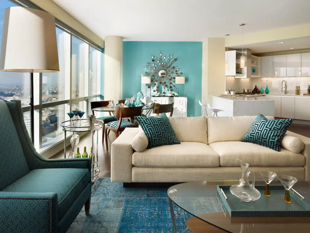
White and turquoise.
Turquoise and white is a harmonious duo that can elevate any space in your home. For an atmosphere that’s as light and airy as a cloud, this colour combination is a perfect choice. To take it to the next level, incorporate vibrant accents through accessories and decor. This will not only add visual interest but also create a sense of energy and dynamism.
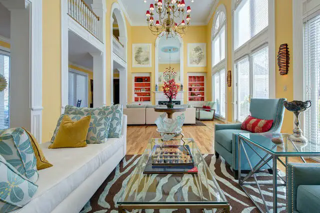
Yellow and turquoise.
When it comes to combining colors, complementary pairs like yellow and turquoise are a match made in heaven. By incorporating these two hues into your room’s decor, you can create a visually stunning space that exudes warmth and energy. To start, consider adding subtle pops of yellow and turquoise through accessories such as wall art, throw pillows, or area rugs. This will not only add a splash of color to the room but also inject some personality.
For those looking for a quick refresh without committing to major changes, this harmonious combination is an excellent starting point.
How to decorate with turquoise
When it comes to decorating with turquoise, the key is finding a balance that brings life and energy to the space without overwhelming the senses. Here’s how to achieve this: Start by incorporating turquoise as an accent color through select pieces of furniture or accessories. This will add a pop of vibrancy without dominating the room. For added visual interest, pair different shades of turquoise together, such as pairing a light blue with a dark blue for a striking contrast.
To temper the boldness of the color, incorporate textured elements like fabrics or rugs into your design scheme. Ultimately, consider the mood you want to create in the space and choose colors and accessories that reflect this tone. Whether it’s an energetic and playful vibe or a calming and serene atmosphere, turquoise can be used to achieve either effect.
Conclusion
With the perfect color palette in place, it’s time to bring your design vision to life! By incorporating these harmonious hues into your room, you’ll be creating a space that exudes both style and warmth. And the best part? It’s incredibly easy to get started. So why not make today the day you finally give your space the makeover it deserves?
Related Posts
When it comes to selecting the perfect color for your garage door, it’s essential to consider the exterior of your home. A yellow house is a great starting point, and choosing the right garage door color can make all the difference in terms of curb appeal. For instance, a bold red or orange garage door can create a striking visual contrast with the brightness of the yellow house.
Alternatively, you could opt for a more subtle approach by selecting a neutral color like beige or cream that blends seamlessly into the surrounding environment. Similarly, if you have a green house, a natural wood tone or earthy brown garage door can bring out the best in the exterior. When it comes to choosing curtains with gray furniture, you’ll want to select hues that complement the cool tones of the furniture. Blues and greens are great options as they create a soothing atmosphere.
For alabaster walls, an ideal ceiling color is one that complements the soft, creamy tone without overpowering it. A pale blue or off-white can work beautifully in this case. When selecting bedding with gray headboard, you’ll want to choose colors that harmonize with the neutral tones of the headboard. Pastel shades like pink and lavender can add a touch of whimsy to the bedroom, while deeper hues like navy and emerald green can create a sophisticated ambiance.