Do Red And Green Go Together? (12 Colors To Pair With)
The iconic color combination of red and green has transcended its association with the holiday season, becoming a staple in various aspects of life. Beyond their festive connotations, these two colors possess a rich history and multifaceted symbolic meanings that span cultures and contexts. In this article, we will delve into the versatility and power of red and green in design, exploring their unique characteristics and potential applications across different mediums.
Color Theory Basics
Color theory serves as the foundation for designing visually appealing compositions. It’s a framework that helps designers comprehend how colors interact with each other, including their properties such as hue, saturation, and brightness. A crucial aspect of this theory is the concept of complementary colors, which are pairs located on opposite sides of the color wheel. When placed together, these contrasting colors create a striking visual effect.
The classic combination of red and green, for instance, is an exemplary demonstration of how complementary colors can work harmoniously in design. However, achieving effective design goes beyond mere contrast; harmony is equally essential. This balance is achieved through the thoughtful manipulation of color relationships within a composition.
Complementary colors can be used to create a sense of equilibrium and harmony by employing varying proportions or combining them with other colors that bridge their gap. The application of color in design is an intricate art form that demands a profound understanding of its principles and applications. By exploring the harmonious coexistence of red and green, we can gain a deeper appreciation for the power and versatility of color in design, extending beyond seasonal contexts.
Do red and green go together?
The relationship between red and green is far more nuanced than their seasonal association suggests. These two colours are not limited to the holiday season; in fact, they form a striking complementary pair that can be leveraged effectively across various design disciplines. By understanding the fundamental principles of colour theory, including hue, saturation, and brightness, designers can craft harmonious colour schemes that are both aesthetically pleasing and communicative.
At the core of this compatibility is the concept of complementary colours. When two colours occupy opposite positions on the colour wheel, they create a high-contrast combination that can produce a powerful visual impact. In the case of red and green, their proximity on the colour spectrum allows for a striking juxtaposition.
While red and green are bold and intense on their own, designers can achieve balance by using these colours in varying proportions or combining them with other hues to bridge the gap between them. For instance, incorporating white or gray into a red and green scheme can temper the contrast and create a more subdued effect.
The Psychology of Red and Green
Red and green, two colors often evoking strong emotional responses, have distinct psychological connotations. Red, a passionate and energetic hue, can signify danger, anger, or love, depending on the context. In design, it’s frequently employed to create a sense of urgency or excitement, making call-to-action buttons, logos, and marketing materials stand out. This bold color is a powerful tool for designers, capable of grabbing attention and instilling a sense of urgency.
In contrast, green, often linked with nature, growth, and tranquility, brings a calming and harmonious atmosphere to design. It can also represent wealth, money, or prosperity, making it an attractive choice for financial institutions and businesses. When combined, red and green create a dynamic impact on design. The juxtaposition of the two colors produces a sense of balance and harmony, while also injecting energy and excitement.
This color combination is particularly well-suited for festive and celebratory designs, such as holiday-themed projects. However, it’s crucial to use these colors in moderation to avoid overwhelming the senses.
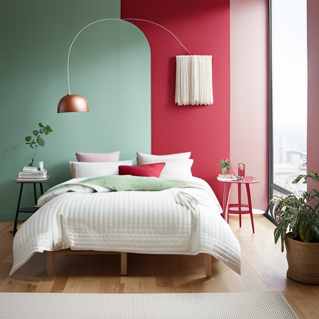
Red and Green in Interior Design
When designing with red and green, it’s essential to strike a balance between these two bold colors. To avoid overwhelming the senses, use them in moderation by designating one as the primary accent and the other as a secondary accent. This approach allows for visual interest without feeling too loud or chaotic.
Another way to add depth and nuance is to combine different shades and tones of red and green.
For instance, pairing a bright, fire-engine red with a muted, forest-green can create a harmonious balance that’s both calming and engaging.
For inspiration, look to traditional Christmas-themed designs, where the classic combination of red and green is iconic. However, this color pair also lends itself well to modern and unexpected applications – think pairing a rich, crimson red with a bold, lime-green for a strikingly contemporary look.
Ultimately, achieving balance in interior design requires considering the overall aesthetic and mood you want to create. If you’re aiming for a serene atmosphere, opt for muted shades of red and green. Conversely, if you want to energize the space, brighter and more vibrant hues may be just what you need.
12 Colors to Pair With Red and Green
Red, Green, and Black
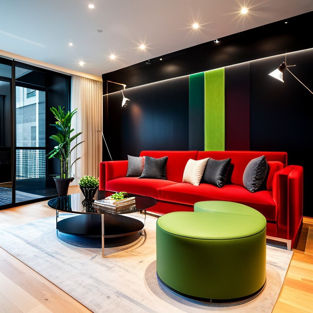
Red, green, and black are a powerful trifecta of colors that can add depth, drama, and energy to any interior design scheme. When combined, these colors evoke a range of emotions and moods, from passion and excitement to nature’s serenity and growth. Black brings sophistication and balance to the mix, making it an excellent accent color. In terms of creating distinct atmospheres, red, green, and black can be used in various settings.
For instance, in a modern living room, a bold red sofa paired with green and black accents can produce a striking contemporary look. This combination can also be applied to a traditional dining room, where a black table is complemented by red and green place settings, creating a festive and celebratory ambiance. In the bedroom, a calming atmosphere can be achieved by pairing a red and green bedding set with black accent pillows and drapes.
Similarly, this color combination can be used in a home office, where a green desk is paired with a red and black rug to create a productive and energizing workspace. When incorporating red, green, and black into an interior design, it’s essential to balance their boldness with neutral tones and textures. For example, pairing a black leather sofa with red and green throw pillows and a neutral rug can create a cozy and inviting living space.
In the kitchen, white cabinets can be paired with red and green accessories and black hardware to produce a timeless and classic look.
Red, Green, and Blue
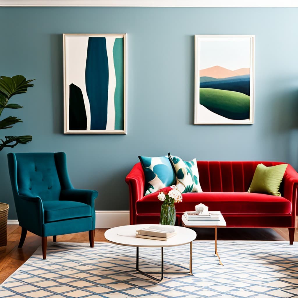
The classic triad of red, green, and blue has been a cornerstone of interior design for ages. This harmonious combination creates a sense of equilibrium and dynamism in a space, making it perfect for a wide range of designs. Each color brings its unique character to the table – red injects drama and excitement, green evokes serenity and harmony, while blue offers versatility, ranging from calming to vibrant depending on its shade and tone.
When blended together, these colors form a rich and diverse palette that can be employed in various design styles and moods. Whether you’re aiming for a bright and airy feel or a more subdued and peaceful atmosphere, the red-green-blue trifecta provides endless possibilities for interior designers to explore.
Red, Green, and Greige
The unconventional blend of Red, Green, and Greige has taken the world of interior trends by storm. This innovative color scheme combines warm, cool, and neutral tones to create a bold statement that adds texture and depth to any room. By pairing the vibrant hues of red and green with the earthy undertones of greige, designers can craft a harmonious balance that effortlessly adapts to various interior design styles.
To incorporate this striking color scheme into home decor products, designers can use an array of items such as cushions, curtains, rugs, and more to create a cohesive look. For instance, a statement red and green patterned rug against greige walls can become the focal point in a living room, while a set of green cushions with subtle red accents on a neutral-colored sofa can add a pop of color and visual interest.
When working with this bold color scheme, it’s essential to strike a balance between the three colors. One effective way to achieve harmony is by using green as the primary color and incorporating red as an accent. Alternatively, designers can experiment with different shades and tones of Red, Green, and Greige to create depth and visual interest in their design.
Red, Green, and Light Blue

The dynamic trio of red, green, and light blue colors can be harnessed to craft living spaces that are both energizing and soothing. This palette’s foundation is rooted in the principles of color theory, where complementary colors like red and green create a striking contrast when combined, while light blue injects a sense of calmness and serenity.
The emotional resonance of this scheme can vary depending on the tone and proportion used, potentially evoking feelings such as passion, energy, tranquility, or calmness in inhabitants and visitors. When designing with these colors, it’s crucial to consider the room’s purpose and the clients’ personalities. For instance, a youthful family might opt for brighter, bolder shades of red and green, whereas a more mature individual might prefer deeper, more subdued tones.
A variety of interior design elements can be employed to seamlessly integrate these colors into a space. Flooring can serve as a neutral backdrop, allowing the color scheme to take center stage. Wall paint can feature light blue tones for a calming effect, while furniture can blend red, green, and light blue in different proportions.
Lighting also plays a vital role in enhancing the scheme’s impact, with warm lighting amplifying the warmth of red tones and cooler lighting complementing the soothing quality of light blue. To achieve harmony and invitation, it’s essential to use these colors in varying proportions and combine them with neutral tones to balance out their boldness.
For example, a living room featuring a light blue wall, green curtains, and red accents can create a cohesive look, or a space with a green carpet, a red armchair, and light blue decorative accessories can foster a welcoming atmosphere.
Red, Green, and Mustard Yellow

Incorporating Red, Green, and Mustard Yellow into your interior design can be a bold and innovative move, yielding a unique space that exudes energy and sophistication. The harmony these colors create is striking, with each hue bringing its own distinct characteristics to the table. Red injects passion and excitement, while green brings a calming sense of nature and tranquility. Mustard yellow adds warmth and elegance, balancing out the boldness of the other two.
When selecting these colors for your design, consider the ambiance and theme you want to create. For instance, in an entertainment-focused living room, a red sofa paired with green and mustard yellow accent pillows can generate a lively atmosphere perfect for hosting friends. Conversely, in a bedroom designed for relaxation, a green bedding set complemented by red and mustard yellow throw pillows can foster a peaceful retreat.
To add some creative flair to your design, experiment with different textures and patterns. A patterned rug featuring red and green stripes with a mustard yellow border can add visual interest to your flooring. A green velvet armchair adorned with red and mustard yellow striped cushions can create a cozy and luxurious seating area. Even a mustard yellow lampshade perched atop a red lamp base with a green cord can introduce an unexpected touch of whimsy to your lighting.
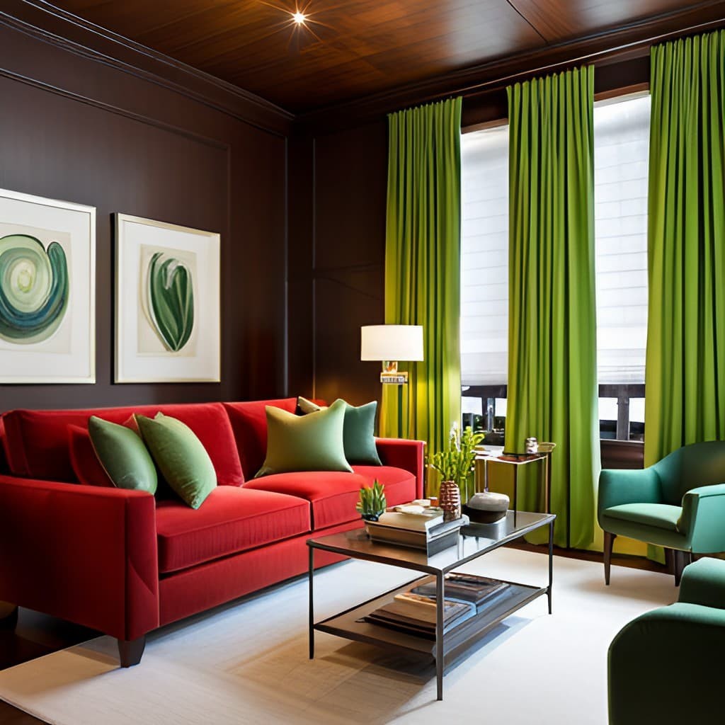
Red, Green, and Natural Wood

The harmonious blend of red, green, and natural wood creates a warm and inviting ambiance that’s both lively and cozy. The complementary nature of red and green produces a striking contrast when combined with the organic warmth of natural wood. This trifecta can be arranged in various ways to evoke distinct moods and styles.
For instance, juxtaposing deep red accents – such as a plush armchair – against a backdrop of natural wood flooring and verdant walls can craft a rich and snug atmosphere, ideal for a winter retreat. Conversely, sprinkling green elements into a space dominated by red and natural wood can inject a refreshing and rejuvenating quality. In terms of materials and patterns, pairing natural wood furniture with lush greenery and pops of red creates a visually appealing combination.
Additional textures, such as plaid or florals, can add depth and visual interest to the space. Ultimately, this trio of elements is perfect for crafting a cozy and welcoming atmosphere in any room, whether it’s the living room, bedroom, or beyond.
Red, Green, and Tan

In interior design, the harmonious blend of red, green, and tan colors has been a timeless favorite for creating warm and inviting spaces. The complementary relationship between red and green generates a striking contrast, while the neutral tone of tan provides a stabilizing force that softens the boldness of the other two colors.
This color scheme can evoke a broad spectrum of emotions and moods, from the passion and energy of red to the serenity and comfort of green, with tan serving as a soothing anchor. The versatility of this palette allows it to be applied to various design styles, from traditional to modern, making it an adaptable choice for diverse purposes and personalities.
To achieve a cohesive look, designers can experiment with different shades and tones of each color, incorporating textures and patterns that add dimensionality and visual interest to the space. Ultimately, the combination of red, green, and tan is a sophisticated and refined option that can elevate any room’s aesthetic.
Red, Green, and Terra Cotta
The trifecta of red, green, and terra cotta creates an unparalleled warmth and coziness in any room. Red, with its bold and vibrant undertones, injects passion and energy, while green’s calming and refreshing essence symbolizes growth and harmony. Terra cotta, with its earthy and warm characteristics, adds depth and richness to the space. When combined, these colors harmonize to create a welcoming atmosphere that can be applied across various interior design aspects.
For instance, pairing a red sofa with green throw pillows and terra cotta curtains can craft a cozy living room. Alternatively, painting walls green and introducing red and terra cotta accents through rugs, vases, or artwork can infuse warmth into a bedroom. To effectively integrate this color scheme, it is crucial to incorporate complementary textures, fabrics, patterns, and accessories.
For example, combining plush green velvet with a red and terra cotta paisley rug can create a luxurious and inviting space. Similarly, incorporating natural materials like wood or stone can amplify the earthy vibe of this palette.
Red, Green, and White
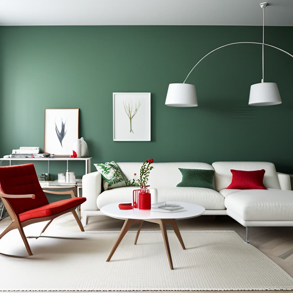
This timeless color combination of red, green, and white is a versatile palette that can bring a sophisticated touch to any interior design. The emotional resonance of these colors can evoke varying moods and perceptions depending on the viewer’s perspective. Red, with its connotations of passion, energy, and warmth, harmonizes with green, representing growth, renewal, and harmony, while white embodies purity, clarity, and simplicity.
This combination is particularly well-suited for seasonal decor during holiday seasons, where it can create a festive atmosphere. Moreover, the colors have rich historical significance and cultural associations, being closely tied to Christmas and winter celebrations. The palette’s connection to nature can also be leveraged by incorporating shades of green reminiscent of foliage and leafy plants.
To successfully incorporate this color scheme, balance is key, using one dominant color as a base and adding accents through various design elements. Avoid overwhelming the space with excessive use of any single color. Instead, consider applying variations of the colors to create interest and depth. For instance, a statement wall in deep red, paired with white furniture and green accessories, can produce a dramatic and chic look.
Alternatively, soft green on walls, accented by red and white through pillows, throws, or artwork, can generate a serene and relaxing ambiance.
Red, Green, Canary Yellow, Blue, and Pink

Transforming a space into a vibrant and energetic atmosphere is achievable by combining the colors red, green, canary yellow, blue, and pink. This harmonious blend of hues creates an ideal setting for children’s rooms or recreational areas, fostering a playful and cheerful ambiance.
Each color in this palette holds its own significance: red embodies passion and energy, green symbolizes growth and harmony, canary yellow radiates brightness and optimism, blue represents calmness and serenity, and pink adds a touch of femininity and sweetness. To successfully integrate these colors, it’s crucial to strike a balance and use them thoughtfully throughout the design.
A neutral base color like white or beige provides an excellent foundation for incorporating pops of red, green, canary yellow, blue, and pink through furniture, fabrics, or accessories. For instance, a white room featuring a red sofa, green accent chairs, canary yellow throw pillows, blue curtains, and pink artwork can result in a cohesive and playful look. To add visual interest and depth, incorporate bold prints and patterns like stripes, polka dots, or florals.
Similarly, combining different textures such as plush rugs, soft fabrics, or sleek surfaces can create a dynamic and visually appealing space. To avoid overwhelming the senses, use these colors sparingly and strategically, with each color making a statement. In terms of furniture, opt for neutral pieces that can harmonize with the bold colors. For example, a beige sectional sofa paired with red and green throw pillows and a canary yellow accent chair can create a balanced look.
Additionally, incorporating wooden furniture or natural elements like plants or flowers can add warmth and balance to the space.
Red, Mint Green, and Pink
This bold and vibrant color palette featuring red, mint green, and pink has the power to transform any room into a lively and energetic space. When combined, these colors create a dynamic and harmonious look that’s perfect for youthful spaces like children’s bedrooms or creative studios. Red embodies passion and energy, while mint green represents growth and harmony, and pink adds a touch of femininity and sweetness.
To effectively integrate and balance these colors, consider using them sparingly and strategically. A neutral base color, such as white or beige, can provide a calm backdrop for pops of red, mint green, and pink through accessories like throw pillows, artwork, or curtains. Texture plays a crucial role in adding depth and interest to the room, whether it’s plush rugs, soft fabrics, or sleek surfaces.
For instance, a white room with a bold red accent wall, soothing mint green bedding, and playful pink throw pillows can create a harmonious yet lively look. When incorporating these colors, it’s essential to consider which specific elements or features of the room would suit each color best. Red can make a statement as an accent on a bold wall or in artwork, while mint green can provide a calming atmosphere through bedding or curtains.
Pink adds sweetness and femininity, making it ideal for accessories like throw pillows or lighting. To avoid overwhelming the space, it’s vital to use moderation and balance when working with this bold palette. One or two main accent colors, supported by subtle pops of the other hues, can create a playful yet harmonious space. Ultimately, this color combination has the potential to make a bold statement in any room when used thoughtfully and in moderation.
Red, Teal, and Mustard Yellow

Red’s bold and vibrant nature makes it an excellent choice for injecting passion and energy into a living room or dining room. Teal’s calming and refreshing hue, on the other hand, creates a sense of tranquility and relaxation, making it perfect for bedrooms and bathrooms. Mustard yellow adds warmth and sophistication to designs, and its versatility allows it to thrive in various rooms like kitchens and home offices.
To strike the right balance between these colors, start with a neutral base and use them sparingly through accessories like throw pillows, curtains, or artwork. Mixing textures such as plush rugs, soft fabrics, or sleek surfaces adds depth and visual interest. Consider the room type when choosing which color to emphasize: warm red for living rooms and dining areas, calming teal for bedrooms and bathrooms, and sophisticated mustard yellow for kitchens.
Accentuate the style with metallic accents like copper or gold for a touch of luxury and glamour, or incorporate natural materials like wood or stone to enhance the earthy vibe. For instance, pair a red sofa with teal throw pillows and a mustard yellow rug for a cozy living room, or paint walls neutral and add pops of color through accessories for a bedroom. Blending colors adds dimensionality to the design.
Try using soft teal on walls and adding red and mustard yellow accents through accessories for a serene ambiance, or pair a mustard yellow sofa with teal and red throw pillows for a dynamic space. By combining these bold colors in moderation, you can create a unique and inviting atmosphere that reflects your personal style.
Red and Green in Fashion
Red and green, the dynamic duo of colors, can add a dash of excitement to any outfit. Whether you’re looking to make a bold statement or simply want to add some visual interest, these two vibrant hues can work together in harmony. Here’s how to style them for maximum impact. When it comes to pairing red and green, remember that they’re complementary colors, meaning they sit opposite each other on the color wheel.
This means you can create a striking contrast by combining a rich red with a deep green. But if bold colors aren’t your thing, don’t worry – there are plenty of ways to incorporate them into your wardrobe without going all out. Start small by adding red or green accessories, like a scarf or shoes, to a neutral outfit. This is a great way to ease into the world of bold colors. Alternatively, try mixing shades of red and green with earthy tones, like beige or brown, for a more subtle approach.
And if you really want to go all out, pair red and green with metallic accents, like gold or silver, for a festive look. When it comes to putting together an outfit featuring red and green, the possibilities are endless. A classic holiday look might involve pairing a green velvet dress with red heels and gold accessories. For a more casual vibe, try combining a red sweater with dark green jeans and brown ankle boots.
Alternatively, you could opt for a polished and professional look by tucking a red blouse into a green skirt and adding black tights and pumps. Of course, the key to pulling off an outfit featuring bold colors is accessories. Gold jewelry can add a touch of glamour, while animal prints like leopard or snakeskin can add texture and interest. A black leather jacket can also add edge to a red and green outfit.
And finally, don’t be afraid to experiment with different combinations – like pairing a green handbag with a red dress or adding a red scarf to a green coat. Incorporating red and green into your wardrobe can be a fun and stylish way to express yourself and make a statement. By following these tips and experimenting with different ensembles, you’ll be able to rock the bold colors with confidence and flair.
Red and Green in Logo and Graphic Design
In the realm of branding and logo design, color occupies a pivotal position. By cleverly selecting a palette, designers can craft a visual identity that resonates with audiences, communicates key messages, and leaves a lasting impression. The combination of red and green, in particular, has proven to be a winning formula for many successful logos. This bold pairing is capable of evoking strong emotions, conveying vital information, and establishing a brand’s distinct character.
The Importance of Color in Branding and Logo Design
In branding and logo design, color plays a vital role in evoking emotions, shaping behavior, and conveying messages without the need for words. To build a strong connection with customers and make a brand more recognizable, it is essential to select a color scheme that harmonizes with the brand’s values and resonates with its target audience. Each hue has unique associations and meanings, such as red’s link to energy, passion, and excitement, while green embodies growth, nature, and harmony.
When combined, these colors can create a dynamic and visually stunning logo that effectively communicates the brand’s message.
Examples of Successful Red and Green Logos
The use of red and green colors in logos is not unique to small startups or unknown brands; some of the most recognizable global companies have leveraged these hues to create iconic branding. Starbucks, Coca-Cola, and Heineken are just a few examples of successful enterprises that have effectively employed this color combination. The Starbucks logo, for instance, features a green mermaid surrounded by a circular frame with white and green accents.
This design embodies the brand’s commitment to sustainability through the green hue, while the clean and modern aesthetic is achieved through the harmonious balance of colors. Similarly, Coca-Cola’s script-based logo incorporates red and white lettering with a green leaf in the background. The bold red color conveys energy and excitement, while the green leaf symbolizes the company’s dedication to environmental sustainability.
Heineken’s logo takes a different approach by combining a green star with a red banner and white text. The dominant green tone represents the brand’s connection to nature, whereas the red banner injects a sense of vibrancy and enthusiasm. By cleverly utilizing these colors, these globally recognized brands have created logos that are not only visually striking but also reflective of their core values.
Tips for Designing with Red and Green in Graphic Design Projects
To achieve a harmonious balance between red and green in graphic design projects, it’s crucial to strike a delicate equilibrium between contrast and cohesion. Here are some expert tips to ensure your design stands out:Firstly, incorporate a neutral background color to temper the boldness of the red and green hues. This will prevent the overall composition from feeling overwhelming. Next, explore various shades of red and green to introduce depth and visual interest to your design.
This subtle nuance can make all the difference in captivating your audience’s attention. When it comes to typography, using white or black lettering against a red and green backdrop can create striking contrast and add an extra layer of sophistication to your design. Before finalizing your concept, consider the target audience and the cultural associations they may have with these colors. This will enable you to tailor your design to resonate with your intended viewers.
Finally, don’t be afraid to experiment with different combinations of red and green to forge a truly unique and visually stunning design that showcases your creative flair.
Breaking the Holiday Stereotype
While red and green are often synonymous with the holiday season, these colors can also add a pop of creativity and vibrancy to non-holiday settings. In fact, research has shown that the combination of red and green can boost productivity and inspire new ideas in the workplace. One way to incorporate this color combination is by using it as an accent against a neutral or monochromatic backdrop.
A statement piece of furniture, throw pillows, or artwork in shades of red and green can bring warmth and energy to a room. Alternatively, you can pair these colors with unexpected hues like bright pink or turquoise to create a bold and playful atmosphere. The versatility of red and green is truly remarkable – their unique blend of warmth and freshness allows for a wide range of styles and moods, from rustic farmhouse charm to modern minimalism.
Whether you’re looking to add some personality to a room or simply want to inject some creativity into your daily routine, the possibilities are endless when it comes to using red and green in non-holiday settings.
Conclusion
While the combination of red and green may seem simple at first glance, it holds a profound potential for creating visually striking and impactful designs. This pairing can be used in various contexts, from festive marketing campaigns to modern website designs, allowing designers to convey a range of emotions and messages with precision. As creatives, experimenting with red and green color combinations is an excellent way to push the boundaries of personal and professional projects.
With thoughtful consideration and deliberate application, the results can be nothing short of breathtaking. Moreover, it’s essential to recognize the profound impact that color has on human emotion and behavior. Research has consistently shown that color can influence mood, behavior, and even purchasing decisions, making color selection a crucial aspect of the design process.
In essence, the strategic use of red and green in design can be a potent tool for visual communication, worthy of exploration and attention to detail. As designers, we have the unique ability to harness the emotional and psychological power of color to craft memorable and effective visual experiences that leave a lasting impression on our audiences.
FAQs
Is it possible to combine red and green in interior design?
When it comes to combining red and green in interior design, it’s crucial to strike the right balance. By carefully weighing the possibilities and planning thoughtfully, you can create a harmonious fusion of these two bold colors that will add depth and visual interest to your space.
What are the different shades of red and green that can be used together in interior design?
In the realm of interior design, the harmonious marriage of red and green hues is a timeless favorite. While there are numerous shades to explore, some particularly striking combinations include the dramatic pairing of dark green with rich burgundy or maroon tones, the earthy union of olive green with deep crimson, and the bold juxtaposition of emerald green with vibrant scarlet.
How can red and green be used together in interior design to create a cohesive look?
When combining red and green in interior design, achieving harmony lies in finding a balance between the two vibrant hues. One effective approach is to let one color take center stage while subtly incorporating the other. Alternatively, introducing neutral shades like white, beige, or gray can create a cohesive visual flow that ties everything together.
What are some tips for using red and green together in interior design?
When it comes to incorporating red and green into your interior design, there are several strategies you can employ to achieve a cohesive and visually appealing result. One approach is to designate one color as the dominant hue and use the other as an accent color, which can add depth and visual interest to the space. Another option is to incorporate patterns that feature both colors, such as a bold red and green striped rug or a vibrant green and red geometric wallpaper.
Additionally, introducing metallic accents like gold or silver can elevate the overall aesthetic of the room, imbuing it with a touch of luxury.
Can red and green be used in any room or are there certain rooms where they work better?
When it comes to incorporating red and green into your interior design, it’s crucial to consider the room’s purpose and overall aesthetic. While these bold colors can be used effectively in any space, the specific shades and patterns you choose should be tailored to the room’s unique characteristics.
For instance, rich, deep tones of green and red might create a sophisticated ambiance in a formal dining area, whereas brighter, more vibrant hues could bring energy and playfulness to a children’s playroom or home office. By carefully selecting the right shades and patterns for your space, you can create a cohesive and inviting environment that reflects your personal style.
What other colors can be combined with red and green in interior design?
When it comes to combining red and green, the possibilities are endless. This dynamic duo can be paired with a range of other hues to create a truly one-of-a-kind visual effect. For instance, adding metallic accents like gold or silver can add a touch of sophistication and glamour, while blue or purple tones can introduce a sense of calm and serenity.
Alternatively, incorporating neutral shades like white or beige can help ground the look and provide a subtle contrast to the boldness of red and green.