Is Dove Grey A Blue Grey?
What is Dove grey?
Dove grey is a pale grey color with subtle hints of blue or pink undertones. The name “dove” refers to the soft, subtle coloration of dove birds, which often feature grey, beige, and brown plumage. As a color name, “dove grey” has been in use since the early 20th century.
One of the earliest and most notable uses of dove grey was in the automobile industry. In 1914, the Hudson Motor Car Company began using a custom-mixed dove grey paint on their vehicles. This soft grey color stood out among the more common black vehicles of the time. Dove grey grew in popularity through the 1920s and 1930s as a fashionable and luxurious neutral color for vehicles.
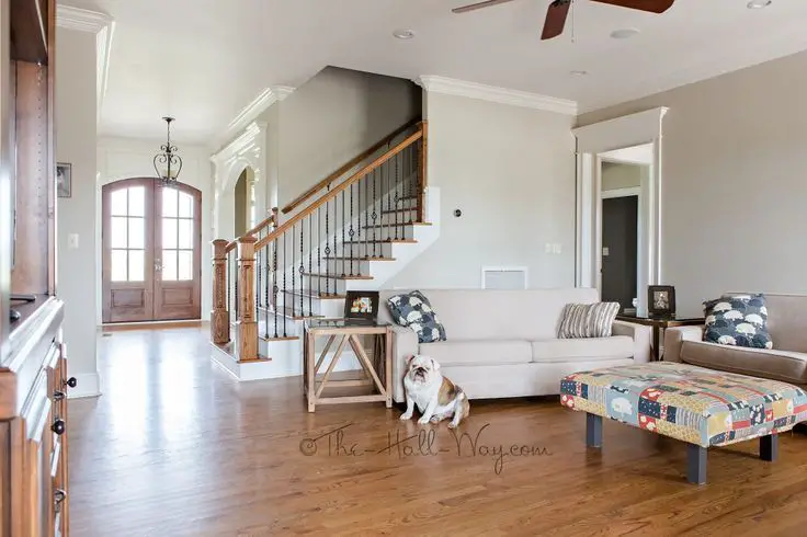
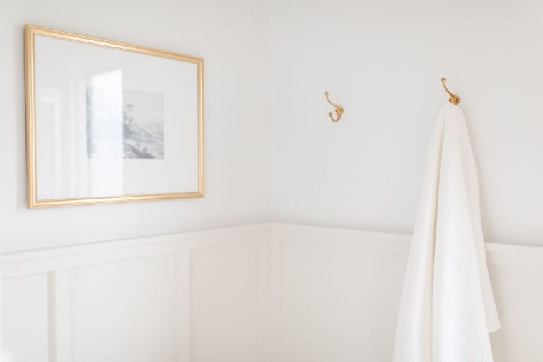
Beyond automobiles, dove grey became widely used in interior design and architecture. Its muted tone created an airy and refined feel in homes and commercial spaces. Dove grey remains a popular neutral wall color today, often used in living rooms, bedrooms, and bathrooms. It provides a soothing backdrop without dominating a space.
In fashion, dove grey is a staple neutral shade, especially for business attire. It bridges the formality of black and navy with the softness of lighter greys. Dove grey pantsuits and sheath dresses became common professional looks for women in the 1950s and beyond. The color continues to signify professionalism while still appearing elegant.
Is Dove Grey Technically a Blue?
Blue grey is a range of cool greys with a slight blue tint. According to Grafixfather, “Dove grey has a subtle warm undertone that differentiates it from the cooler hues in the blue grey family.”
While Dove grey may have a hint of blue, it tends to read as more of a neutral grey compared to brighter blue greys like cadet grey. Dove grey is much softer and more muted.
Other popular blue greys like slate grey and steel blue have a more pronounced blue cast and feel crisper and cooler toned. Dove grey has subtle warm undertones that give it a softer, more muted look compared to these bolder blue greys.
So while Dove grey sits on the blue grey spectrum, it is among the warmest and most neutral options without having an overt blue appearance.
Dove grey vs other blue greys
Dove grey is frequently characterized as a blue grey, but how does it compare to other popular blue-leaning neutral greys? Colors like Benjamin Moore Stonington Gray, Sherwin Williams Agreeable Gray, and Behr Silver Drop, are all known for their subtle blue-green undertones that temper the warmth of pure grey.
Dove grey sits on the cooler, bluer end of the grey spectrum compared to these paint colors. Benjamin Moore Stonington Gray has more green-gray undertones, lending it a slightly warmer, more relaxed feeling than Dove grey. Sherwin Williams Agreeable Gray also skews slightly more green-beige than Dove grey. Finally, Behr Silver Drop has a hint of violet-blue that creates a sense of sophistication and modernity compared to Dove grey’s more straightforward, tranquil blue-grayness.
While Dove grey shares the blue-grey family with these popular neutral paint colors, its crisp, icy undertone sets it apart. Dove grey is sometimes described as having a hint of blue-violet, giving it a cooler, crisper feeling than the blue-green greys. This makes Dove grey ideal for creating a clean, bright, airy look.
Use of Dove Grey in Design
Dove grey has become a popular neutral color choice among interior designers, architects, and other design professionals. Its soft, muted tone allows it to work well as a background color that doesn’t overpower. Dove grey can help create a soothing, relaxed aesthetic when used carefully in room designs and decor.
Interior designers often recommend Dove grey for bedrooms, living rooms, and other calm environments. The neutral grey tone serves as a blank canvas that allows accent colors and decor to pop. Dove grey is commonly seen in minimalist, modern, and Scandinavian design styles where clean lines and muted colors are emphasized.
Many designers say Dove grey has just enough depth and saturation to keep a space feeling warm and cozy, while still remaining a neutral backdrop. Compared to brighter whites or cooler greys, Dove grey strikes a pleasing balance. Designers may use it on walls or larger furniture pieces as a foundational color and then layer in touches of colors like blue, green, pink or yellow to add visual interest.
Overall, Dove grey is appreciated by designers for its versatility as a neutral that can adapt well to a variety of styles and spaces. It provides a soothing and elegant starting point upon which other decor colors and elements can build.
Dove Grey in Fashion
Dove grey has long been a popular color in fashion, with its soft, muted hue lending an elegant and refined look to clothing and accessories. Historically, dove grey gained prominence as a fashionable color in the mid-19th century. During the Victorian era, dove grey dresses and gowns were considered highly fashionable, often made from fine wools or silks.
According to The Drape, undyed wool in the 19th century was naturally a greyish color, leading to an association of dove grey with quality fabrics. An example is this 1860’s dove grey silk dress featuring a rose print, demonstrating how the color was used in women’s daywear.
Today, dove grey remains a staple neutral color for clothing items ranging from dresses, pants, and sweaters to accessories like handbags, shoes, and scarves. It has a refined look that works for many styles and occasions, from casual everyday wear to formal events. Style icons like Audrey Hepburn have embraced the color, wearing elegant dove grey outfits that exude class.
Dove Grey in Marketing
Dove grey is a popular color choice in marketing and branding due to its subtle, refined, and elegant connotations. Many high-end fashion and beauty brands utilize dove grey in their logos, packaging, and branding to evoke luxury, sophistication, and classic style.
Notable brands that feature dove grey include:
- Dove – The beauty brand uses a greyish tone for its iconic Dove logo and white and grey self-care product packaging. The soft dove grey connotes the brand’s gentle, caring ethos (Source).
- Tiffany & Co. – The iconic jewelry brand uses a signature robin egg blue color, but often incorporates dove grey tones into its packaging and brand materials to complement the blue and connote refined luxury.
- Chanel – The fashion house utilizes dove grey paired with black and white in many of its handbag and accessory designs to create a polished, elegant aesthetic.
In marketing, dove grey strikes a balance between feeling upscale and approachable. It has an air of authority while still feeling soothing and subtle. This allows brands to communicate prestige and quality without seeming overly ostentatious or cold.
Psychological Effects
The psychological effects of the color Dove grey have been studied by researchers. Dove grey elicits feelings of calmness, sophistication, and balance (Source). Studies have found that lighter shades of grey like Dove grey create a soothing environment that reduces stress. Participants in psychological experiments rate spaces painted in Dove grey as feeling comforting and stable.
Researchers theorize that the muted nature of Dove grey does not overstimulate the senses, creating a relaxed feeling. Neutral greys like Dove grey are seen as tranquil colors that encourage introspection and quiet focus. Designers often recommend using Dove grey in bedrooms, home offices, and living spaces to promote restfulness. It conveys elegance and composure without coming across as too austere.
Dove grey differs from darker greys that may feel dreary or gloomy. The warmth from its blue undertones gives Dove grey a polished, inviting quality according to color theorists. While bright shades engage the senses, the subtlety of Dove grey allows the mind to unwind. This makes it an ideal choice for creating a soothing retreat.
Cultural meanings
Dove grey has developed various cultural associations and symbolic meanings throughout history. In Western cultures, dove grey is often associated with neutrality, calmness, and tranquility due to its soft and muted appearance. The color dove grey evokes a sense of sophistication and elegance, especially in fashion and interior design.
In Christianity, the dove is a symbol of the Holy Spirit and peace. As a result, dove grey carries spiritual connotations and is sometimes used in religious iconography and architecture to represent purity and divinity (Source). Some view dove grey as symbolic of resurrection and rebirth.
In parts of Asia, dove grey can signify mourning, grief, and loss when used in rituals and ceremonies honoring the deceased. For example, dove grey is a traditional funeral color in some Chinese cultures. In contrast, dove grey represents vitality and happiness in Indian culture.
Historically, dove grey became popular during the 18th century and was associated with the Rococo art movement in Europe. The soft, feminine hue was fashionable among French and British nobility. Dove grey gowns and suits were a staple in aristocratic wardrobes.
Dove Grey in Nature
Dove grey is a subtle, neutral shade that draws inspiration from the gentle, muted tones found in nature. Its origins come from the plumage of doves and pigeons, which range in color from pale grey to beige-brown (1). The soft, feathered texture of these birds inspired the name and light, understated quality of dove grey.
Beyond bird plumage, dove grey can be seen in weathered wood, light stone, dry grasses, and other organic materials that fade over time. For example, weathered cedar shakes on coastal homes often turn a dove grey color from sun exposure. Large rocks smoothed by water develop a similar stony, pale grey. Dry prairie grasses in the winter take on subdued grey-beige tones (2).
These examples from nature showcase the muted, neutral essence of dove grey. As a color, it draws inspiration from the gentle weathering, aging, and subtle color shifts found in natural materials over time.
Alternatives to Dove Grey
While Dove grey is a popular neutral shade, there are many other grey tones that can work well as substitutes in certain situations. Here are some top alternatives to consider:
Boulder – This is a lighter grey that has a subtle warmth to it. It can create a softer, more approachable look than Dove grey. Boulder works well in kids’ rooms or relaxed living spaces where you want a light, airy feel.
Carbon Grey – For a grey with more vibrancy and brightness, Carbon grey is a good choice. It has a bluer undertone than Dove grey. Carbon grey can create a sleek, modern look and pairs nicely with other saturated colors. It’s ideal for contemporary kitchens, bathrooms or offices.
Cloudy Grey – This very light, soft grey has a hazy, ethereal look. It’s great for bedrooms, as it promotes relaxation. Cloudy grey also works nicely in romantic or vintage styled spaces where you want a dreamy ambiance.
Smokey Grey – With more depth than Dove grey, Smokey grey has a charcoal-like richness. It feels upscale and refined. Use Smokey grey in place of Dove grey when you want a moodier, more sophisticated vibe.
In summary, lighter greys like Boulder or Cloudy can substitute Dove grey in relaxed, casual spaces, while deeper, bluer greys like Carbon and Smokey work for sleek modern or elegant traditional designs. The undertone and depth of grey ultimately impacts the overall look and feel.