15 Stunning Tile Colors To Complement Cherry Cabinets Perfectly
Choosing the right tile color to complement cherry cabinets can be a daunting task, especially with the rich and elegant tone they bring to the kitchen. The wrong choice can result in an awkward and mismatched look, while the perfect pairing can elevate the natural beauty of cherry wood and create a harmonious space. With 15 tile color options that seamlessly integrate with cherry cabinets, this article will guide you through the process of selecting the ideal hue for your kitchen renovation.
You’ll discover the characteristics of cherry cabinets, styles to consider, factors to take into account when choosing tile colors, and how lighting, kitchen size, and overall aesthetic impact the final decision. From neutral shades like white and beige to bold options like navy blue and terracotta, we’ve curated a diverse range of tile color options that will help you achieve a stunning and cohesive look in your kitchen.
Understanding Cherry Cabinets
Characteristics
Cherry wood is renowned for its striking, reddish-brown hue that exhibits a range of tones from light to dark. This natural variability ensures each cabinet boasts a one-of-a-kind appearance, imbuing your kitchen with character. As the years pass, cherry wood undergoes a transformation, gradually deepening in color and acquiring an even more resplendent beauty. It’s little wonder this coveted wood tone remains a popular choice among homeowners seeking to elevate their kitchen’s aesthetic.
Styles
Cherry cabinets are incredibly adaptable, capable of seamlessly integrating into diverse kitchen settings. In traditional kitchens, they infuse warmth and sophistication, effortlessly complementing classic designs. Meanwhile, in modern spaces, the rich tone of cherry cabinets provides a bold contrast to sleek, minimalist aesthetics, creating a visually striking harmony.
For those seeking a rustic ambiance, cherry cabinets bring a cozy, inviting essence that harmonizes beautifully with natural elements and vintage decor, ultimately crafting a warm and welcoming atmosphere.
Factors to Consider When Choosing Tile Colors
Lighting
When it comes to creating an inviting kitchen atmosphere, lighting plays a crucial role in enhancing the appearance of your tile and cabinets. While natural light can bring out the best in your tile, making it look vibrant and radiant, artificial lighting can have a contrasting effect, potentially dulling its appearance. To ensure your kitchen always looks its best, consider how both types of light will interact with your tile at different times of day.
This simple consideration can help you avoid any unwanted surprises and create a harmonious visual flow that showcases the beauty of your tile.
Kitchen Size
When selecting tile colors for your kitchen, it’s crucial to consider the room’s size. In smaller kitchens, lighter hues can create an illusion of more space and openness, while darker shades may have the opposite effect, making the area feel cramped. Conversely, larger kitchens can accommodate darker tiles, which can add depth and a cozy ambiance. By choosing tile colors that harmonize with your kitchen’s size, you can significantly impact the overall atmosphere and functionality of the space.
Overall Aesthetic
Crafting a harmonious visual identity in your kitchen requires a thoughtful approach that extends beyond just cabinets and tiles. The interplay between countertops, appliances, and other elements must be carefully considered to create a cohesive look. When selecting tile colors, it’s essential to envision how they will interact with the rest of your kitchen’s design components, fostering a seamless and inviting space that exudes a sense of completeness and warmth.
Tile Color Options
White

The subtle elegance of white tile backsplashes creates a stunning visual juxtaposition when paired with rich, dark cherry cabinets. This harmonious combination not only adds a touch of sophistication to the kitchen but also has a profound impact on the overall ambiance, injecting a sense of freshness and airiness that makes the space feel larger than it is.
Cream/Beige
Pairing cream or beige-toned tiles with cherry wood furniture creates a warm and welcoming ambiance, reminiscent of cozy family gatherings. The gentle hue of the tile perfectly complements the rich, reddish tones of the wood, resulting in a space that exudes comfort and hospitality.
Light Gray
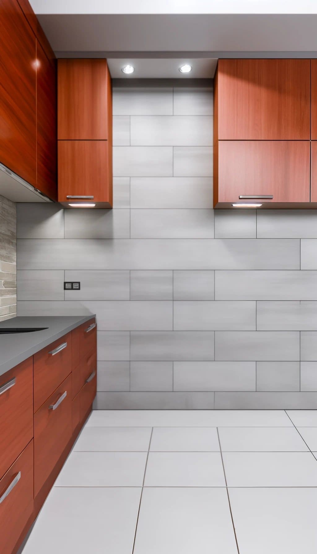
The subtle nuance of light gray tiles brings a touch of sophistication to the kitchen, providing a versatile backdrop for bold cherry cabinets. This understated combination effortlessly conveys a modern and contemporary aesthetic, elevating the space with its sleek and refined vibe.
Dark Gray

Introducing a stylish twist to traditional kitchen designs, dark gray tiles bring a modern flair by creating a sophisticated contrast against richly hued cherry cabinets. This harmonious union allows the bold color of the cabinets to take center stage while the tile’s subtle undertones add depth and visual interest.
Black
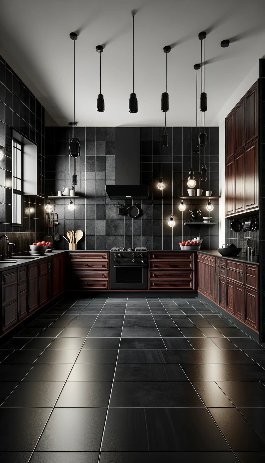
Selecting black tiles for your kitchen is a daring decision that yields a striking, high-contrast aesthetic. By doing so, you’re introducing a sleek, contemporary flair that sets your space apart from the ordinary.
Light Blue

Softly illuminating the kitchen space, light blue tiles exude a sense of calmness and tranquility. Their subtle hue creates a harmonious balance when paired with the warm tones of cherry cabinets, resulting in a visually appealing combination that adds depth to the room without overpowering its natural ambiance.
Navy Blue
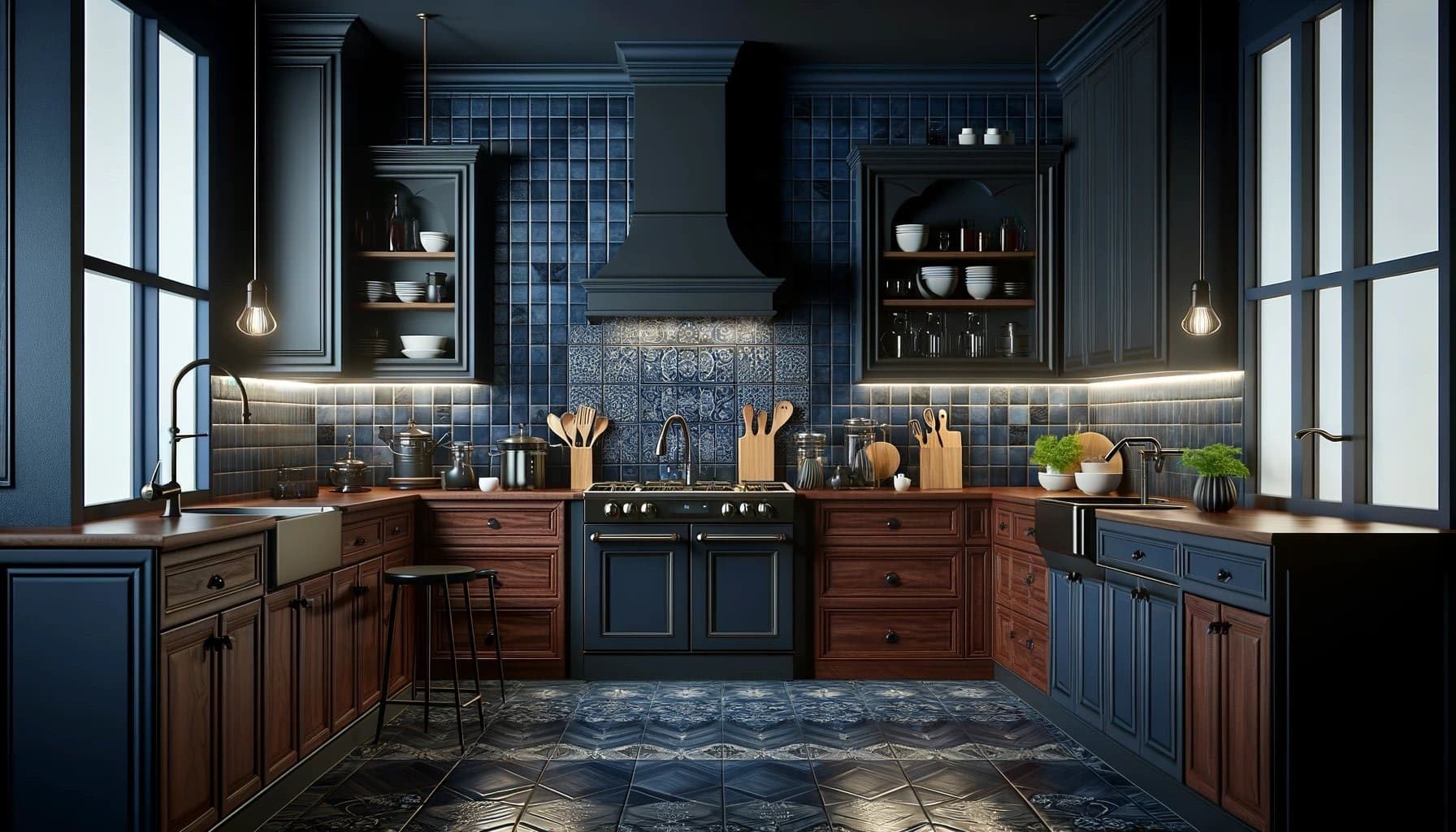
The harmonious blend of navy blue and cherry wood creates a refined and luxurious atmosphere in your kitchen. The dark, rich tone of navy blue tiles complements the deep, warm undertones of cherry wood beautifully, resulting in a sophisticated and stylish design that exudes elegance.
Green (Mint/Sage)

Incorporating mint or sage green tiles into your kitchen design can have a calming effect on the senses. The earthy tones evoke a connection to nature, creating a refreshing atmosphere that’s perfect for cooking and dining. When paired with cherry cabinets, these soothing hues bring a sense of balance and serenity, making your kitchen feel like a peaceful retreat.
Olive Green

The olive green hue brings a sense of understated refinement to the space, harmonizing beautifully with the rich warmth of the cherry wood. As a result, it imbues the kitchen with an air of sophistication and coziness, creating a welcoming atmosphere that’s perfect for gathering with family and friends.
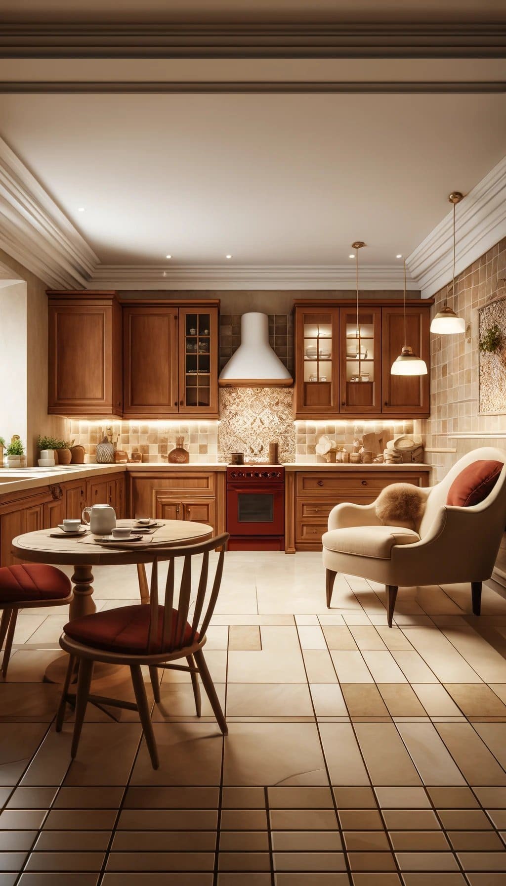
Brown/Tan
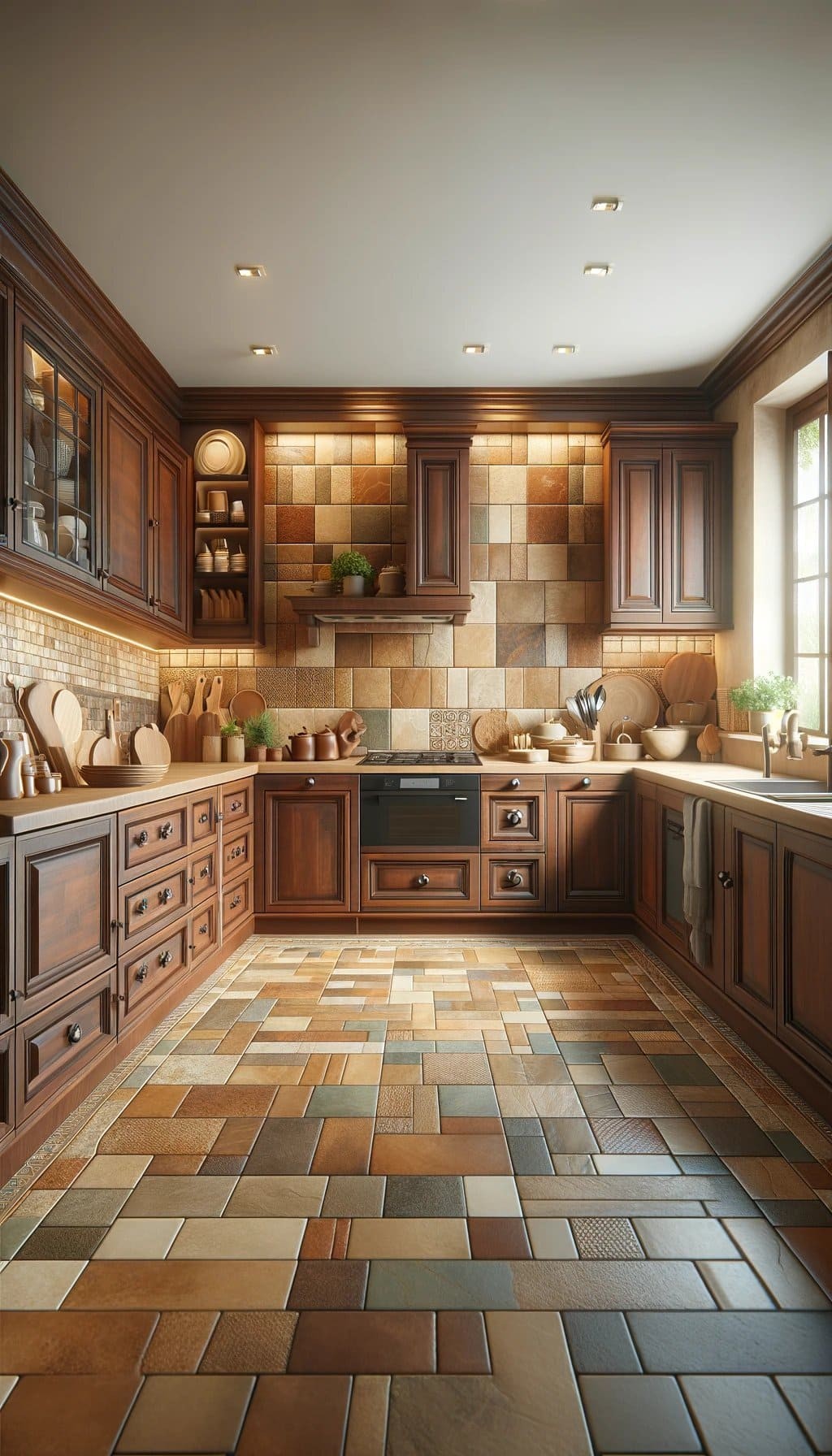
When it comes to combining tile colors with cherry cabinets, opting for brown or tan hues can create a stunning visual harmony. These earthy tones blend effortlessly with the rich, deep red of the cabinetry, resulting in a warm and inviting atmosphere that’s perfect for a cozy kitchen setting.
Terracotta

The warm tones of terracotta perfectly complement the rich, earthy undertones of cherry wood, imbuing your kitchen with a cozy, rustic ambiance that’s hard to resist. The inviting quality of this color combination creates a sense of warmth and welcome, making it an ideal choice for a kitchen where family and friends gather.
Gold/Yellow
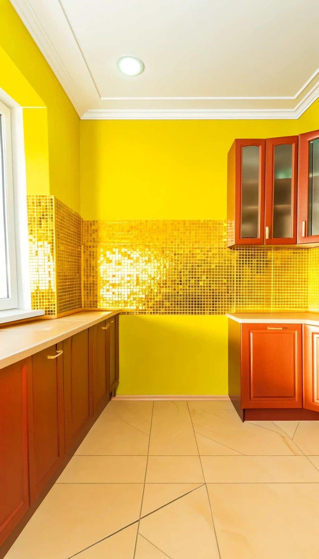
Incorporating golden or yellow hues into your kitchen design can instantly add a burst of warmth and energy. The vibrant tone brings a sense of optimism and joy, perfectly complementing the deep, rich tones of cherry wood cabinets. This harmonious combination creates a welcoming atmosphere that’s sure to brighten up any room.
Red
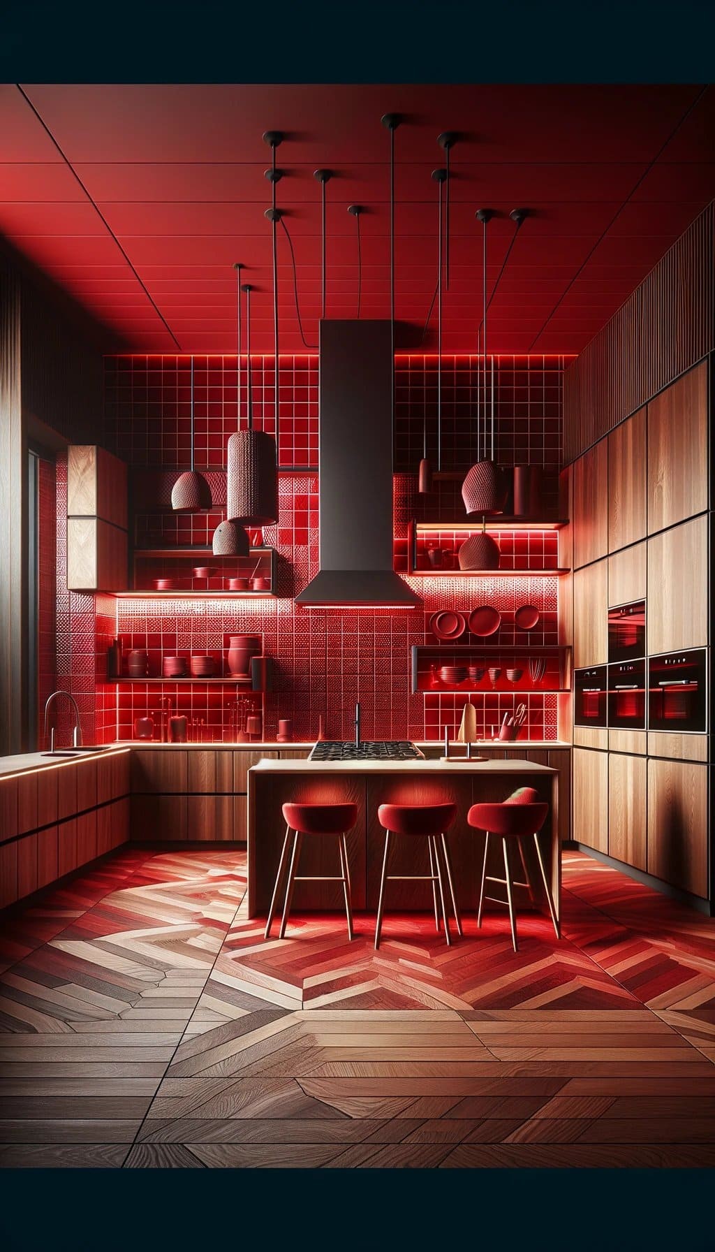
By incorporating red tiles into your design, you can create a striking, monochromatic aesthetic that showcases the inherent beauty of cherry wood. The varying shades of red add depth and visual interest to the space, setting your kitchen apart from more traditional designs.
Burgundy

The marriage between burgundy and cherry wood is a match made in heaven. The deep, rich hue of burgundy not only complements the warm tones of the cherry wood but also amplifies its natural beauty. This harmonious union brings a level of sophistication and luxury to your kitchen, instantly elevating it from ordinary to extraordinary.
Mosaic/Multicolored

By incorporating mosaic or multicolored tiles into your kitchen design, you can inject a burst of creativity and visual appeal. The versatility of these tiles allows you to combine multiple colors, which can be perfectly harmonized with cherry cabinets, resulting in a lively and engaging atmosphere that’s sure to spark conversation.
Conclusion
Transforming your kitchen into a stunning space begins with selecting the perfect tile color to complement your cherry cabinets. The right hue can elevate your kitchen’s style and cohesiveness. You have a wide range of options, from clean and modern whites and grays to warm and inviting creams, beiges, and earthy tones. For a bold contrast, consider rich colors like black or deep blues that add sophistication and elegance.
If you prefer a natural look, opt for soft pastels like mint, sage, or olive green that bring a calming atmosphere. Terracotta, brown, and tan hues create a harmonious balance, while cheerful gold and yellow tones brighten up the space. For added flair, try unique options like bold reds and burgundies or mosaic and multicolored tiles that allow for creative expression.
Whatever your preference, these tile color options ensure that your cherry cabinets remain the focal point of your beautifully designed kitchen.