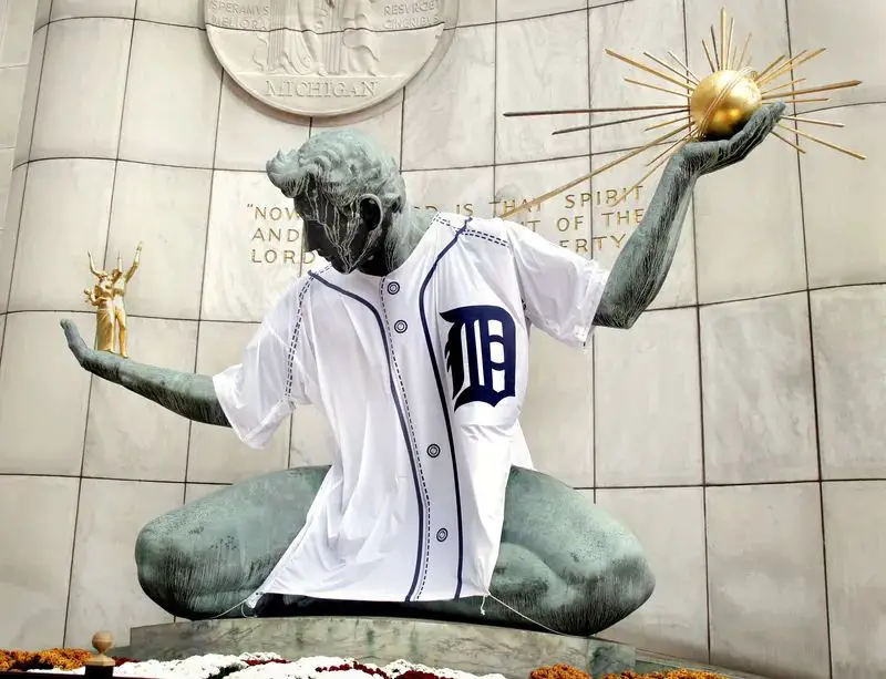
What Font Is The Old English D?
The Old English D font, featured prominently as the logo for the Detroit Tigers baseball team, has a long and storied history dating back to the early 20th century. Though commonly referred to as “Old English,” the font’s proper name is Blackletter. Blackletter fonts emerged in the 12th century and were widely used for manuscripts and early printing, especially in Germany. According to sources the Old English D font itself was designed by Monotype in the 1990s as a digital revival of classic Blackletter typefaces.
The font’s distinctive, bold, Gothic-inspired letterforms make it an iconic symbol of Detroit and the Tigers franchise. Though the origins of the Old English D logo trace back to the team’s founding in Detroit in 1901, it rose to prominence on the team’s uniforms in the 1920s and has endured as the defining visual identity for the Tigers for over a century.
Creation
The Old English font, as used in the Detroit Tigers logo, can be traced back to a typeface originally called Blackletter. Blackletter emerged in the 12th century in Europe and became widely used for printing books in Germanic languages. It was known by various names including Gothic, Fraktur, and Old English.
According to the Fonts.com story on Old English, the digital font version was designed by Monotype’s staff around 1990. However, its roots go back much earlier, with similar blackletter-style fonts used in Germany and England dating back hundreds of years. So while the digital Old English font was created fairly recently, the overall style and design has origins going back to medieval times.
Specifically for the Tigers usage, the Old English D derives from a font that was used in the Detroit News and Detroit Free Press newspapers starting in the early 20th century. So when the team adopted the Old English D in 1904, it was drawing from an existing stylized letterform already popular in Detroit publications.
Use in Baseball
The Old English D has been closely associated with the Detroit Tigers baseball team since the early 1900s. According to the Detroit Historical Society, the earliest known use of the Old English D by the Tigers was in 1904 (Source). It was not consistently used until the 1920s when Tigers owner Frank Navin made it the team’s official logo. Navin wanted a distinctive logo to represent the Tigers and chose the stylized Old English D because of its bold, Gothic look.
The Old English D has appeared on Tigers uniforms, signage, and merchandise ever since. It represents the city of Detroit and is a beloved symbol of the ballclub. Generations of Tigers fans have recognized the iconic D logo. Using the Old English font for the D links the team visually to the city’s history and identity in a way no other font could.
Over the decades, the logo has undergone minor design changes in terms of color, proportions, and details. But the Tigers have kept the Old English D at the heart of their branding due to its timeless connection to Detroit baseball. It remains one of the most classic and recognizable logos in all of Major League Baseball.
Visual Elements
The Old English D font has a very distinct visual style known as Blackletter calligraphy. According to https://jakerainis.com/blog/the-history-of-blackletter-calligraphy/, Blackletter fonts are characterized by their thick and thin strokes, angled stress, and dramatic counters and serifs. The Old English D exemplifies these qualities with its thick vertical stems contrasted by hairline horizontal and diagonal strokes.
The letter shapes of the Old English D are very ornate, with flourishing curved details reminiscent of calligraphy. As described by https://design.tutsplus.com/articles/old-english-fonts–cms-28174, the letters have a hand-drawn and elegant style despite the rigid Blackletter structure. This blend of flourish and discipline is part of what makes the font so visually striking and distinctive.
Cultural Impact
The Old English D has become an iconic symbol for the city of Detroit and the Detroit Tigers baseball team. When the Tigers moved to Tiger Stadium in 1912, the ballpark featured an Old English style D on the stadium’s facade. This unique font style, inspired by medieval Blackletter typefaces, helped give the Tigers their own distinct visual identity.

Over time, as the Tigers experienced success and became an important part of Detroit’s culture, the Old English D became closely associated with the spirit of the Motor City. Fans began embracing the D as a badge of honor representing their hometown baseball team. The font evoked a sense of strength, resilience and tradition fitting for a hardworking Midwestern city like Detroit.
As noted by Vintage Detroit, “The Old English D, to baseball fans, is as synonymous with the Tigers now as the Yankee ‘NY’ or the Dodger ‘LA’” (https://www.vintagedetroit.com/old-english-or-old-german-which-d-is-it/). The font has been immortalized through merchandise, tattoos and displays of team pride. Over a century later, the Old English D remains an iconic symbol of Detroit’s identity and culture.
Popularity
The Old English D font, also known as Blackletter, is widely recognized around the world as the symbol of the Detroit Tigers baseball team. However, its popularity extends far beyond baseball. The font has been in use since the Middle Ages, with origins dating back to the 12th century in Europe. It was commonly used for manuscripts and early printing presses before more modern fonts became widespread (Source: Where did the iconic Detroit “D” come from?).
Even though newer fonts have largely replaced it, Old English remains recognizable and evocative of medieval times. It is frequently used in popular culture to signify “old-timey” lettering, often on pub signs, wine labels, and other marketing materials wanting to convey a sense of history and tradition. The font maintains popularity in tattoo culture as well, with the Detroit Tigers’ Old English D being a common tattoo among fans. Overall, while mainly seen today as the Tigers’ logo, the Old English D font continues to be identifiable and impactful centuries after its peak usage, retaining cultural significance even outside of baseball. (Source: Old English or Old German: Which D Is It?)
Criticism
The Old English D font has faced some controversy and criticism over the years due to its association with blackletter typefaces. Blackletter fonts like Old English were used extensively in Nazi Germany, leading many to associate these fonts with German nationalism and fascism (The Blackletter Typeface: A Long And Colored History). After World War II, blackletter fonts fell out of favor in most parts of the world because of these negative associations.
More recently in 2019, there was controversy when a high school principal in California banned students from using “dangerous” fonts like Old English on posters, citing concerns about gang affiliations (The Case of the Dangerous Font). Critics argued this ban violated students’ free speech rights and unfairly targeted certain styles of typography.
Overall, while the Old English D has strong roots in Detroit baseball culture, its stylistic origins as a blackletter font have led some to criticize its usage in certain contexts due to associations with questionable political movements or stereotyping of urban culture.
Digital Usage
The Old English D font has been adapted for use in the digital world in several ways. Many desktop publishing and word processing programs include fonts inspired by or based on the classic Old English style. This allows designers and regular users to incorporate the iconic stacked letter look into digital designs and documents.
There are also entire digital fonts dedicated to recreating the Old English D. These include fonts like Ballparkby Font Diner, which contains the Tigers’ D along with a full set of letters, numbers, and symbols in the Old English style. This makes it easy for digital designers to recreate the classic baseball logo or incorporate those stylistic elements more broadly.
The digital Old English D fonts mirror the stylistic features like the angled crossbars and serif details. But they are optimized for legibility and clarity on screen by being a bit heavier and bolder. This adapts the vintage look for the digital age.
Beyond fonts, the Old English D has been adapted as a downloadable emoji/sticker and incorporated into illustrations and graphics. It remains one of the most iconic and recognizable symbols in sports and Detroit culture, and the digital world has allowed it to be reimagined and reused creatively in the digital realm by new generations of designers and fans.
Similar Fonts
The Old English D has inspired many other fonts over the years. Some of the most notable fonts with visual similarities or connections to the Old English D include:
Canterbury Regular – This font has thick, bold serifs similar to the Old English D. It evokes a classic, old-fashioned style.
Encient German Gothic – With its blackletter style, this font shares the Old English vibe of the D logo. It has that medieval flair.
OldEnglishFiveOpti – As the name suggests, this font specifically draws inspiration from old English fonts like the D. It has embellished serifs and swashes.
Madina Scallion – This font has a comparable sturdy, blocky style to the Old English D, though with a more rounded shape.
Arnhem Pro – The thick strokes and angled serifs give this font a printed, baseball-style look reminiscent of the D logo.
Though not exact matches, these fonts capture the aged, bold spirit of the Old English D in their own unique ways. They showcase the inspiration and design influence the iconic D has had on typography.
Legacy
The Old English D font has left a lasting legacy. Created in 1904, it has been used on Detroit Tigers uniforms for over 100 years (https://www.vintagedetroit.com/old-english-or-old-german-which-d-is-it/). It has become an iconic symbol, not just for the Tigers, but for the city of Detroit and its spirit. Even as the Tigers have updated their uniforms over the years, the Old English D remains a constant (https://www.linearity.io/blog/old-english-font/).
The legacy of the Old English D font also lives on through its prominent use in popular culture. It has been referenced in music, films, television shows, and other media as a symbol of Detroit and its gritty, never-say-die attitude. Rappers like Eminem and Kid Rock have featured the Old English D in their lyrics and artwork. It remains a classic sports logo that connects generations of Tigers fans.
Overall, the Old English D font has transcended its origins as a sports team’s uniform lettering. It has taken on a deeper meaning that pays tribute to the spirit of Detroit. The font’s longevity is a testament to its timeless, iconic design. Over 100 years later, the Old English D continues to proudly represent the Tigers, the city of Detroit, and generations of fans.


