30 Colors That Go With Burgundy: How To Coordinate Colors For Your Home
When it comes to incorporating burgundy into your home decor, choosing the right colors to pair with it can be a challenge. But fear not! With its rich, bold tone, burgundy can be easily complemented by a variety of hues. In this article, we’ll explore 30 different color combinations that work well with burgundy, from neutral tones like beige and gray to brighter options like coral and turquoise.
Whether you’re looking to add some warmth to your living room or make a statement in your dining area, these pairings will provide inspiration for your next home decor project.
What is burgundy?
While often linked to the renowned wine, burgundy is more than just a hue associated with vintages. It’s a captivating shade that embodies depth, richness, and intensity, making it an ideal choice for designs seeking to create a dramatic effect. This majestic color has become a staple in both fashion and interior design spheres. To unlock its full potential, consider using burgundy as an accent color, pairing it with other rich shades, or incorporating it into textiles.
Moreover, this regal hue can effortlessly evoke a sense of tradition or vintage flair, making it an excellent option for designers seeking to add depth and sophistication to their next project.
30 Colors That Go Well With Burgundy
Beige and burgundy
When pairing beige with burgundy, you’ll find that the former’s natural tone beautifully enhances the latter’s richness. This harmonious combination works wonders in any room of your home, allowing you to create a cohesive and inviting atmosphere. The versatility of beige also makes it an excellent choice for blending seamlessly with other design elements.
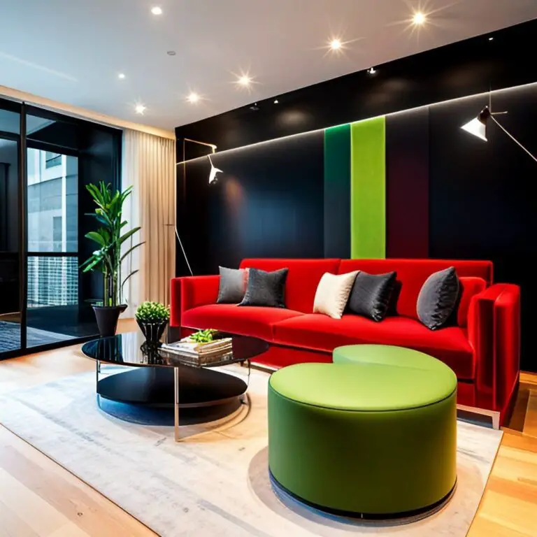
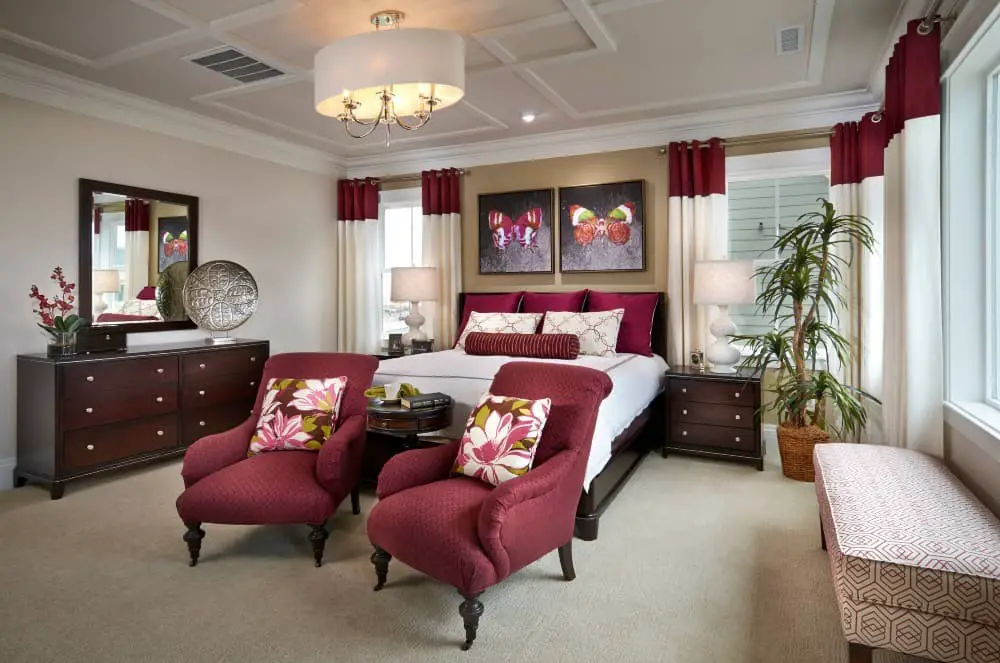
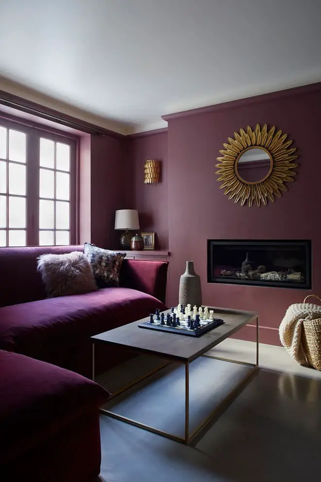
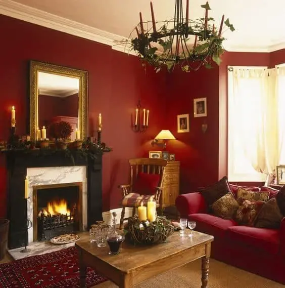
Black and Burgundy.
When it comes to decorating a home, selecting the right color palette is crucial. The combination of black and burgundy offers a timeless and versatile option that can be applied in both traditional and modern settings. To achieve a cohesive look, consider pairing these colors together. Black can serve as an accent color to add depth and dimensionality to burgundy walls or furniture, while burgundy can add warmth and coziness to black walls or pieces of furniture.
Additionally, each color can also be used separately to create a unique and inviting atmosphere. For instance, a statement piece like a burgundy sofa can be paired with a black coffee table and pops of colorful accents to create visual interest. Conversely, a black bedroom set can be elevated by adding burgundy pillows or curtains. By experimenting with these colors together or on their own, you can craft a look that perfectly reflects your personal style.
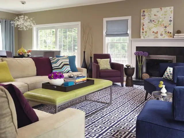
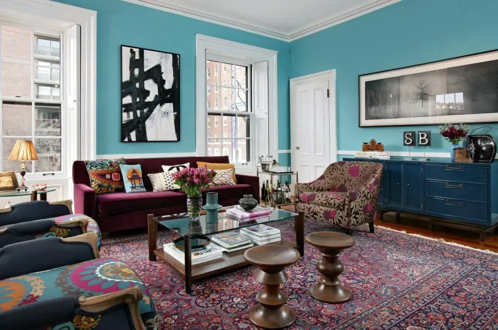
Blue and burgundy.
When it comes to selecting colors for your home, few combinations are as effective as the pairing of calming blue and warm burgundy. This duo can effortlessly evoke a sense of serenity and coziness, making it perfect for any room. To incorporate these hues into your décor, consider adding subtle pops of blue through accent pieces like pillows or accessories, which will create a sophisticated look when paired with rich burgundy tones.
For a more dramatic effect, use the colors in larger doses, such as on curtains, area rugs, or even furniture. Whichever approach you choose, blue and burgundy are sure to bring a sense of warmth and tranquility to your home.
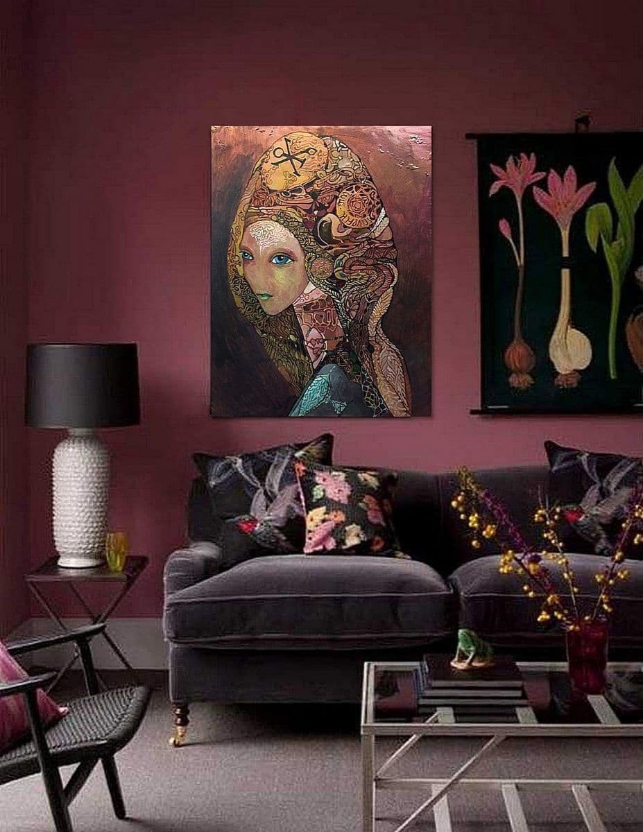
Blush and burgundy.
When it comes to creating harmonious spaces, the combination of blush and burgundy is a winning formula. This dynamic duo can be used in various ways to produce breathtaking results. For instance, you could pair blush with subtle burgundy accents to create a soft, romantic ambiance or use blush as the primary color to create a warm and inviting atmosphere. Regardless of how you choose to blend these two colors, they’re sure to inject a touch of sophistication into your home’s décor.
Bronze and burgundy.
Complementing bronze with burgundy is a harmonious combination that can foster a cozy ambiance in your home. To incorporate these colors, consider specifying bronze hardware for your doors and cabinets, and introducing burgundy accents throughout the space. For added depth, you could even paint one wall in this rich hue. However, it’s essential to balance this bold color with sufficient light sources to prevent visual overload.
Brown and burgundy.
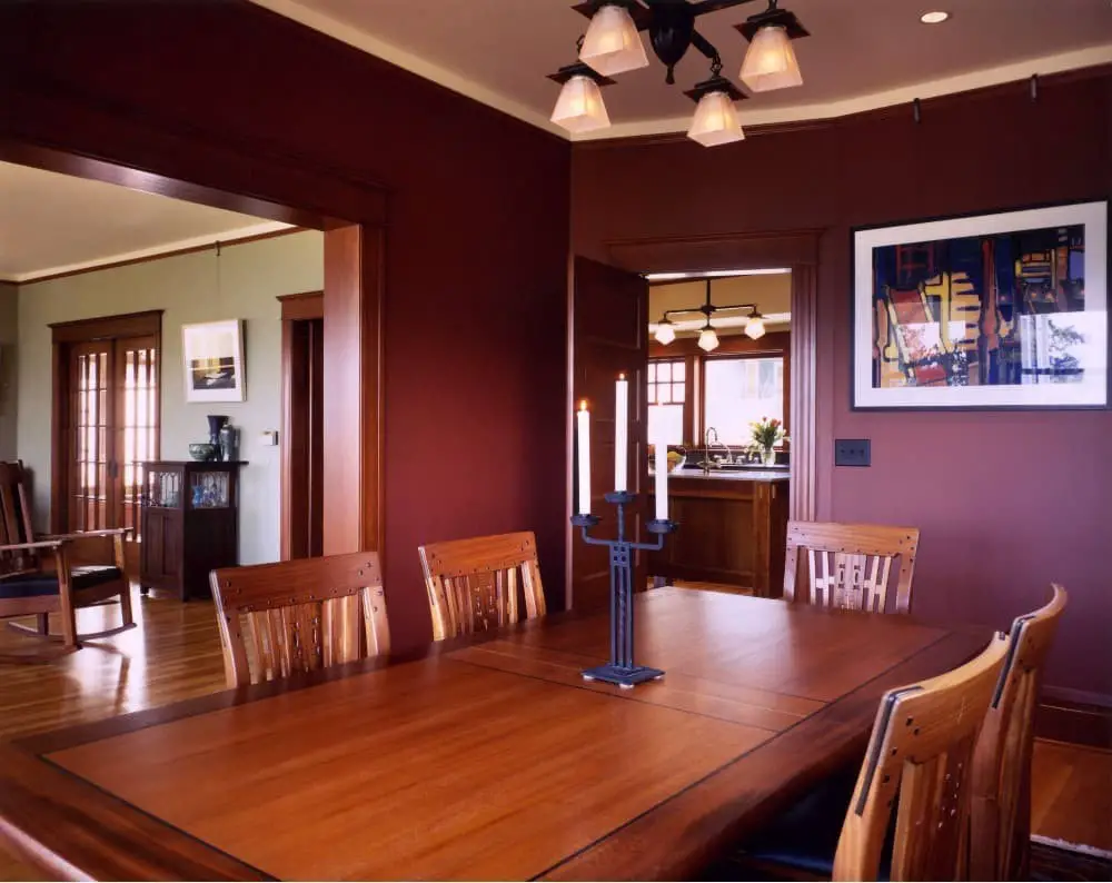
When it comes to incorporating the luxurious hue of burgundy into your home decor, one common challenge is finding complementary colors that bring out its rich tones. A simple yet effective solution is to pair burgundy with brown, a natural pairing that creates a cozy and inviting atmosphere. The earthy undertones of brown subtly enhance the depth of burgundy, resulting in a harmonious visual balance that can add warmth and sophistication to any room.
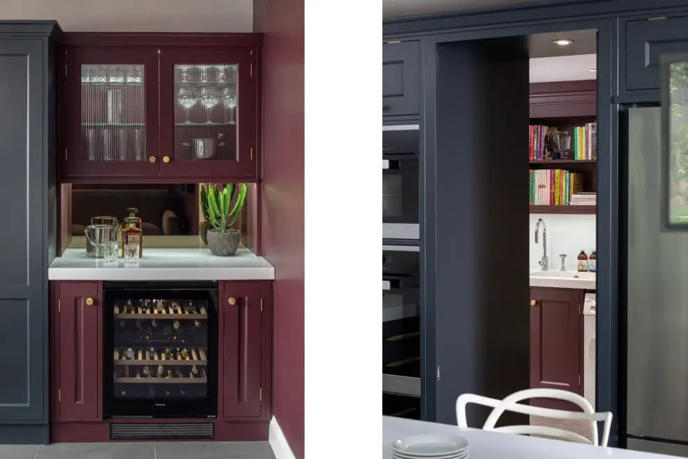
Charcoal gray and burgundy.
When pairing charcoal gray with burgundy, the key is to balance the lighter tone of the latter with a darker shade that can ground it effectively. Charcoal gray fills this role perfectly, offering a sense of stability and depth that prevents the space from feeling too bright or overwhelming. This color combination is not only aesthetically pleasing but also evokes a warm and inviting atmosphere, making your home feel elegant and sophisticated.
Chartreuse and burgundy.
On the color wheel, chartreuse and burgundy occupy opposite positions, making them a harmonious pairing. Chartreuse, with its vibrant yellow-green hue, provides a striking contrast to burgundy’s rich, red-purple tone. This dynamic duo can be effectively used as accent colors in a room or as the primary color scheme, creating a visually appealing and balanced atmosphere.
Coral and burgundy.
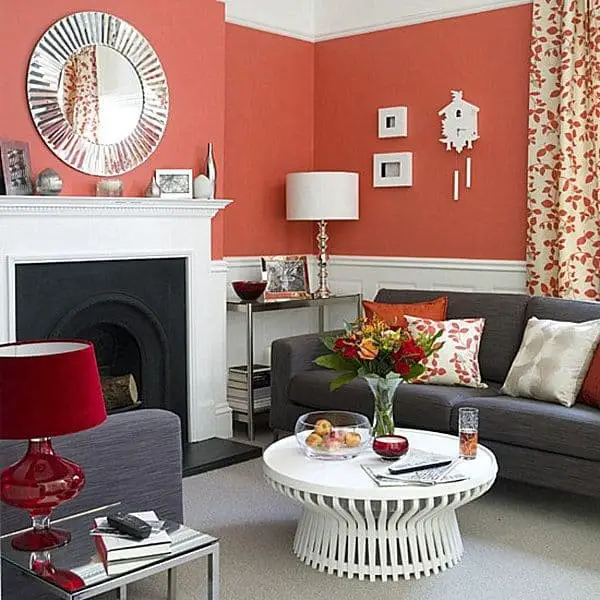
While coral and burgundy may appear to be contrasting hues on the color wheel, they surprisingly harmonize beautifully when paired together. This dynamic duo can infuse any space with a cozy and inviting ambiance. If you’re seeking inspiration for incorporating these colors into your home decor, consider the following ideas: Create visual interest by using coral as an accent against burgundy walls or furniture, or vice versa.
Add warmth to your exterior spaces by painting your front door burgundy and accessorizing with coral pieces on the porch. Alternatively, add depth to a room by pairing burgundy pillows with coral-colored upholstery or hang a coral curtain in front of a rich burgundy window treatment. For a bold look, incorporate burgundy accents into a room with crisp white walls, while coral pops can add a touch of playfulness against black walls.
As two of the most popular colors for fall decorating, coral and burgundy bring warmth and depth to any space, offering countless opportunities for creative expression.
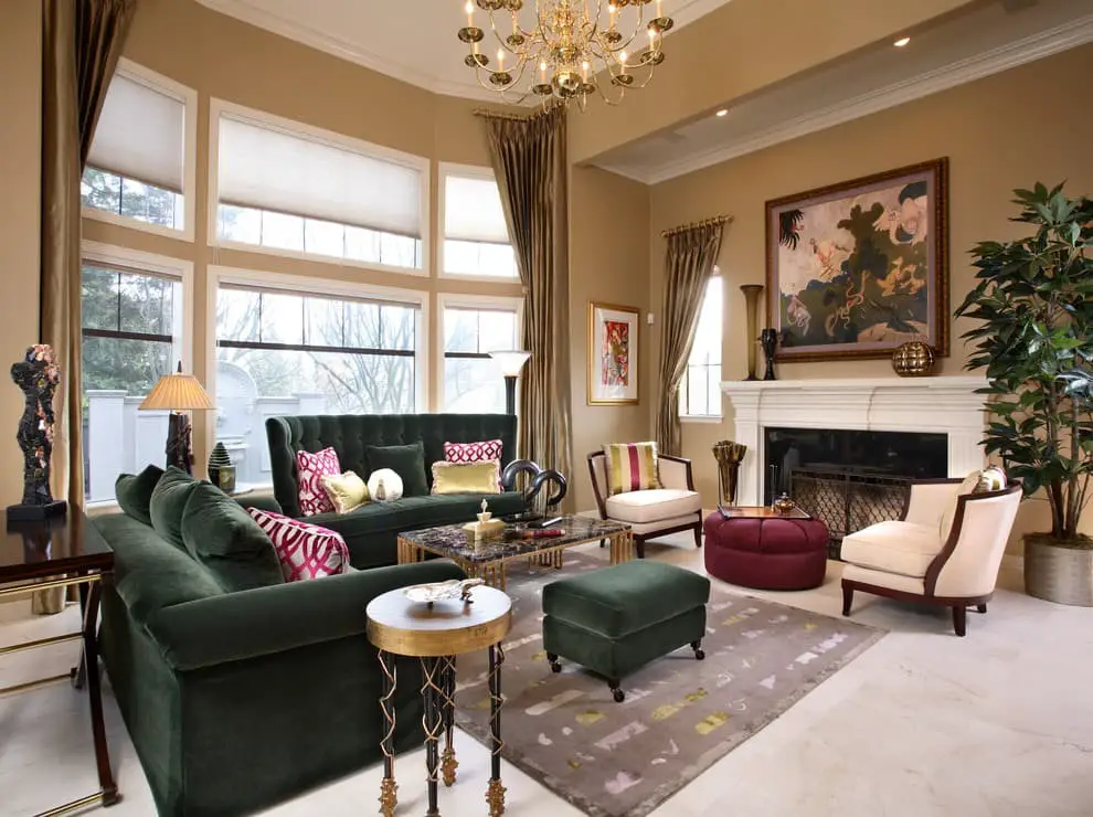
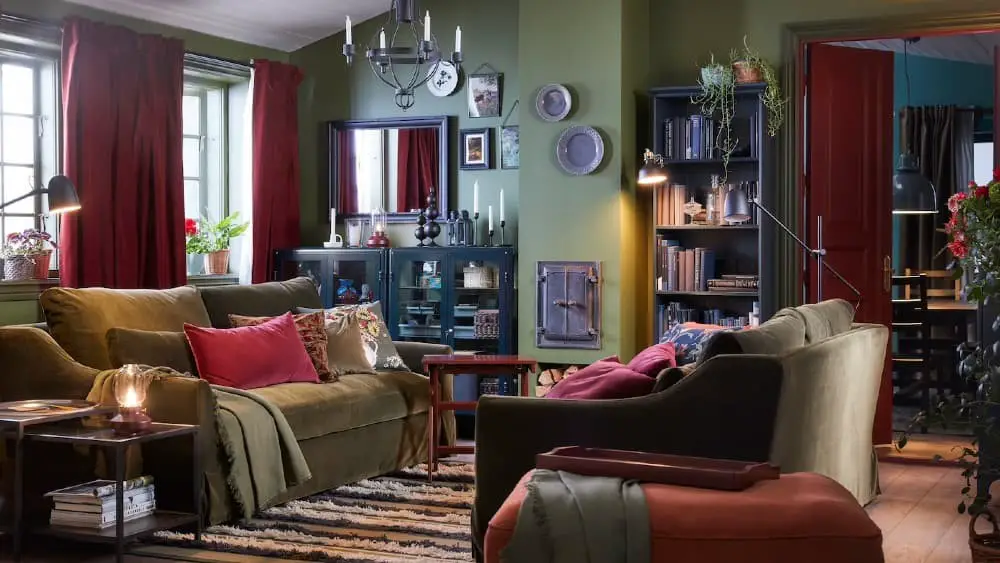
Forest green and burgundy.
To create a warm and welcoming ambiance in your home, you can combine the earthy tones of forest green with the rich warmth of burgundy. These complementary colors work beautifully together to evoke a sense of coziness. Consider incorporating forest green as an accent color through throw pillows, area rugs, or blankets. Meanwhile, burgundy can be used as an accent color on walls, curtains, or furniture pieces. Alternatively, you can also bring these colors together in a harmonious paint scheme.
Gold and burgundy
When it comes to pairing with burgundy, gold is another great complementary color that can add warmth to your space. To create a cohesive look, consider incorporating gold as an accent color in walls, furniture, or accessories. Adding some gold trim to doors and cabinets can also bring a touch of luxury to the room. Just remember to opt for warm gold tones rather than cool silver ones to ensure a harmonious pairing.
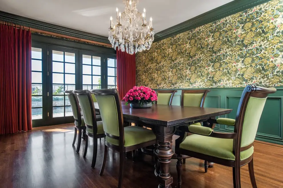
Green and burgundy.
When combining colors, few pairings are as harmonious as green and burgundy. The former brings out the natural depth of the latter, imbuing the space with a sense of richness and sophistication. Meanwhile, green’s calming properties can effortlessly create a serene atmosphere within a room. By uniting these two hues, you can craft beautiful, stylish spaces that exude elegance and refinement.
Greige and burgundy.

Combining greige and burgundy creates a harmonious atmosphere in any room. These two colors share a cozy, inviting quality that makes them ideal for home decor. The versatility of greige, a blend of beige and gray, allows it to seamlessly integrate into various spaces, while its neutral tone ensures it never goes out of style. In contrast, burgundy’s rich, deep hue adds a touch of sophistication and luxury, making it perfect for rooms that require an air of elegance and warmth.
Whether you’re seeking to add depth or create a statement piece, these two colors complement each other beautifully, offering endless possibilities for home design.
Light Grey and burgundy.
When it comes to adding a pop of color to a room with bold, rich burgundy walls, light grey can be an excellent choice for an accent hue. This subtle yet effective combination helps to balance out the darkness of the burgundy and creates a warm, welcoming ambiance that’s perfect for relaxing or socializing.
Ivory and burgundy.

When combining ivory and burgundy in your home decor, it’s essential to consider a few key factors. Firstly, keep in mind that these two colors have distinct intensity levels. Ivory is a soft, gentle hue, while burgundy is a rich, bold color. This means you’ll need to strike the right balance between the two to achieve a harmonious look. In addition, think about the room itself. Burgundy can be overpowering, so it’s often more effective in smaller spaces or areas with limited natural light.
Ivory, on the other hand, is versatile and can work well in any room. Finally, take into account the other colors in the space. Instead of competing with ivory and burgundy, choose hues that complement them, creating a cohesive and inviting atmosphere.
Lapis and burgundy.
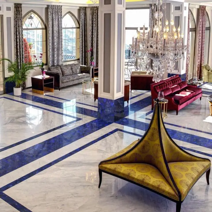
When it comes to creating a striking visual effect, complementary colors are unbeatable. The combination of these two hues produces a high-contrast result that’s perfect for making a bold statement. To maximize the impact, consider incorporating them into your home design through an accent wall or by adding pops of color to your furniture. Alternatively, you can incorporate these colors into your accessories, such as throw pillows or blankets, to add a touch of visual interest to your space.
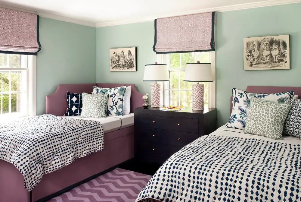
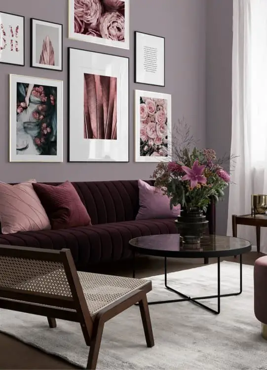
Mauve and burgundy.
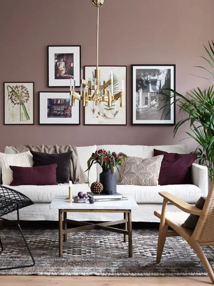
When seeking to establish a harmonious aesthetic within your living space, the combination of mauve and burgundy can be an excellent choice. These colors complement each other beautifully, allowing for a unified appearance when used in various forms such as paint, accessories, or fabric. To further enhance this coordination, consider incorporating different shades of both colors into the same room. This will introduce visual interest and prevent the space from feeling monotonous.
Additionally, experimenting with diverse textures and patterns can also contribute to an engaging atmosphere. Conversely, if you plan to employ these colors in separate rooms, selecting analogous hues will create a sense of continuity throughout your home.
Mint green and burgundy.
Combining mint green and burgundy creates a harmonious palette that can elevate any room in your home. The bright, cheerful nature of mint green makes it an excellent accent color, while the rich, luxurious quality of burgundy makes it perfect for anchoring a space. When used together, these colors produce a sophisticated look that’s both elegant and inviting.
If you’re looking to incorporate this color combination into your decor, here are some ideas to get you started:• Balance bold burgundy with bright mint green accents in a room dominated by one or the other. This creates visual interest and prevents either color from overpowering the space.• Use burgundy as an accent against a predominantly mint green backdrop for added sophistication and depth.
• Choose neutral walls as a backdrop to let mint green and burgundy take center stage, creating a beautiful and harmonious atmosphere.• For maximum impact, pair mint green and burgundy with other bold colors. This adds contrast and creates a truly show-stopping space.
Mustard Yellow and burgundy.
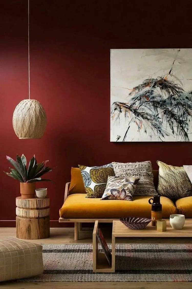
When seeking to infuse warmth and hospitality into your living space, the harmonious union of mustard yellow and burgundy is an excellent starting point. These two colors complement each other beautifully, making them ideal for creating a cozy atmosphere. To incorporate these vibrant hues into your home decor, consider the following ideas: paint one wall in a rich burgundy tone, then juxtapose it with bright yellow accents such as a rug or throw pillows.
Alternatively, introduce mustard yellow through accessories like vases, picture frames, or pillows to add a pop of color. For an inviting entryway, create a wreath using dried flowers in shades of yellow and red. You can also use burgundy and yellow fabrics to craft unique window treatments or a throw pillow cover. Lastly, hang a large piece of art that features both colors, allowing their warm tones to set the tone for your living space.
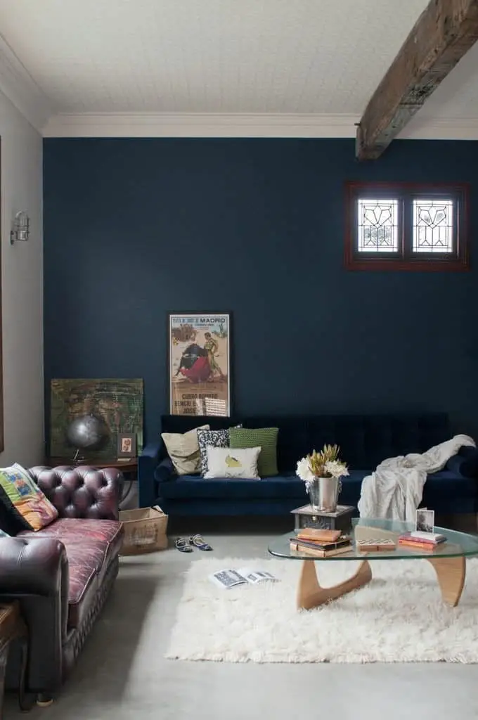
Navy blue and burgundy.
Burgundy’s rich, bold hue can be effortlessly merged with navy blue to create a stunning visual effect. This harmonious pairing can be applied to both home decor and personal style. Here are some ways to beautifully combine these two colors:Pair them in the same space by incorporating navy blue and burgundy accents throughout the room. Imagine a plush burgundy sofa paired with navy blue throw pillows, or vice versa.
For your wardrobe, try combining a navy blue dress with a statement burgundy scarf or jacket. You can also experiment with mixing and matching different pieces to create unique outfits. Alternatively, opt for a more subtle approach by incorporating both colors within the same color family. This could be achieved through a navy blue and burgundy striped shirt, or a patterned scarf featuring both hues.
Olive Green and burgundy.
When it comes to pairing colors with burgundy, one often overlooked yet harmonious combination is olive green. This earthy shade complements the rich, warm tones of burgundy perfectly, creating a visually appealing and balanced look.
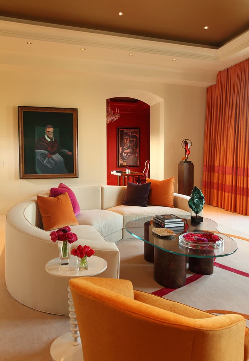
Orange and burgundy.
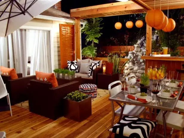
When it comes to combining orange and burgundy in your home decor, the key is finding harmony between these two vibrant colors. As complementary colors, they have a natural affinity for each other. To create a cohesive look, start by considering the unique characteristics of each color. Burgundy has a warm, rich tone, while orange is bright and energetic. By using different shades of each color, you can add depth and visual interest to your space.
Additionally, incorporating complementary textures – such as smooth and rough, or matte and glossy – can further enhance the overall aesthetic. The key is finding a balance that avoids overwhelming the senses, ensuring the final result is harmonious and inviting.
Peach and burgundy.
The harmonious pairing of red-violet and green-blue is reminiscent of the classic combination of peanut butter and jelly. As complementary colors on the color wheel, they naturally complement each other, resulting in a visually appealing combination. To infuse a touch of burgundy into your home décor, consider incorporating accessories that feature these shades. Alternatively, you can use paint or fabric to bring these colors together and create a cohesive look within your home.
Pink and burgundy.
Combining burgundy and pink may seem like an unconventional pairing at first, but the complementary nature of these colors makes them surprisingly harmonious. To effectively incorporate this duo into your home design, consider the following factors. Firstly, evaluate the existing color palette in your space. As burgundy is a bold hue, it’s best used as an accent color to avoid overwhelming the senses. Pink, on the other hand, can be used throughout various rooms.
However, lighter pinks may suit areas with ample natural light, while darker pinks are more suitable for spaces with less illumination. Next, think about the atmosphere you want to create in your home. Burgundy’s warm undertones evoke a cozy ambiance, whereas pink’s cool tones can produce a refreshing and calming environment. Choose burgundy for a traditional aesthetic or pink for a modern one, depending on your design goals. Thirdly, consider the overall style of your home.
If you’re aiming for a classic look, burgundy is a timeless choice. For a more contemporary feel, pink’s sleekness may be a better fit. Lastly, think about the fabrics and furniture you’ll use to bring these colors together. Burgundy pairs well with heavier textures like velvet or corduroy, while pink looks stunning on lighter fabrics such as cotton or linen.
Similarly, burgundy’s darker tone makes it suitable for wood or leather furnishings, whereas pink is a natural fit for metal or plastic pieces.
Purple and burgundy.
When it comes to creating a harmonious atmosphere in your home, few color combinations are as effective as purple and burgundy. These rich, regal hues can be seamlessly integrated into any room, but they truly shine when used in the living room or bedroom. If you’re looking for a solid foundation for your home’s color scheme, purple and burgundy is an excellent starting point.
To achieve a cohesive look throughout your home, it’s essential to use a consistent color palette.
This means selecting a few core colors that complement each other and applying them consistently across different rooms. You can opt for varying shades of purple and burgundy or stick to the same exact hues. The key is to create a visual thread that ties everything together.
/ If you’re struggling to decide on a color scheme, there are several strategies you can employ. First, draw inspiration from online resources, design magazines, or even nature.
Once you have a few colors in mind, test them out by painting small sections of your walls with each option. This will give you a better sense of which hue resonates with you.
/ Having settled on a color palette, it’s crucial to remain committed to it. Use different shades of purple and burgundy in various rooms or maintain the same colors throughout – either approach can lead to a visually stunning home.
By embracing these two rich colors, you’ll create a sense of continuity that ties everything together.
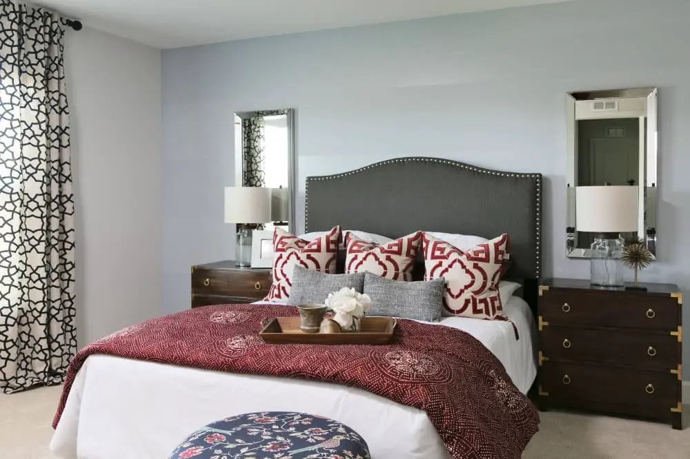
Red and burgundy.
While burgundy and red may seem similar at first glance, their undertones set them apart. Burgundy boasts a warmer tone, whereas red tends towards cooler hues. This subtle difference means they can be paired, but it’s crucial to choose shades that complement each other harmoniously.
To achieve visual balance in your home, focus on colors with similar hues but distinct values. This will create a sense of equilibrium in the space.
If you’re determined to combine burgundy and red, try pairing them with shades situated on opposite ends of the color spectrum. For instance, match a warm burgundy with a cool blue-red or its counterpart. Alternatively, experiment with varying values of the same color to introduce contrast.
Taupe and burgundy.
To create a harmonious and stylish winter-themed space, consider pairing taupe with burgundy. These complementary colors work well together in any room of your home, producing a sophisticated look that’s perfect for the season. Begin by painting one wall in a soothing taupe hue. Next, incorporate burgundy accents through throw pillows or rugs to add depth and warmth. Alternatively, apply this color combination to your kitchen by painting cabinets burgundy and walls taupe.
This unique pairing will evoke a cozy atmosphere, making your home feel inviting and snug.
Turquoise and burgundy.
When combining burgundy and turquoise, two colors that sit at opposite ends of the color wheel, you can create striking and dynamic schemes in your home. To get started, paint an accent wall in one of the colors and then select furniture, accessories, and rugs that harmonize with both hues. Textiles can also be used to introduce both colors, such as incorporating a turquoise throw pillow or blanket into the design.
If you’re concerned about creating a busy look, try using different shades of each color – for instance, pairing a lighter burgundy with beige accents and a deeper turquoise to create a more dramatic effect.
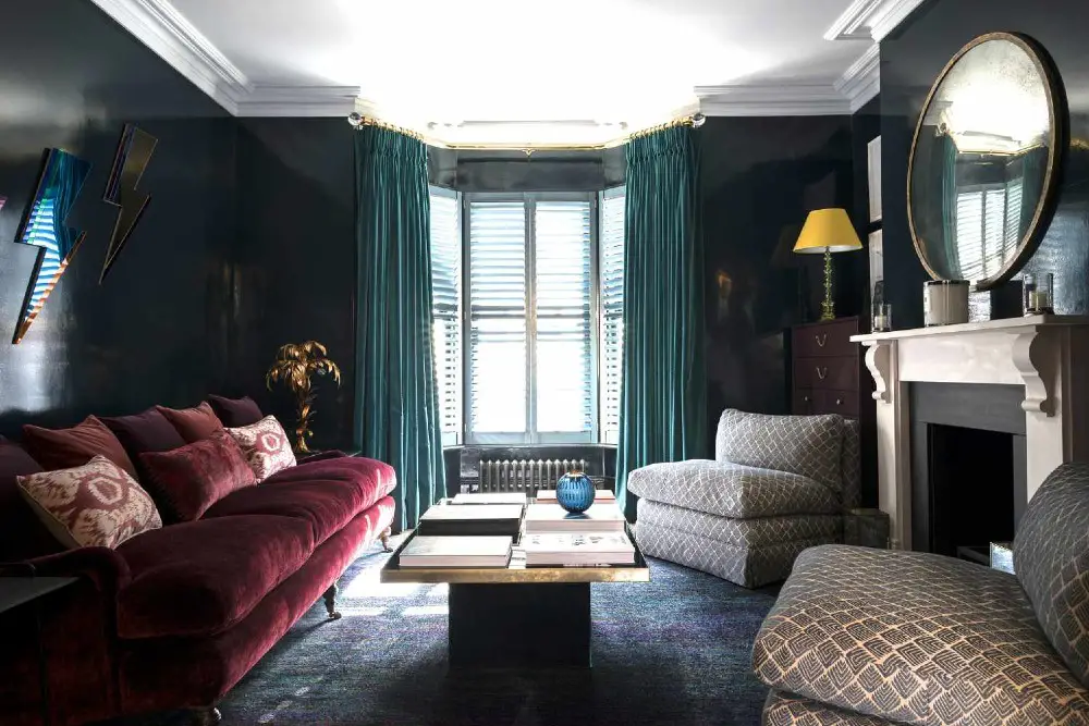
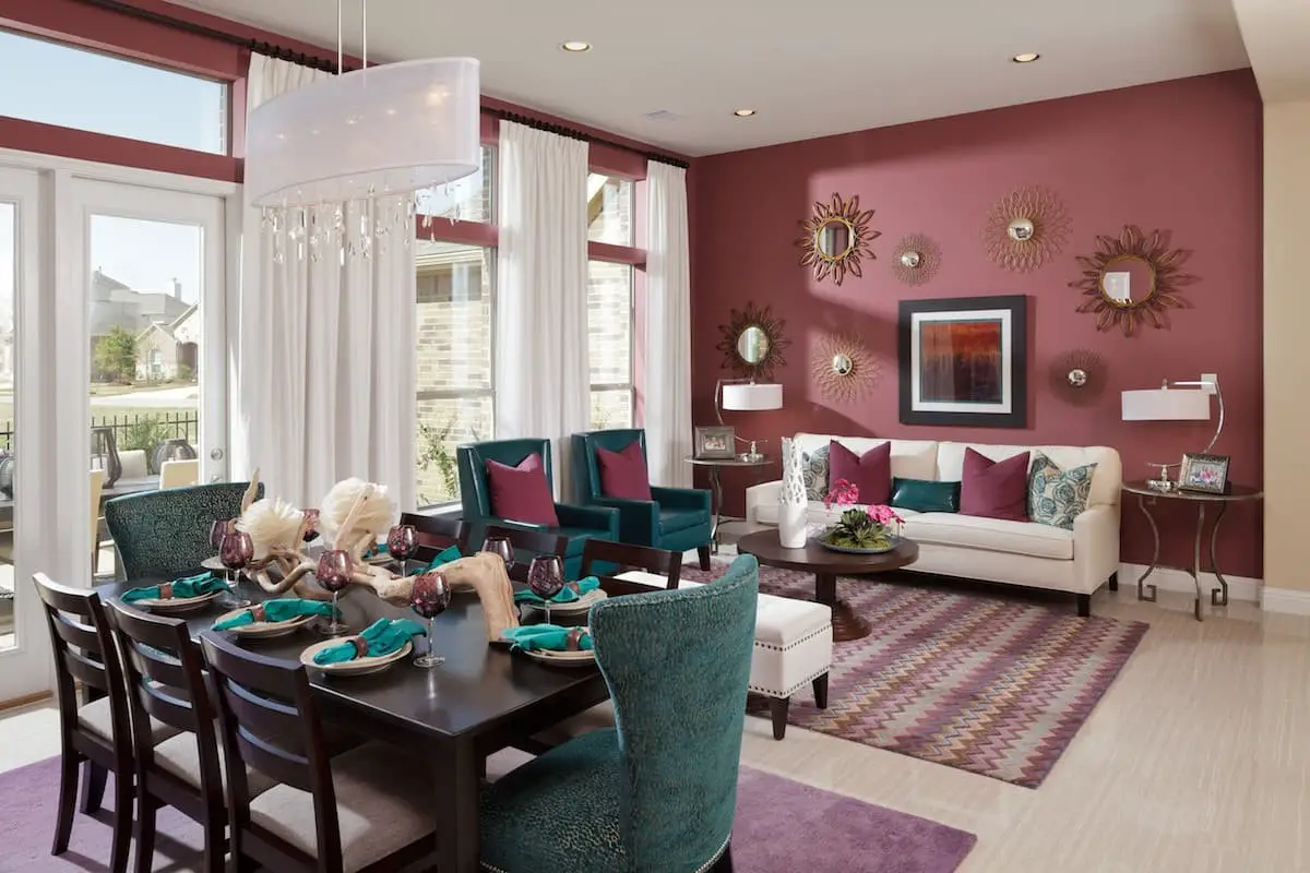
Teal and burgundy.
Complementary colors teal and its variations – deep purple, navy blue, bright burgundy, and light pink or yellow – offer endless possibilities when it comes to creating a unique and captivating color scheme in your home. By pairing these hues, you can craft a look that’s both bold and sophisticated.
For instance, combining teal with deep purple or navy blue accents can result in a refined atmosphere, while blending bright burgundy with light pink or yellow accents can create a lively and festive ambiance. Regardless of the combination you choose, these colors are sure to inject excitement into your décor.
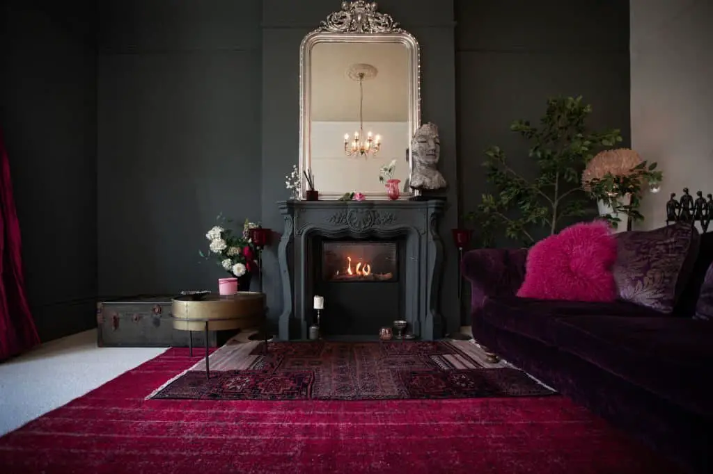
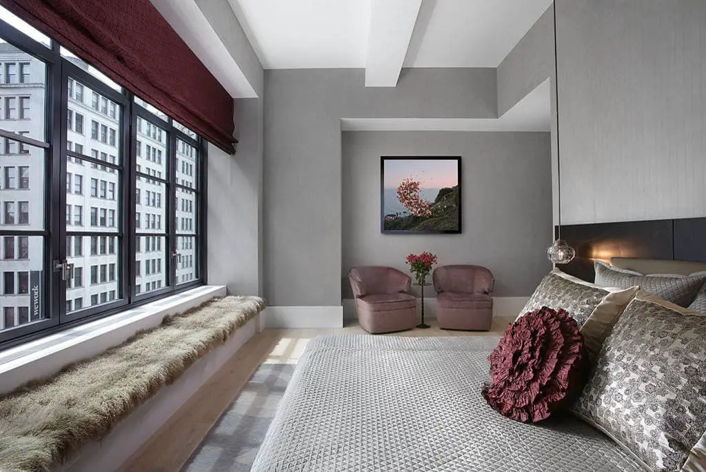
White and burgundy.
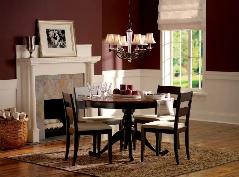
The harmonious combination of white and burgundy offers endless possibilities for design. White can be employed as a bold accent or serve as the dominant hue in a room’s décor. Conversely, burgundy proves an excellent choice for painting walls, selecting furniture pieces, and incorporating decorative elements, allowing for a sophisticated and refined aesthetic.
FAQs
Is burgundy the same as maroon?
While burgundy and maroon share some similarities as colors, they possess distinct differences. The primary composition of burgundy is a blend of red and blue hues, whereas maroon is characterized by a higher proportion of brown tones. This disparity results in burgundy often appearing brighter than its maroon counterpart. Nonetheless, the distinction between these two colors ultimately lies in individual perspectives on color.
Although there’s no definitive answer, most people generally agree that burgundy and maroon are not identical.
What colors are similar to burgundy?
Burgundy’s rich hue shares commonalities with other deep red shades such as maroon, wine, and oxblood. These colours all boast a robust, crimson tone that can be harmoniously paired with various hues to achieve distinct aesthetics. For a dramatic appearance, combining burgundy with black creates a striking contrast. Alternatively, pairing it with softer tones like pink or purple produces a more understated look.
Regardless of the colour combination chosen, burgundy’s bold presence ensures it remains a standout element.
Is burgundy color a masculine or feminine?
The age-old debate surrounding burgundy’s gender connotation has sparked intense discussions. While some argue that this wine-inspired shade is inherently masculine due to its historical associations with power and authority, others propose a more nuanced interpretation. They contend that burgundy’s deep, rich tone can also be attributed to femininity, highlighting the complexity of individual perspectives.
What does the color burgundy symbolize?
Rich and regal, burgundy is a deep red hue often linked to royalty and opulence. Its sophisticated tone makes it an excellent choice for formal events like weddings. This enigmatic colour not only adds depth and richness to designs but also has the power to evoke feelings of love and passion, making it an ideal pick for romantic occasions. Moreover, burgundy is said to be connected with wisdom and intelligence, rendering it a fitting choice for academic settings or marketing high-end products.
In essence, this versatile shade can be employed across various contexts to convey a sense of refinement and sophistication.
What does the color burgundy mean spiritually?
The rich, deep hue of burgundy is often characterized by subtle purple undertones, evoking feelings of luxury, wealth, and prestige. In a spiritual context, this majestic color is linked to power, strength, and passion, while also symbolizing love and devotion. When burgundy appears in your dreams or meditation practice, it may be an invitation to tap into your inner reserves of energy and determination, helping you overcome obstacles and achieve your aspirations.
As a reminder of the importance of empathy and compassion, burgundy can also serve as a guiding light, illuminating the path forward when uncertainty and self-doubt arise.
Conclusion
While burgundy can be a stunning addition to any room, finding the right colors to pair it with can be a challenge. However, by exploring complementary hues and neutral shades, you can create a cohesive look that exudes timeless sophistication. To achieve this, consider combining burgundy with analogous colors like black, white, or gray, which will help balance its richness and create a harmonious atmosphere.
With a little experimentation, you’ll be able to discover the perfect color combination that reflects your personal style and adds warmth to your home.