18 Best Colors That Go Well With Coral For Interior Design
Coral is a versatile color that can evoke the feeling of a tropical paradise in interior design. Its calming and refreshing essence makes it an excellent choice for creating a relaxing atmosphere in the home. As we explore some of the best color combinations to pair with coral, we’ll also share tips on how to effectively incorporate this vibrant hue into your designs.
Whether you’re looking for inspiration for a new paint color or seeking ways to add coral accents to your decor, this guide is designed to inspire and delight. In this article, we delve into the world of coral colors, from its origins to its various shades. We’ll also examine some fascinating facts about coral and its meaning, as well as explore 18 beautiful color combinations that incorporate this stunning hue.
From classic pairings like coral and black to more unexpected matches like coral and chartreuse, we’ll show you how to bring out the best in your design. In addition to exploring the world of coral colors, we’ll also provide a guide on how to mix coral paint for those who want to take their design skills to the next level. With its calming essence and versatility, coral is an excellent choice for any home design project.
What Color Is Coral?
Coral’s warm, inviting tone spans a rich spectrum of orange hues, from soft peachy tones to deep, vibrant oranges. This dynamic color is capable of energizing and brightening any design, fashion, or home décor setting. When paired with equally bold shades like yellow or turquoise, coral can create a truly show-stopping combination. Alternatively, softer companions such as blush or cream can provide a subtle contrast that allows coral to take center stage, its unique charm shining through.
A Brief History of Coral Color.
Coral’s rich history as a decorative color spans centuries, with its earliest recorded use dating back to ancient Rome and the Byzantine Empire. The color gained popularity during the Renaissance, when artists incorporated it into their works to add vibrancy and depth. In Chinese culture, coral is revered for its symbolism of prosperity and good fortune, while in India, it signified royalty and wealth.
This gemstone has even been woven into ancient mythology, believed to bring protection and good luck to those who wore it. The Victorian era saw a surge in the use of coral as a jewelry color, particularly for necklaces and earrings. Its popularity was fueled by the notion that it possessed magical properties, shielding its wearer from harm. This allure persisted through the 20th century, when coral beads and discs became coveted accessories for evening wear.
Coral has also played a significant role in various visual art movements, including Art Nouveau, Cubism, and Surrealism. In the 1950s, it experienced a resurgence as a fashionable color for clothing and home decor, and today, its versatility continues to captivate interior designers and fashion enthusiasts alike. Whether used to brighten an otherwise neutral space or add a pop of color to a bold design, coral remains a timeless choice that effortlessly elevates any room.
Meaning of Coral Color.
The vibrant coral hue is a harmonious blend of orange and pink tones, reminiscent of the ocean’s warmth and tranquility. This inviting shade is frequently employed in interior design to cultivate a soothing ambiance, perfect for unwinding and recharging. Beyond its calming properties, coral also embodies joy, creativity, and playfulness, making it a popular choice for home decor and wedding celebrations.
Furthermore, this color holds profound cultural significance, symbolizing fertility, new beginnings, and passionate connections. Whether expressing love, friendship, or the beauty of nature, coral is an ideal color to convey these emotions.
Shades of Coral.
Coral has become a staple in home décor, thanks to its understated yet versatile nature. Its muted palette allows it to harmonize effortlessly with a wide range of colors, from soft pinks to deep oranges. This sophisticated hue can be effortlessly incorporated into various elements such as curtains, bedding, and even wall paint, bringing a touch of tropical elegance to any room without overwhelming the senses.
To truly elevate your space, consider pairing coral accents with contrasting textures like wicker furniture and chunky rugs, creating a visually appealing fusion that will leave a lasting impression.
Light coral.
Infusing a touch of warmth into your interior design, light coral’s delicate blend of pink and orange hues is ideal for spaces that require a gentle uplift. This soothing shade can effortlessly brighten up airy bedrooms, creating a cozy retreat that’s perfect for unwinding. Similarly, it can add an inviting ambiance to the living room, making it a natural choice for social gatherings. With its subtle yet undeniable beauty, light coral is sure to bring a sense of warmth and serenity to any room.
Coral Red.
The vibrant reddish-orange tone of Coral Red makes it a sought-after choice for home décor, effortlessly injecting warmth and panache into any space. Its brightness draws attention without overpowering the room, striking a balance that’s both engaging and understated. This versatile hue pairs beautifully with neutral shades like white, cream, beige, and gray, creating a harmonious backdrop for everyday living.
For those who dare to be bold, Coral Red can be paired with pops of green, blue, or yellow to create a lively atmosphere. When used in a room, it has the remarkable ability to craft a cozy ambiance that’s both inviting and comforting – making it an ideal choice for living rooms and bedrooms alike.
Coral Pink.
In contrast to its more vibrant counterpart, coral pink is a subtler shade within the world of coral hues. Rather than being bold and bright, this softer tone can evoke nuances that range from pale salmon to light orange. Its understated nature makes it a popular choice among designers, who appreciate its versatility in creating harmony across various settings.
Living Coral.
The Pantone Color of the Year 2019, Living Coral, is a dynamic and vibrant shade that embodies warmth, optimism, and joy. This energetic coral hue has the power to transform any space into one that radiates happiness and positivity, making it perfect for creating inviting atmospheres.
Whether used as a bold statement or a subtle accent, Living Coral’s versatility makes it an excellent choice for designers seeking to create memorable visuals in various settings, from home décor and fashion to graphic design and web design. Its vividness brings life to any project, while its warmth evokes feelings of comfort and well-being, making it a great option for creating spaces that foster positivity and joy.
18 Best Colors that Go Well with Coral for Interior Design.
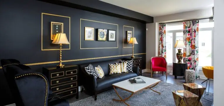
Coral and Black.
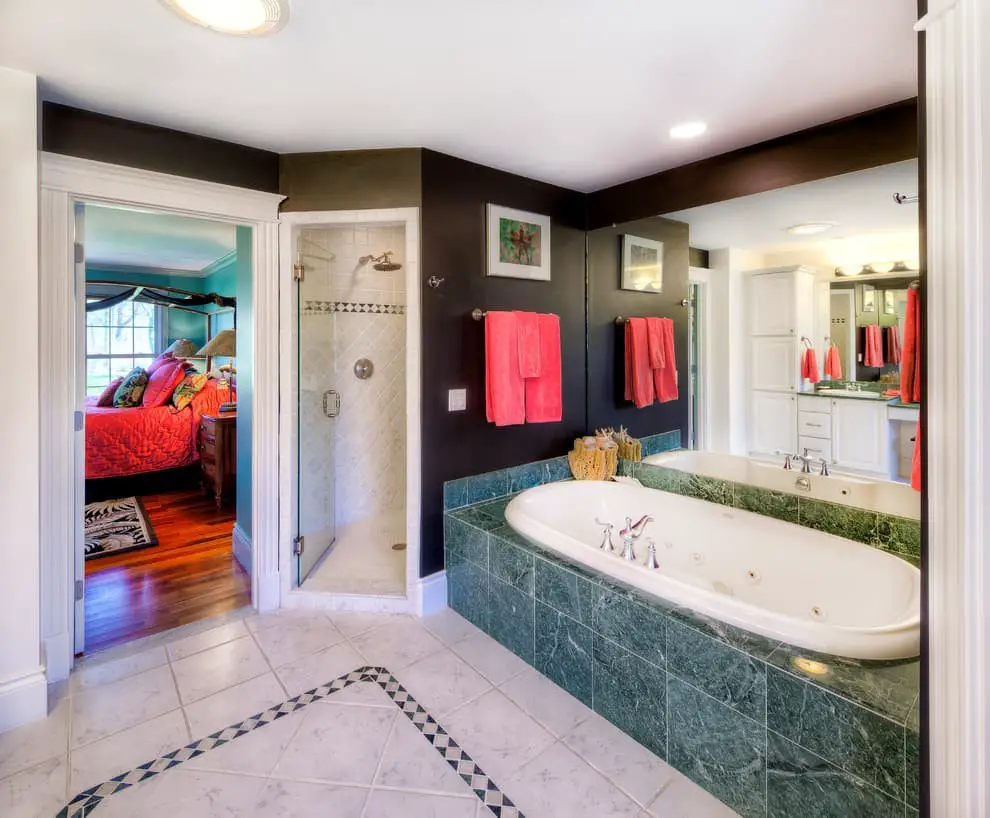
While a coral wall can certainly make a statement on its own, adding black furniture or fixtures can amplify the drama. The striking contrast between these two colors can be tempered by incorporating neutral tones like white, grey, or beige. For a truly unique look, consider pairing large coral walls with dark furniture and lighter shades of coral for a bold, yet harmonious design. Alternatively, create an accent corner featuring black furniture or fixtures alongside the coral wall.
To add visual interest, incorporate floral prints, stripes, or other playful patterns to keep the space engaging.
Coral and Blue.
When it comes to creating a beach-inspired interior design, combining coral and blue colors is a winning formula. The vibrant and playful nature of coral beautifully offsets the calming effect of blue, making for a harmonious and visually appealing combination. This classic duo can be used to create a range of atmospheres, from relaxed and casual to more formal and sophisticated, depending on the specific shade of blue employed – whether it’s navy, baby blue or something in between.
To take this look to the next level, consider incorporating patterned prints such as gingham, stripes, and polka dots, which can add an extra layer of visual interest and whimsy.
Coral and Brown.
When it comes to combining brown with coral, the possibilities are endless. One way to achieve a cozy ambiance is by pairing a light coral wall with rich dark brown furniture. The contrast between warm and cool tones creates a sense of depth and visual interest. Alternatively, blending lighter shades of both colors produces an airy, beachy feel that’s reminiscent of sun-kissed shores.
Coral and Canary Yellow.
When it comes to combining colors, coral and canary yellow make for a winning pair. The vibrant quality of coral injects energy into the space, while the softer tone of canary yellow adds a warm and inviting ambiance. This harmonious duo works beautifully as accents or used consistently throughout a room. Try incorporating them among neutral tones to create pops of color, or experiment with different shades to achieve an ombre effect that adds depth and visual interest.
Coral and Chartreuse.
Combining chartreuse green with coral creates a striking visual effect that can elevate any room’s ambiance. The vibrant green provides a bold contrast to the softer coral tones, maintaining harmony within the same color palette. For a more understated approach, blend coral with muted greens like sage or olive, adding depth and dimension while introducing subtle pops of color. Alternatively, pair coral with navy blue or black for a traditional look that exudes sophistication and refinement.
Coral and Gold.
The timeless combination of coral and gold has been a staple in interior design for years, evoking a sense of romance and luxury. The warm, pinkish-orange tone of coral pairs exquisitely with the rich, golden undertones, producing a striking contrast that can be used to make a bold statement in any room.
To avoid overwhelming the senses, consider pairing this iconic duo with neutral hues such as white, black, or grey, which will help to create a classic yet modern aesthetic that’s sure to impress.
Coral and Gray.
The combination of coral and gray is a timeless classic that works beautifully in both modern and traditional settings. The soft warmth of coral provides a lovely contrast to the cool tones of gray. To create a look that feels both nostalgic and contemporary, pair a light or medium shade of coral with gray accents on curtains, rugs, and furniture upholstery. For a more modern take, opt for a deeper coral hue and complement it with light gray walls.
Add some glamour by introducing gold or brass accents, such as statement lamps or coffee tables, to give the space a touch of sophistication.
Coral and Green.
The timeless harmony between coral and green is undeniable. Complementary colors with similar temperature profiles, this duo effortlessly creates a visually appealing combination. To cultivate an organic ambiance reminiscent of nature, combine light coral hues with olive green tones. For a more vibrant atmosphere, pair bright tangerine coral shades with forest greens.
Alternatively, for a sophisticated look, darker coral tones can be paired with emerald green, punctuated by white or black accents to prevent the space from feeling too monochromatic.
Coral and Orange.
When it comes to pairing colors with coral, one of the most effective combinations is with orange. This harmonious pairing produces a warm and inviting ambiance that’s perfect for modern designs or eclectic styles. Coral can be used as an accent wall to add visual interest, while orange can be incorporated into furniture, pillows, rugs, or artwork to complete the look. To create a softer palette, opt for lighter shades of orange like peach or apricot.
For a bolder statement, choose brighter and deeper oranges such as tangerine or rust.
Coral and Peach.
This timeless pairing of coral and peach creates a cozy atmosphere that’s ideal for living spaces and bedrooms. Coral serves as a warm canvas for showcasing peach-toned accents, such as rugs, furniture, curtains, or artwork. The combination can also be applied to outdoor settings with accessories like cushions and planters. To introduce more contrast, incorporate deeper shades of brown, such as espresso or chocolate.
For a modern twist, incorporate neutral hues like white and gray to lighten the look. Finally, add vibrant pops of color with accessories in bold shades like purple, teal, yellow, or pink.
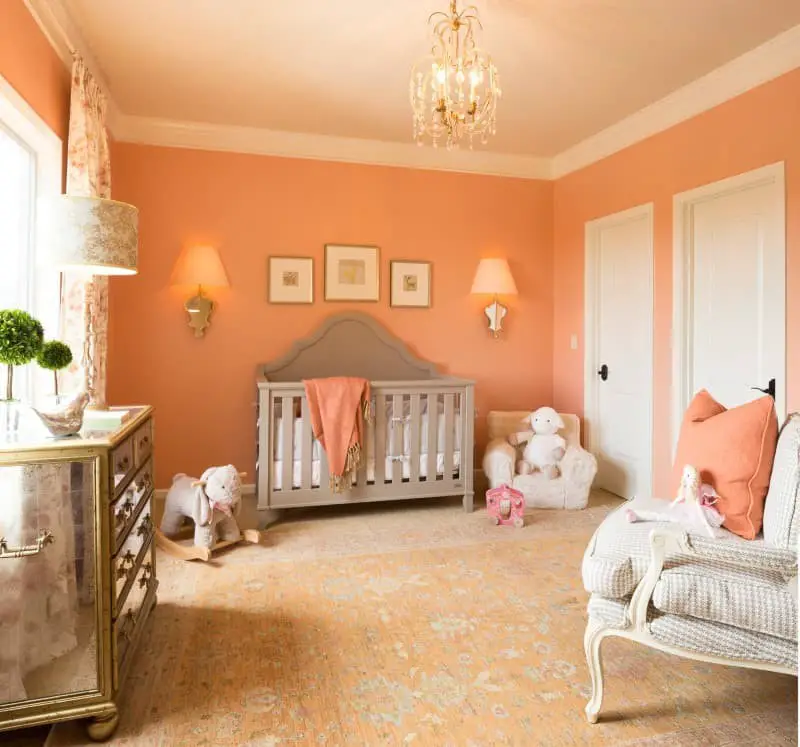
Coral and Pink.
A vibrant coral and white pairing exudes a lively, carefree spirit, making it an ideal choice for a little girl’s bedroom or playroom. Additionally, this color combination is a great option for a nursery, as it offers a neutral tone that can be appreciated by both boys and girls.
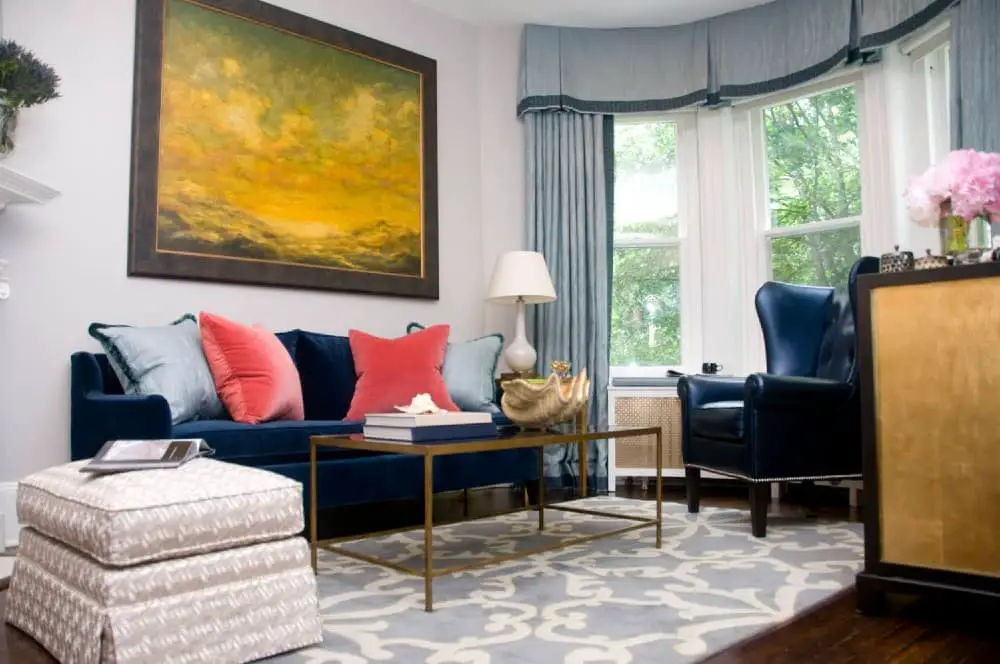
Coral and Purple.
For a serene and peaceful interior design, the harmonious blend of coral and purple is a winning combination. The vibrant warmth of coral orange is beautifully balanced by the richness of purple, adding depth and visual interest to the space.
To create an inviting ambiance, use dark purples like eggplant or amethyst as the primary color palette, then introduce lighter shades of purple, such as lavender or lilac, through accents and accessories.
This contrast creates a sense of dimensionality and visual appeal.
To keep the look engaging, incorporate varying textures and sizes in both colors. For instance, pair a plush coral ottoman with a richly upholstered velvet purple chair or add a deep-purple sofa to a room featuring a vibrant coral area rug.
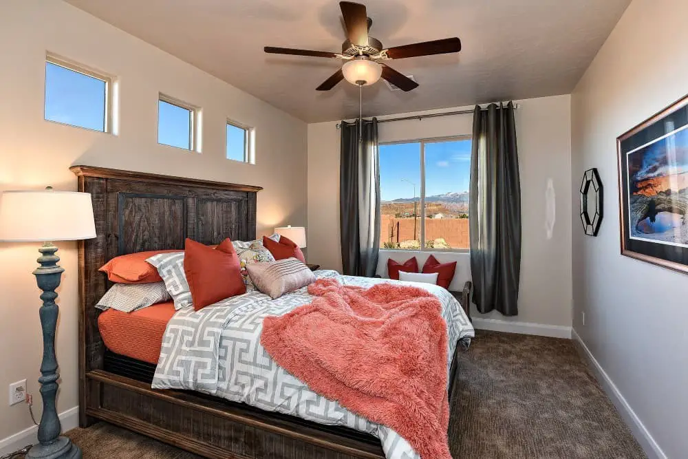
Coral and Red.
When it comes to creating a bold and vibrant atmosphere in any room, the combination of red and coral is a match made in heaven. The striking contrast between the bright tones of red and the softer hues of coral can help draw attention to specific design elements, such as a statement wall or an accent piece. For instance, pairing pale coral walls with darker red furniture and fabrics creates a visually exciting effect.
Alternatively, using coral as an accent against a neutral or white backdrop produces a subtle yet impactful statement. What’s more, the complementary nature of these colors means they can be used in larger doses without causing visual dissonance.
Coral and Teal.
When it comes to creating a timeless and inviting interior design space, few combinations can rival the classic pairing of coral and teal. The muted warmth of the coral tones is beautifully tempered by the deep blues of the teal, producing an atmosphere that’s at once cozy and sophisticated. This harmonious contrast not only complements a wide range of furniture styles but also lends itself to being paired with various decorative elements.
For a sleek, modern aesthetic, consider pairing the coral and teal palette with glossy white paint and metallic accents for a chic, high-end look. Alternatively, introducing shades of grey and beige can lend an air of elegance and tradition to the space. Nature lovers will also appreciate the rustic charm that arises when soft green accents are added to the mix.
Finally, incorporating neutral tones like cream or ivory helps to temper the bolder hues, creating a sense of balance and harmony in the room.
Coral and White.
The harmony between white and coral is undeniable, creating a timeless aesthetic that transcends trends and decor styles. This classic combination is versatile enough to be used as a dominant feature or accent piece, effortlessly adding brightness and warmth to any room. The neutral tone of white cleverly highlights the vibrant personality of coral, making it an ideal choice for those who appreciate subtle nuance and versatility.
Moreover, white’s adaptability allows it to seamlessly blend with other colors, making it an excellent option for those who enjoy experimenting with different color palettes.
Coral, Burgundy, and Cobalt Blue.
When it comes to creating a harmonious and inviting color palette for your space, these three colors – coral, burgundy, and cobalt blue – are the perfect trio. Coral, with its unique and eye-catching quality, can be used as the main attraction or as an accent shade, bringing a bright and cheerful atmosphere that’s still sophisticated enough to elevate any room.
Burgundy, slightly darker than coral, provides a sense of grounding and stability, effortlessly pairing well with both lighter and richer shades. Meanwhile, cobalt blue injects a vibrant splash of color that can instantly brighten up the space.
Coral, Light Blue, and Gray.
The combination of coral, light blue, and gray creates a soothing coastal-inspired atmosphere that’s perfect for a bedroom, living room, or even dining area. The coral adds a pop of color without overpowering the space, while the light blue injects a sense of calmness and serenity. Gray serves as a stabilizing force, tying together the other colors and preventing the palette from feeling too busy.
To elevate the look further, incorporate metallic accents like gold or silver in decorative pieces such as table lamps or picture frames.
Coral, Mustard Yellow, and Emerald Green.
The combination of coral, mustard yellow, and emerald green creates a dynamic palette that can instantly revitalize any room. While the coral and yellow pairing provides a more subtle look, the addition of emerald green brings a sophisticated touch to the mix. For added contrast and visual interest, incorporate black or white accents into your design. This bold combination is well-suited for living rooms, bedrooms, or other areas where you want to make a statement.
If you prefer a softer aesthetic, consider adding shades of pink or peach to complement the coral and yellow tones. These colors can create a feminine and inviting atmosphere perfect for nurseries, bathrooms, or any space that requires a touch of warmth.
How to mix coral paint.
Creating the perfect blend of coral paint for interior design requires a thoughtful approach. The key is finding a harmonious combination of hues that evoke an inviting atmosphere. To begin, define the desired aesthetic: how much contrast do you want between shades, and how bold or muted should the overall effect be? Once you have a vision, select two colors that will work well together. Consult a color wheel for guidance on complementary, analogous, or triadic hues.
A classic approach is to pair one light shade with one dark shade, creating maximum contrast and visual interest. Next, mix the chosen colors using a paint mixer or brush, starting with small amounts and gradually increasing intensity until you achieve the desired shade. Before applying it to your walls, test the color on paper. The possibilities are endless; experiment with different combinations of coral and other colors to create unique looks for your space.
Consider adding subtle touches of white or cream for a soft, airy feel, or be bold by pairing coral with richer shades like navy blue or dark green.
Related Posts
When it comes to creating curb appeal, the right color combination can make all the difference. For homeowners with yellow houses, selecting the perfect garage door color is crucial. While some might assume that the obvious choice would be a matching yellow, others may opt for contrasting colors to create visual interest. In reality, there are many colors that pair perfectly with a yellow house, from earthy tones like beige and brown, to bold choices like navy blue or bright red.
The key is finding a hue that complements the yellow without overpowering it. Of course, not all homes feature yellow exteriors. For those with green houses, the options are just as plentiful. From soft pastels to deep jewel tones, there’s a garage door color out there that will enhance your home’s natural beauty. And for homeowners looking to add some style to their living spaces, choosing the right curtains and bedding can be just as daunting.
In this case, it’s all about finding colors that harmonize with gray furniture. From soft whites to deep blues, the possibilities are endless. But what about the interior of your home? When it comes to selecting a ceiling color to pair with alabaster walls, there are many options to consider. Will you choose a bold, contrasting hue or stick with something more subdued? And for those looking to create a chic bedroom, finding the perfect bedding to match a gray headboard can be a challenge.
Whether you’re looking to create harmony or make a statement, understanding how to choose a color scheme that works for your home is key. With these tips and tricks, you’ll be well on your way to creating a space that’s both beautiful and functional.