Should Backsplash Be Lighter Than Countertop?
Backsplashes and countertops are two key elements in kitchen design that work closely together. A backsplash is a vertical surface installed on the wall behind a countertop, most commonly behind sinks, stoves, and workstations. Backsplashes serve both decorative and functional purposes.
Functionally, backsplashes protect the wall from moisture, grease, food splashes and stains. Having a backsplash makes cleaning easier and prevents water from seeping into the wall material. Aesthetically, backsplashes provide an opportunity to add visual interest, color, and texture. The backsplash and countertop colors and materials chosen create an overall look and vibe for the kitchen.
When selecting backsplash and countertop combinations, designers must consider elements such as color, pattern, texture, and material. The relationship between the backsplash and countertop colors is an important decision. Backsplash colors can match, complement, or contrast the countertop.
Pros of a Lighter Backsplash
One of the main benefits of choosing a lighter backsplash is that it creates an open, airy look in the kitchen. The light colors reflect more light, making the space feel bright and expansive.
According to Mees Distributors, glass tile backsplashes in particular “naturally reflects and refracts light, which will make the kitchen feel more open, brighter and larger.” The glass materials tend to create fewer shadow effects than other backsplash materials like stone or ceramic tile.
Lighter backsplash materials like glass, metal, or pastel-colored tiles also pair well with contemporary kitchen designs, complementing the clean lines and minimalist aesthetic. The light colors keep the look fresh and modern.
In summary, for those going for an airy, contemporary kitchen design, a lighter backsplash can help reflect more light to create that bright and open feeling.
Cons of a Lighter Backsplash
One of the downsides of choosing a lighter backsplash is that it can show dirt and grime more easily than darker colors. Lighter tiles like white, off-white, and light gray will make every little smudge, splash, and spot stand out
(https://www.southernliving.com/backsplash-mistakes-7182325). This means you may have to clean the backsplash more often to keep it looking pristine. If you cook frequently and tend to make messes when cooking, a light backsplash will require diligent maintenance.
Additionally, an all-white or uniform light backsplash can sometimes look boring or flat. Darker grout lines can add visual interest and break up the monotony of an ultra-light backsplash.
Pros of a Darker Backsplash
One of the biggest advantages of choosing a darker backsplash is that it can provide nice visual contrast with lighter countertops, making each surface stand out more. The contrast draws the eye and makes the whole kitchen palette more dynamic and striking. As this article points out, a dark backsplash paired with a lighter quartz or granite countertop creates “depth and dimension.” The interplay of light and dark materials brings a liveliness to the kitchen.
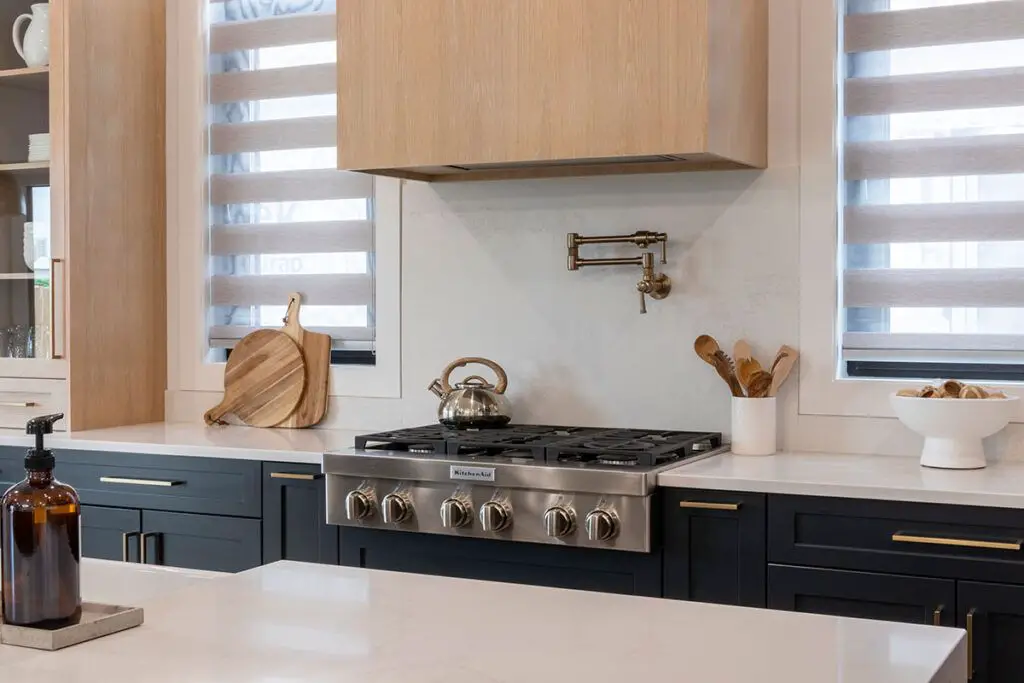
In addition, a darker backsplash can make a statement and become a focal point in the kitchen. Especially if done in a bolder color like deep blue or emerald green, a dark backsplash provides an artistic flair. It also pairs well with stainless steel appliances for a mod, sophisticated look. Overall, the high contrast can make for a bold, contemporary kitchen design.
Cons of a Darker Backsplash
One potential drawback of choosing a darker backsplash is that it can make a kitchen feel closed in or smaller than it is. The dark colors absorb light rather than reflecting it, which can give the impression of a more confined space.
Additionally, darker materials like granite, slate or dark grout don’t bounce light around the room as well as lighter materials. This reduced light reflection can exacerbate the closed-in feeling.
If your kitchen is already small or doesn’t get a lot of natural light, opting for a dark backsplash could make it feel even more cramped and dark. Using a lighter backsplash can help reflect light around the room and make it appear more open and airy.
However, with careful design choices like sufficient lighting and mirrors, the effect of a dark backsplash on a kitchen’s openness can be minimized. But it’s still worth considering if you want to visually expand a small kitchen.
Sources:
https://www.houzz.com/discussions/904021/what-are-pros-and-cons-of-using-black-back-splash
Guidelines for Choosing Backsplash/Countertop Colors
When selecting a backsplash and countertop color combination, first consider your goals for the overall kitchen aesthetic. Do you want a bright, airy look or something more muted and cozy? The backsplash and countertop colors will set the tone for the entire space.
Ease of cleaning is another key factor, especially for the backsplash which sits behind the cooktop. Materials like ceramic tile or wipe-clean laminate are lower maintenance than unsealed natural stone. Stay away from light porous materials if stains will bother you.
Durability is also extremely important. The countertops see the most wear and tear and spills, so select a hardy material like quartz or granite. The backsplash takes less abuse but should still stand up to occasional bumps and moisture. Glass or metal backsplashes add brilliance but require diligent sealing.
When in doubt, turn to classic tried-and-true backsplash and countertop combinations, like white marble countertops paired with a subway tile backsplash. This pairing is timeless yet fresh.
Material Considerations
The porosity, texture, and gloss of materials can significantly impact how a color is perceived in a kitchen backsplash. More porous materials like natural stone tend to absorb light, resulting in colors that appear muted or lighter compared to the same color on a nonporous surface like glass or ceramic tile. Materials with a rough or matte texture also scatter light more, creating a softer look. Meanwhile, glossy surfaces reflect light directly back to the eye, intensifying color saturation.
For example, a dark green glass subway tile will likely appear richer and more vibrant against a neutral countertop compared to the same green color on a honed limestone backsplash. With porous or textured materials, bolder backsplash colors may need to be a shade or two darker than the countertop to compensate for their tendency to absorb light. Consider sheen as well – pairing a glossy countertop with a matte backsplash tile can create nice contrast and dimension. Always view material samples together before finalizing colors.
Source: https://www.linkedin.com/pulse/what-color-should-my-kitchen-backsplash-white-grey-other-jack-bruce
Popular Color Combinations
Some of the most popular backsplash and countertop color pairings include:
White backsplash with white countertop: An all-white kitchen provides a clean, bright look. The similar tones keep the space looking seamless. https://www.bhg.com/kitchen/backsplash/backsplash-pairings/
White backsplash with black countertop: This high contrast combo is very striking. The white backsplash keeps the space looking light and airy. https://www.houzz.com/magazine/top-colors-and-materials-for-counters-backsplashes-and-walls-stsetivw-vs~130148270
White backsplash with gray countertop: Gray countertops provide a nice neutral tone that pairs well with white backsplash tiles. The combo gives a modern, sleek look.
Natural stone backsplash with quartz countertop: Combining natural materials like marble or travertine backsplash with engineered quartz countertops gives an organic, earthy aesthetic.
Boldly patterned or colored backsplash with neutral countertop: Using a vibrant mosaic, handmade, or geometric backsplash tile with a white, beige, or gray countertop creates a focal point in the kitchen.
Tips for Harmony
When choosing a backsplash to pair with your countertop, there are a few guidelines that can help you achieve a cohesive, harmonious look:
Use the color wheel as a guide. Colors that are next to each other on the wheel, such as blue and green, tend to complement each other well. You can also choose opposite colors on the wheel, like red and green, for a bold, contrasting look. Just be sure to avoid colors that clash, like red and orange.
Match the undertones of your backsplash and countertop. For example, pair a backsplash with warm terra cotta tones with a countertop that has similar earthy undertones. Mixing cool and warm tones can look disjointed.
Pull an accent color from your countertop into the backsplash. If your countertop has veins or flecks of a certain hue, choose a backsplash containing that color. This helps unite the two surfaces.
Use the same material or texture for both surfaces. For instance, combine marble countertops with marble subway tile or quartz with a mosaic glass backsplash. Matching textures creates cohesion.
Transition from light to dark or vice versa. You can go from a dark countertop to a lighter backsplash or the reverse. Just be sure there is enough contrast between the two.
Add visual interest with a third color. In addition to the main backsplash and countertop colors, bring in a third shade as an accent. Green counters and blue backsplash could feature orange decor, for example.
Conclusion
While both dark and light backsplashes can work well with countertops of contrasting tones, there are some key factors to consider when choosing colors. The overall style and feel of the kitchen should be evaluated, along with the type of materials being used. A lighter backsplash can brighten up a dark space and make it appear larger and more open, while a darker backsplash might provide a sophisticated or cozy effect. The size of the kitchen and the amount of natural light coming in are also important to factor in. Following basic design principles around color harmony will help create a cohesive and visually pleasing look. With an abundance of gorgeous backsplash tile and countertop options now available, it’s easier than ever to mix, match and find the ideal color combination to suit your kitchen’s unique character and your personal taste.